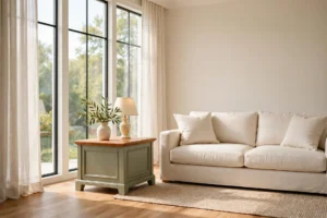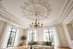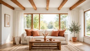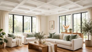

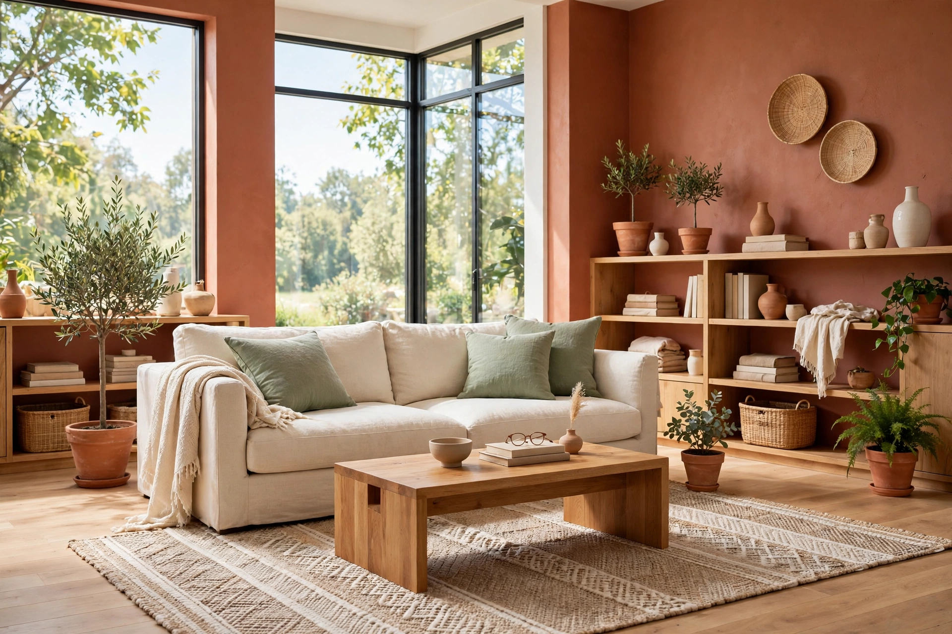
Picture this: you walk into a living room on a cool evening and the whole space seems to glow with warmth. The walls carry a soft baked clay tone, the sofa sits in creamy linen, and a sage green throw is folded neatly over the arm. Nothing feels cold or stark. The room wraps around you like a late summer sunset, and you want to stay a while.
That warmth comes from terracotta, a color that has grounded beautiful homes for centuries. It pairs well with far more colors than most people expect, from quiet neutrals to bold jewel tones. These 29 terracotta color combinations will help you find the pairing that fits your rooms, your light, and your style, so every space feels warm and welcoming.
1. Terracotta and Cream for Soft Warmth
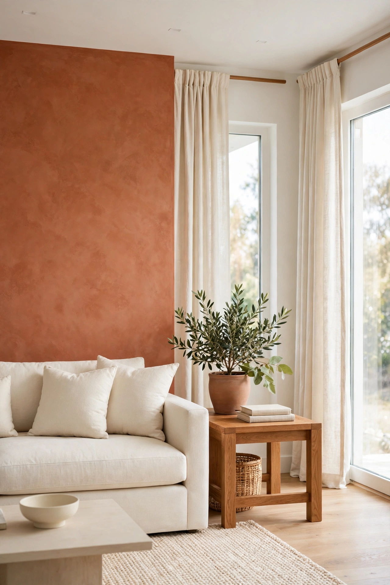
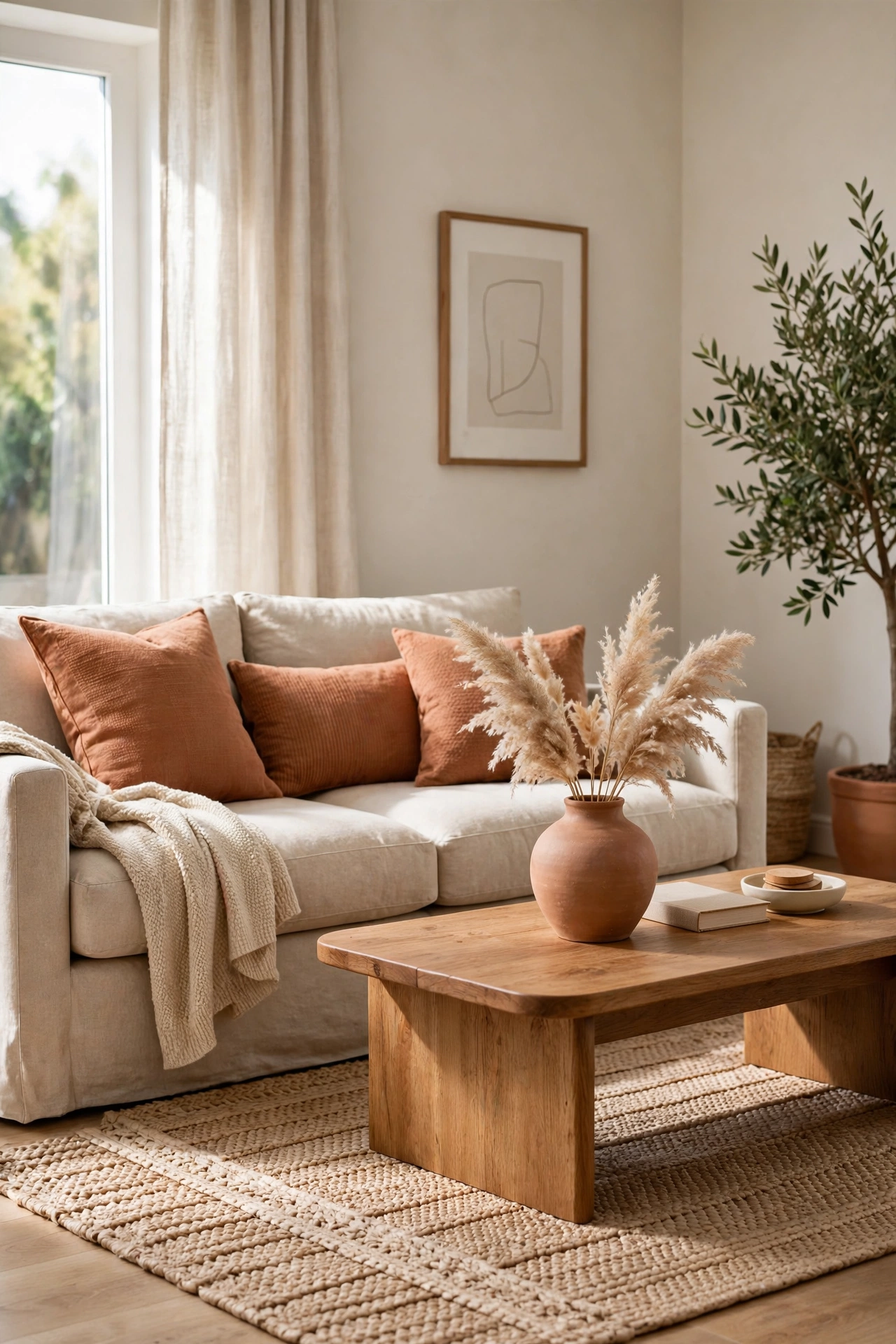
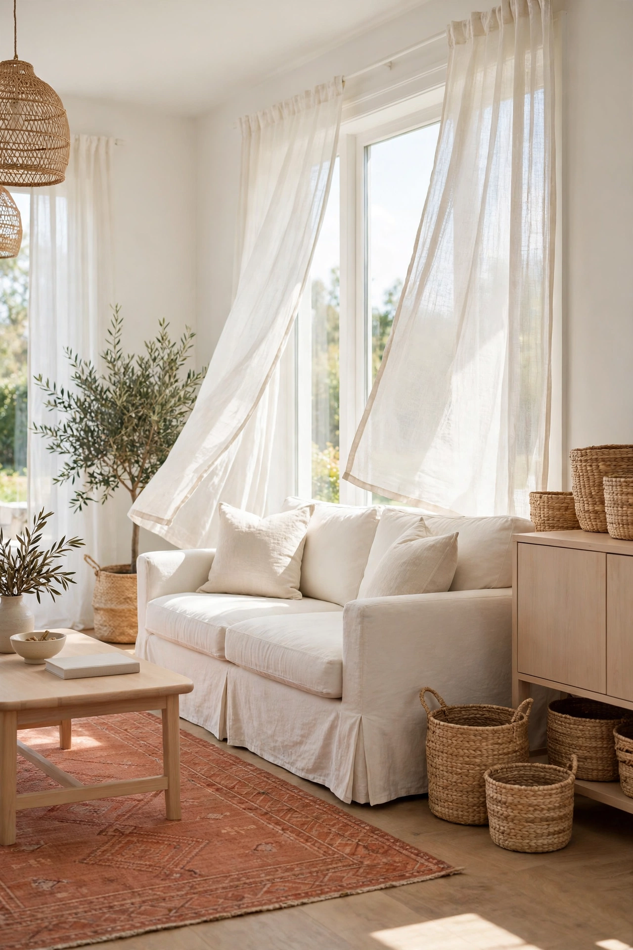
Terracotta and cream is the gentlest pairing on this list, and it works in almost any room. The cream softens the richness of the clay tone, so the result feels calm rather than heavy. Paint one wall terracotta and keep the rest cream, or flip the balance with a terracotta sofa against cream walls.
This combination shines in living rooms and bedrooms where you want a restful mood. Add warm wood furniture and woven textures to complete the look. Cream linen curtains and a cream rug keep the floor and windows light, while terracotta cushions and throws bring the warmth in at eye level.
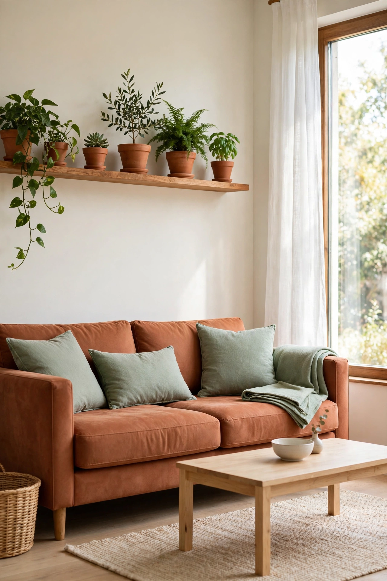
2. Terracotta and Sage Green for Earthy Balance
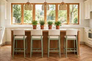
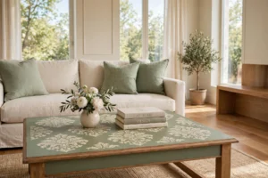
Terracotta and sage green sit across from each other in nature, in clay soil and soft leaves, so they feel balanced the moment you place them together. The cool gray green of sage calms the heat of terracotta, and the terracotta keeps the sage from feeling cold. Together they create a grounded, earthy room that feels fresh all year.
Try sage green cabinets with terracotta tile, or a terracotta sofa with sage green cushions and a sage throw. Potted plants strengthen the connection, because their green leaves echo the sage while the clay pots echo the terracotta. For more pairings built around this quiet green, these sage green interior color combinations show how well it works with warm and cool tones alike.
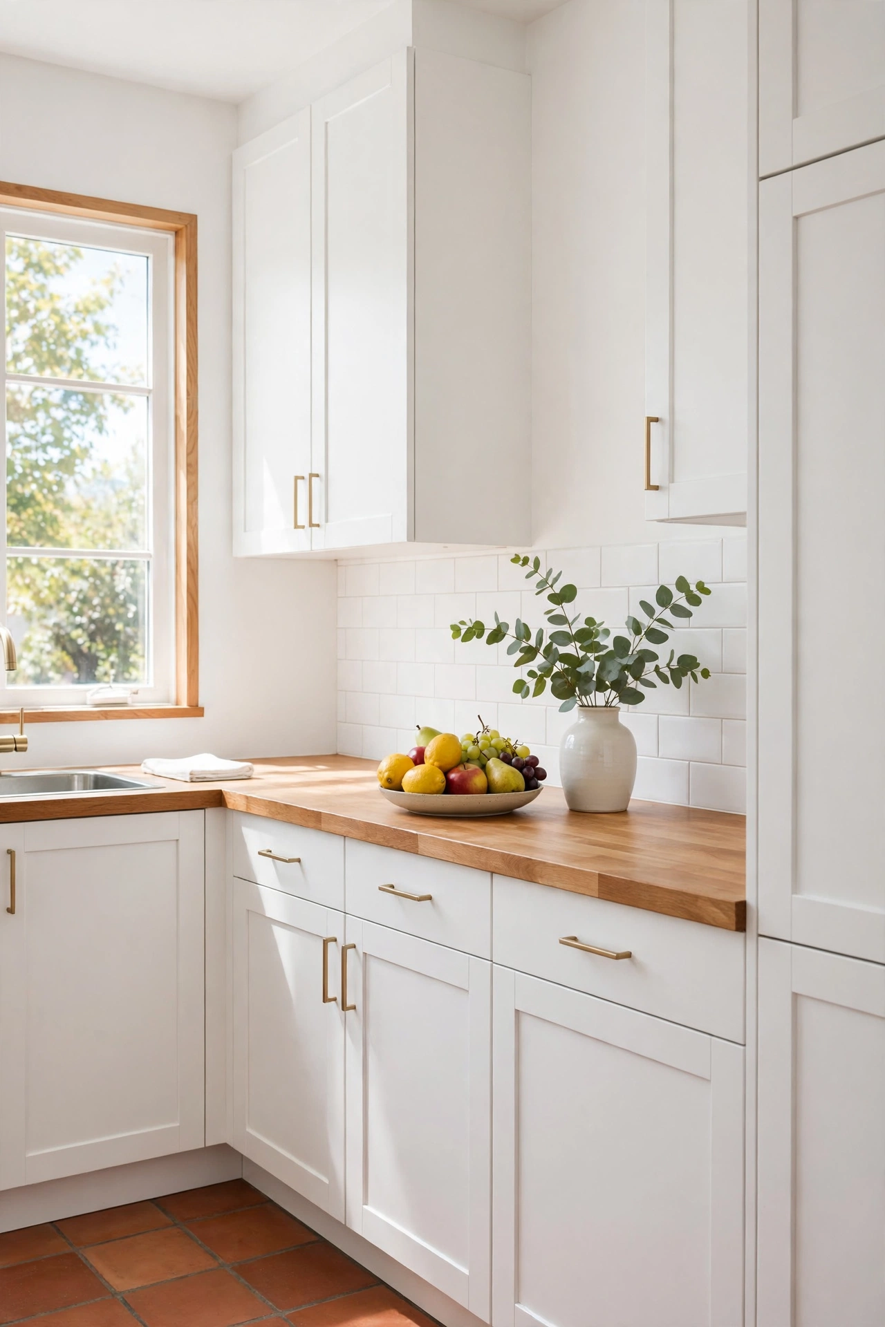
3. Terracotta and Crisp White for Clean Contrast
Crisp white gives terracotta a clean frame that lets the clay color stand out. White walls make a terracotta sofa or a terracotta tiled floor look richer and more deliberate. The contrast is strong but never harsh, because terracotta is a warm color and white keeps it feeling fresh.
This pairing suits kitchens and bathrooms especially well, where white tile and white cabinets meet terracotta floors or a terracotta backsplash. Keep the white truly white rather than yellow toned, so the contrast stays crisp. A few black or dark wood accents will ground the scheme and stop it from floating.
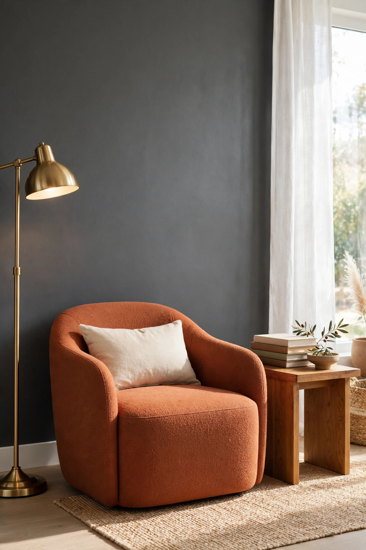
4. Terracotta and Charcoal Gray for Modern Depth
Charcoal gray adds modern depth to terracotta without stealing its warmth. The dark gray acts like a shadow that makes the clay tone glow, so a terracotta chair against a charcoal wall becomes the clear focal point of the room. This pairing feels grown up and current, perfect for a living room or a home office.
Keep the balance in favor of terracotta if you want the room to stay warm. Use charcoal on one wall, on a rug, or on large furniture, and let terracotta carry the soft furnishings. A little warm metal, like brass or copper, bridges the two colors and keeps the gray from feeling cold.
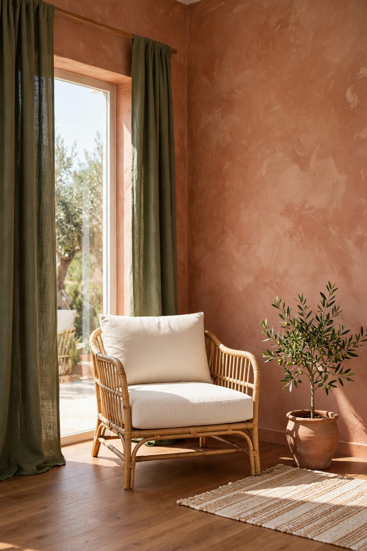
5. Terracotta and Olive Green for a Mediterranean Mood
Olive green and terracotta carry a Mediterranean mood that feels sun baked and relaxed. The muted green has a warmth of its own, so the two colors blend rather than compete. Olive works beautifully on walls, on upholstery, or on painted kitchen cabinets paired with terracotta tile.
Layer in natural textures to complete the feeling, like linen, rattan, and rough plaster. Olive green cushions on a terracotta sofa, or olive drapes beside a terracotta wall, give the room a collected look that suits both old houses and new builds. Keep the lighting warm so the olive stays soft rather than muddy.
6. Terracotta and Warm Wood Tones for Natural Warmth
Warm wood tones are the easiest partner for terracotta, because both come from the same earthy family. Oak, walnut, and warm pine all sit comfortably beside clay tones, and the wood grain adds pattern without adding another color. A terracotta wall behind a warm wood sideboard is a classic combination that rarely goes wrong.
Let the wood do the work of adding texture, and keep other colors quiet so the pairing stays the star. A wood dining table with terracotta chairs, or wood shelves on a terracotta wall, gives a dining room or living room a natural, grounded feel. Choose wood with a visible grain for the richest effect.
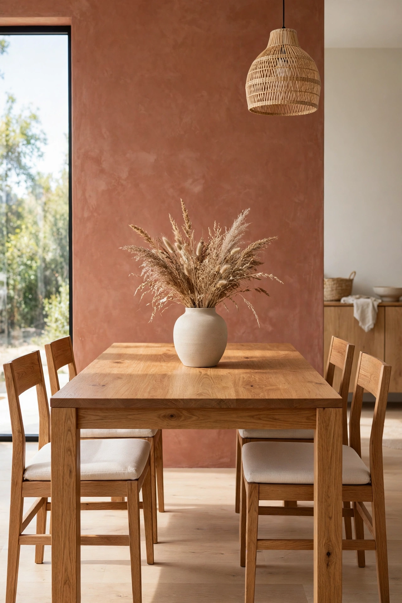
7. Terracotta and Navy Blue for Bold Contrast
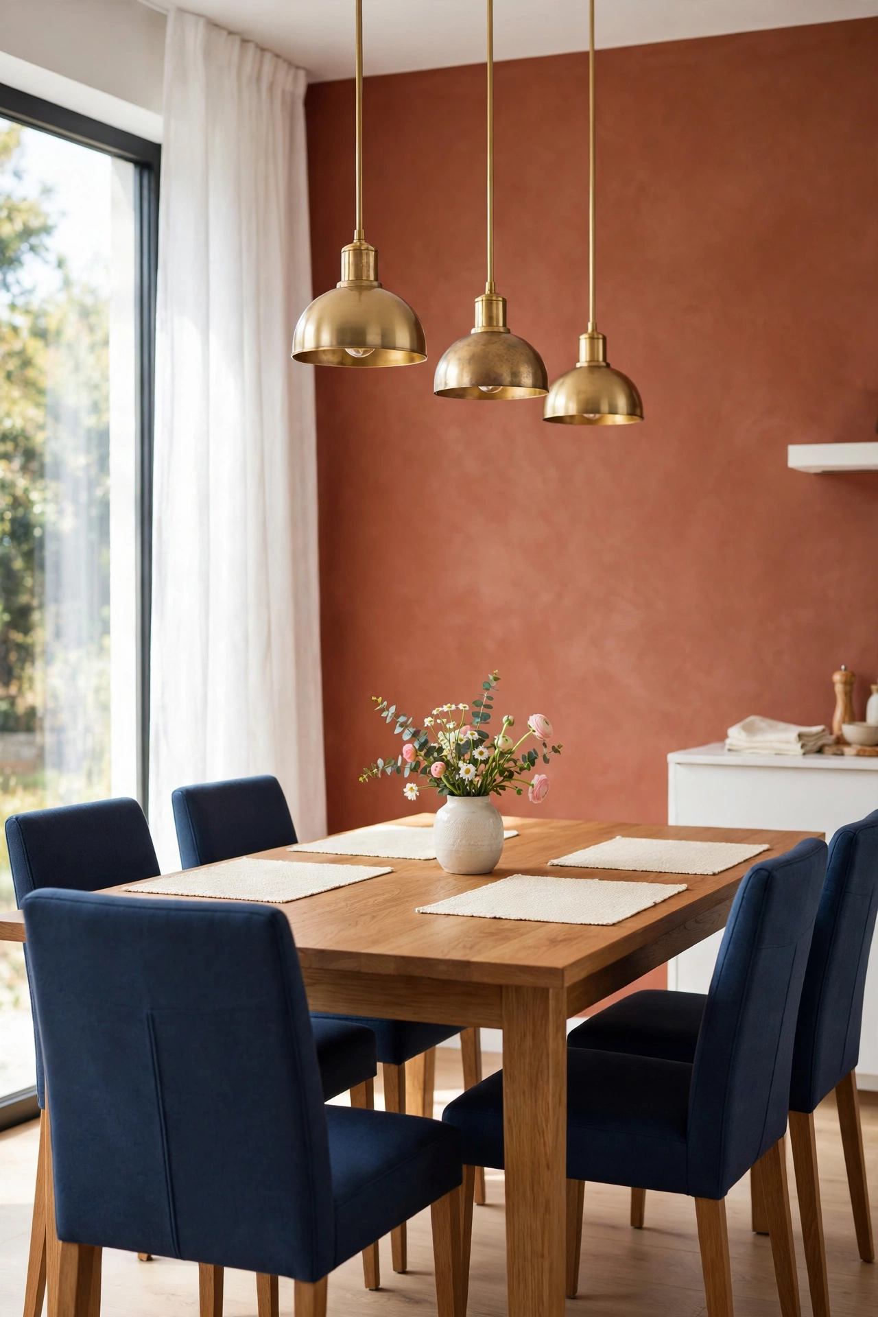
Navy blue and terracotta are a bold pairing with real drama. The deep blue cools the warmth of the clay, and the terracotta stops the navy from feeling too formal. This contrast works best when one color leads and the other accents, so choose a navy sofa with terracotta cushions, or a terracotta wall with navy chairs.
Bedrooms and dining rooms suit this pairing well, because the drama feels intentional in a smaller space. Add cream or soft white as a third color to give the eye a rest between the two strong tones. Navy and terracotta also pair beautifully with brass, which picks up the warmth in both colors.
8. Terracotta and Blush Pink for Gentle Warmth
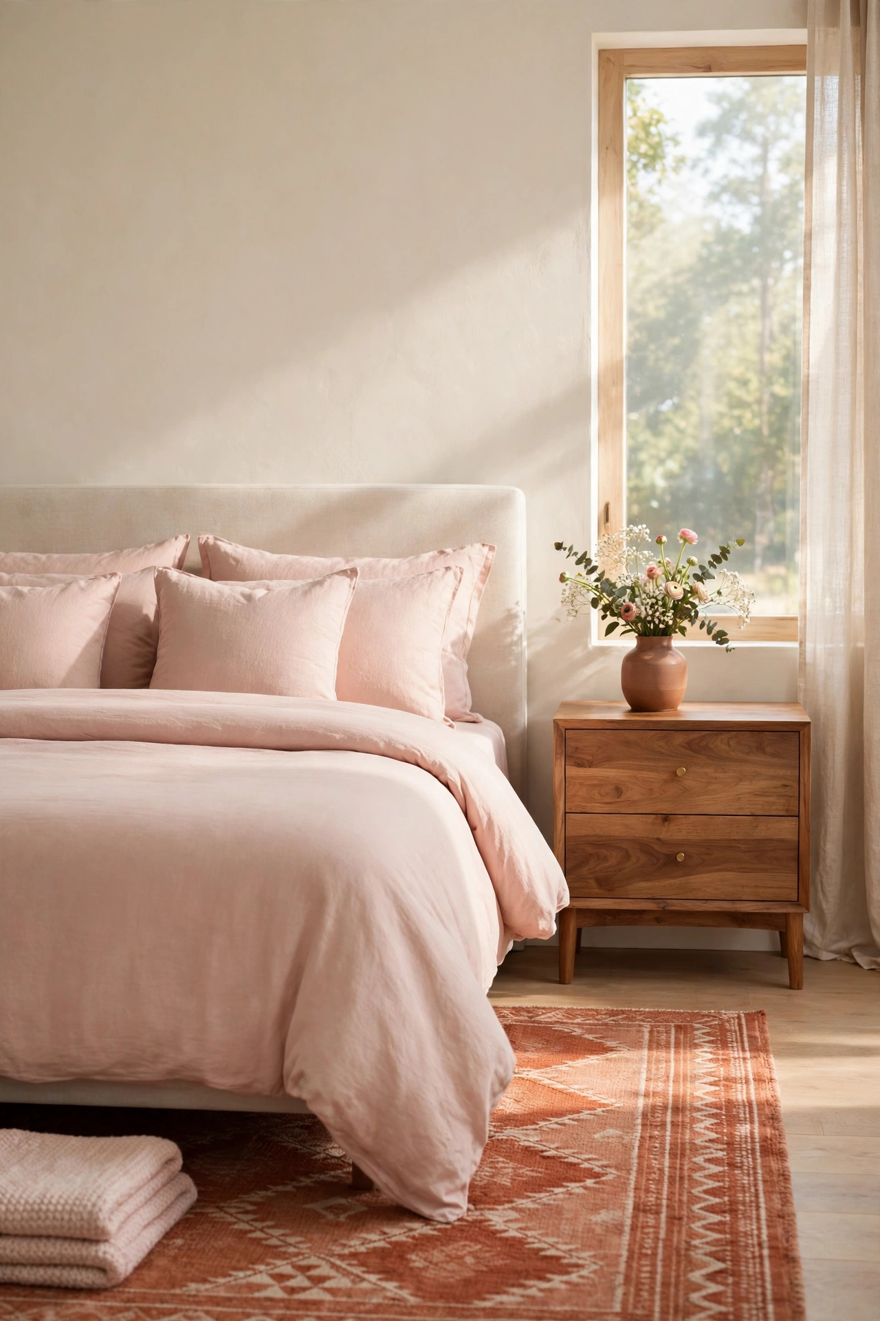
Blush pink softens terracotta into something gentle and romantic. The two colors share warm undertones, so they blend smoothly, with blush acting as the lighter, quieter sister of the clay tone. This pairing feels lovely in a bedroom, a nursery, or a bathroom where softness matters most.
Use blush on bedding, towels, or a painted dresser, and let terracotta appear in the rug, the wall, or a tiled floor. Keep the blush pale rather than bright, so the room stays calm. A touch of cream and warm wood will keep the scheme grounded and stop it from feeling too sweet.
9. Terracotta and Mustard Yellow for Sunlit Energy
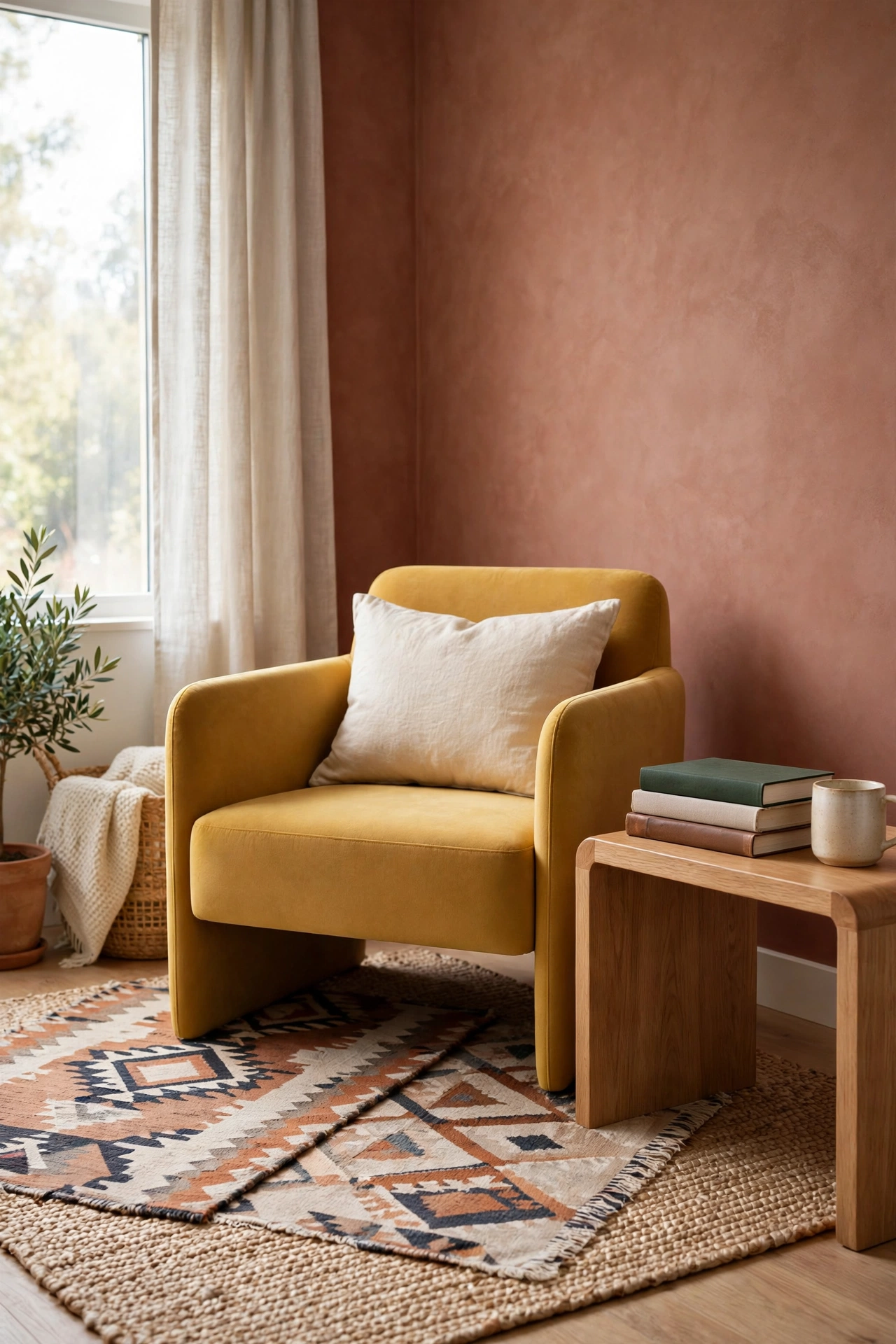
Mustard yellow brings sunlit energy to terracotta, and the two warm tones create a room that feels like golden hour all day. Mustard works best as an accent, in cushions, a throw, a painted chair, or a piece of art, while terracotta holds the larger surfaces. The combination feels joyful without being loud.
This pairing has roots in Moroccan and global styles, where warm spices and sunlit walls sit side by side. Try it in a living room or a reading corner with layered rugs and patterned cushions. For rooms that lean into that collected, well traveled feeling, these Moroccan inspired interior design ideas show how warm color and rich pattern work together.
10. Terracotta and Matte Black for Sharp Definition
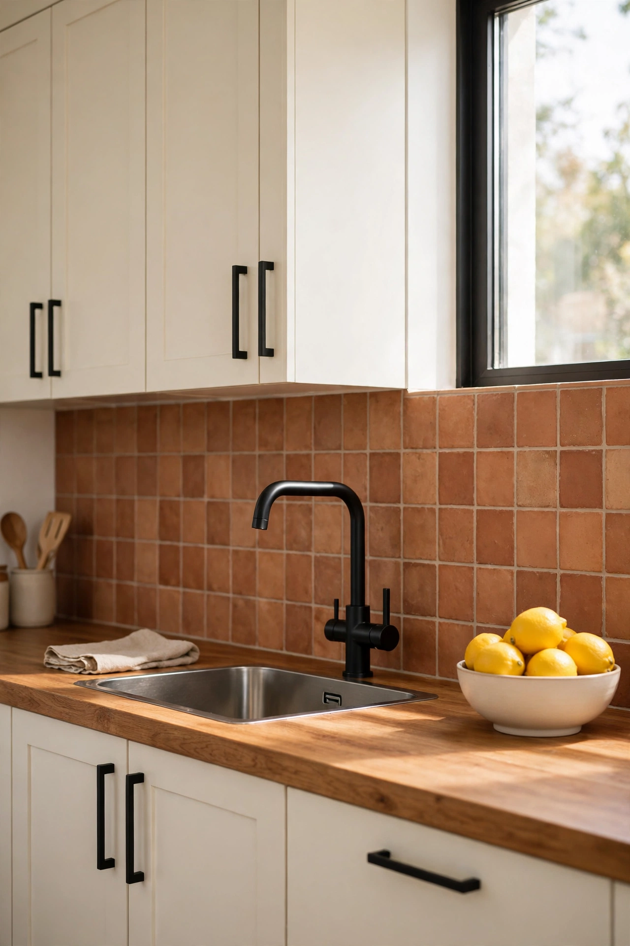
Matte black gives terracotta sharp definition and a modern edge. Black window frames, black light fixtures, or a black fireplace surround outline the clay color and make it look crisp. The contrast is strong, so a little black goes a long way, and the room keeps its warmth.
Use black in thin lines and small shapes rather than large blocks, so the scheme stays balanced. Black metal chairs around a wood table, or black hardware on terracotta painted cabinets, add definition without darkening the room. This pairing suits kitchens, bathrooms, and modern living rooms best.
11. Terracotta and Soft Sky Blue for Airy Calm
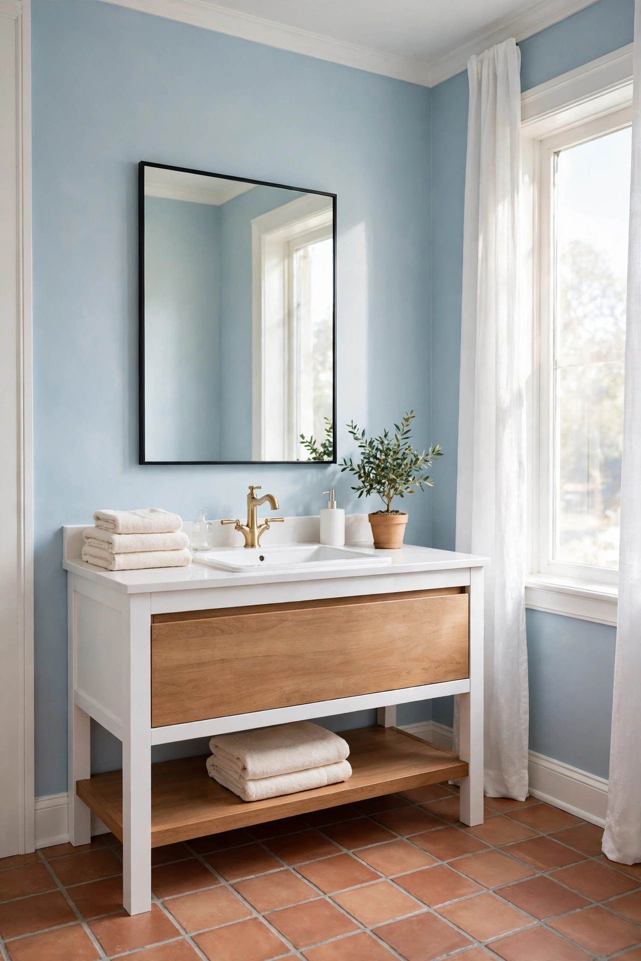
Soft sky blue lifts terracotta and gives the room an airy, open feeling. The pale blue acts like a clear sky above warm earth, and the contrast is gentle enough for a bedroom or a bathroom. Sky blue walls with terracotta tile floors feel fresh and clean, like a coastal cottage.
Keep the blue pale and dusty rather than bright, so it stays in harmony with the earthy clay. Terracotta pots, a terracotta rug, or terracotta towels bring the warm tone in without overwhelming the blue. White trim between the two colors keeps the edges crisp and the room feeling light.
12. Terracotta and Warm Beige for a Layered Neutral Room
Warm beige and terracotta build a layered neutral room that feels rich rather than plain. Beige sits quietly in the background, on walls, carpet, or large furniture, while terracotta adds the depth that stops a neutral room from feeling flat. The two tones blend so smoothly that the room feels calm from every angle.
This pairing works in kitchens too, where beige cabinets and terracotta tile create a warm, hardworking scheme. Layer different shades of beige, from pale sand to deep camel, so the neutral base has its own interest. For a kitchen that balances warm neutrals with a soft green accent, these sage green and cream kitchen paint ideas offer a gentle way to add color without losing the calm.
13. Terracotta and Deep Teal for Jewel Tone Drama
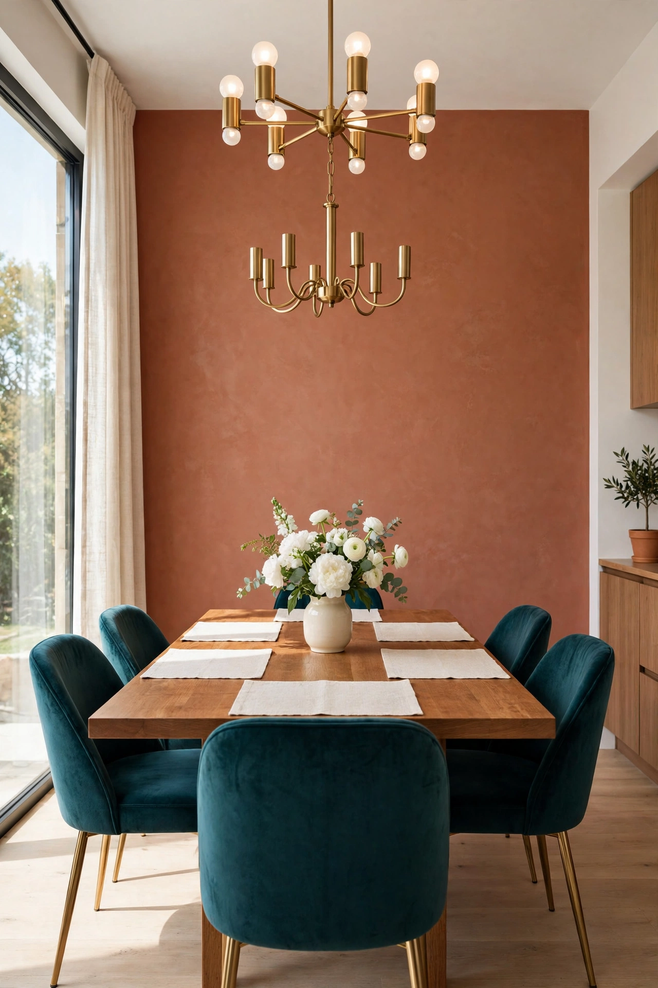
Deep teal and terracotta are both jewel tones, and together they create a room with real drama. The cool green blue of teal makes the clay tone look even warmer, and the terracotta keeps the teal from feeling cold. This pairing suits a dining room, a library, or a bedroom where you want a rich, enveloping mood.
Balance the two strong colors with a quiet neutral, like cream walls or a natural fiber rug, so the room has space to breathe. Try teal velvet chairs with a terracotta wall, or a teal painted cabinet against terracotta tile. Warm brass lighting ties the two jewel tones together beautifully.
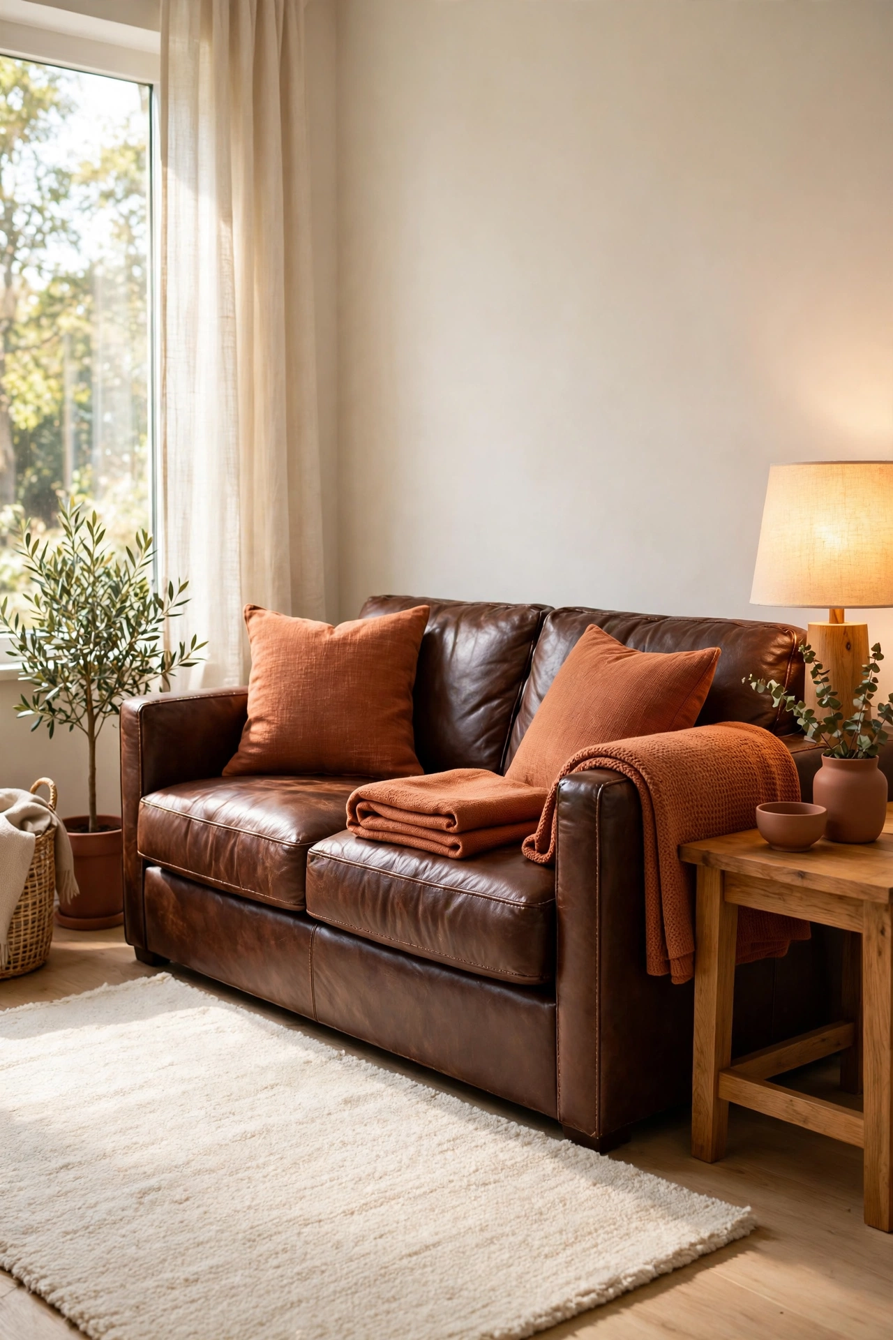
14. Terracotta and Chocolate Brown for Deep Coziness
Chocolate brown deepens terracotta into a cozy, cocooning palette that suits living rooms and dens. The dark brown grounds the clay tone, and the terracotta keeps the brown from feeling heavy. Together they feel like autumn, warm and settled, especially with soft lighting and layered textiles.
Use chocolate brown on large pieces like a leather sofa or dark wood shelves, and let terracotta appear on the walls, the rug, or the cushions. Add cream or warm white in lampshades and throws to lift the scheme. This pairing is at its best in rooms where you gather in the evening.
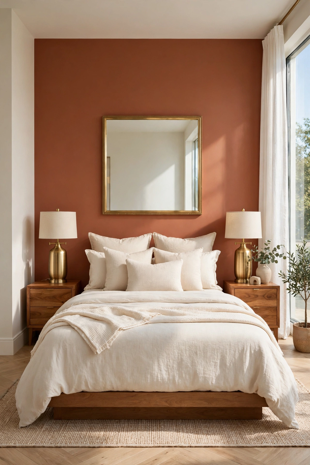
15. Terracotta and Brushed Brass for a Warm Glow
Brushed brass is a metal that behaves like a color, and it brings a warm glow to terracotta. Brass light fixtures, cabinet handles, and mirror frames pick up the golden undertones in the clay and make the whole room shimmer softly. The pairing feels elegant without being formal.
Use brass in small, repeated touches rather than one large piece, so the glow spreads through the room. A brass floor lamp, brass picture frames, and brass handles on a terracotta painted dresser create a rhythm the eye follows. Keep the brass brushed or aged rather than shiny, so it stays warm and calm.
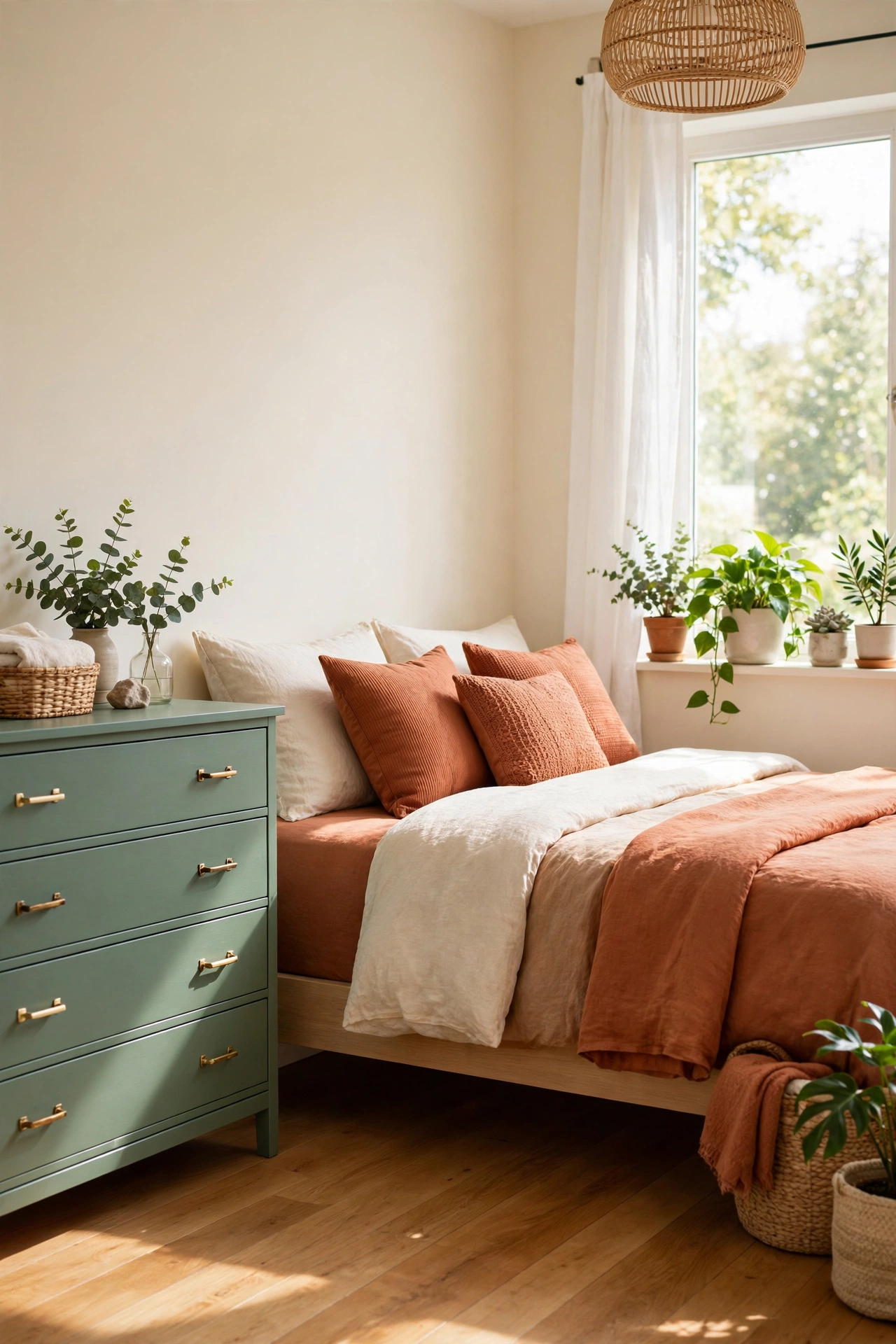
16. Terracotta and Eucalyptus Green for a Fresh Botanical Feel
Eucalyptus green is a soft, silvery green that gives terracotta a fresh botanical feeling. The cool, muted green reads like fresh leaves against clay soil, and the pairing feels natural and calming. Eucalyptus works well on painted furniture, on a feature wall, or in bedding and curtains.
Bring in real greenery to strengthen the theme, with eucalyptus stems in a vase or potted plants in terracotta pots. The live plants bridge the two colors and add life to the room. This pairing suits bedrooms, bathrooms, and sunrooms where a connection to nature feels right.
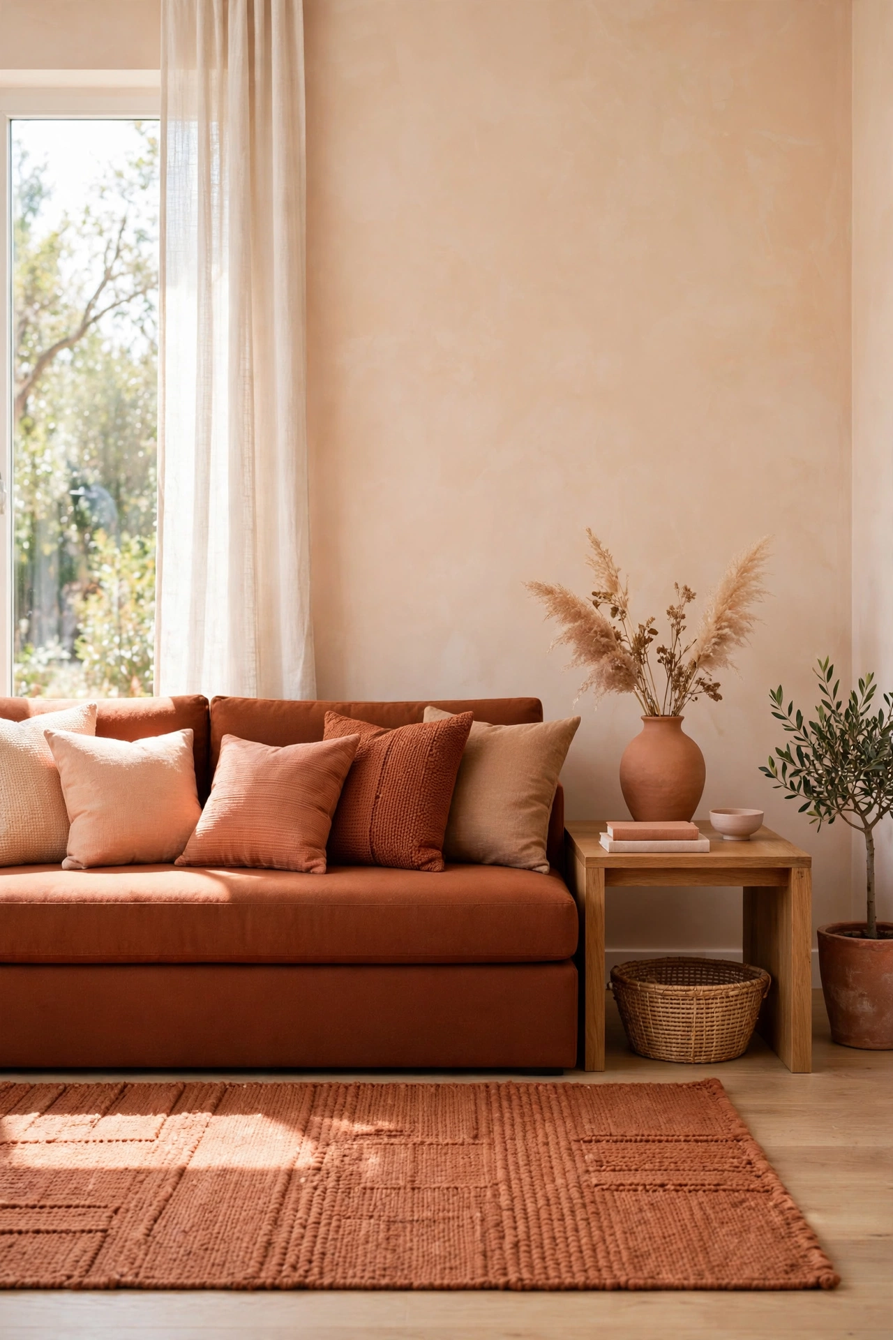
17. Terracotta Tone on Tone for a Wrapped Room
A tone on tone terracotta room layers the clay color in different depths, from pale peach clay to deep burnt sienna. The walls, the rug, the sofa, and the cushions all stay in the same family, and the room feels wrapped in warmth. Small shifts in tone create the interest, so the scheme never looks flat.
To keep a tone on tone room from feeling heavy, vary the textures as much as the tones. Pair smooth plaster walls with a nubby wool rug, linen cushions, and a leather chair. For a bolder version of this wrapped feeling, these color drenching ideas show how one color carried across walls, trim, and ceiling can transform a room.
18. Terracotta and Whitewashed Brick for Old World Charm
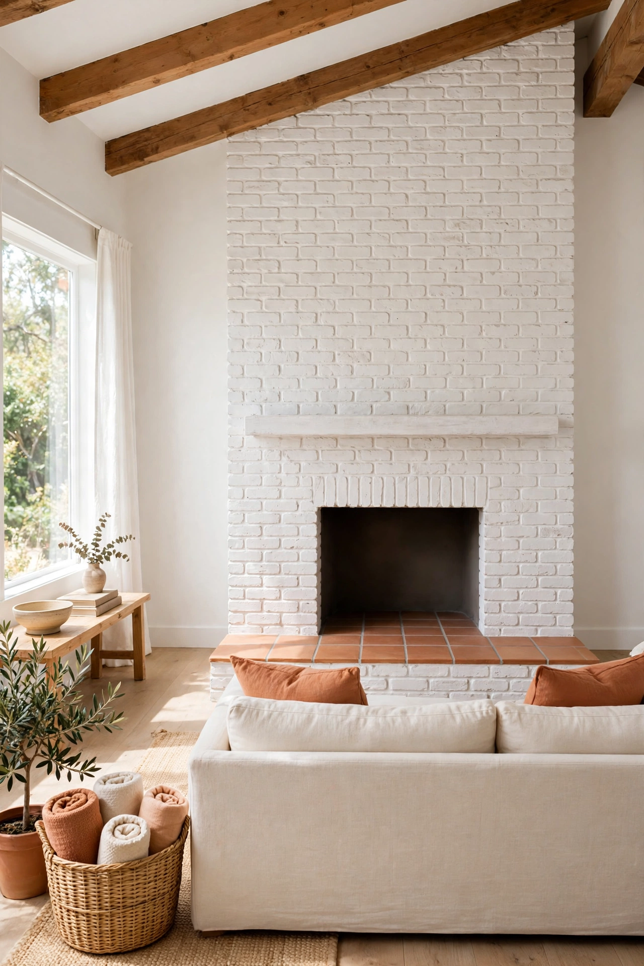
Whitewashed brick and terracotta carry old world charm that suits farmhouses, cottages, and Mediterranean style homes. The pale, chalky brick cools the clay tone, while the texture of the brick adds character that flat paint cannot match. A whitewashed brick fireplace with terracotta tile around the hearth is a classic version of this pairing.
Keep the rest of the room simple, with warm wood, linen, and a few dark accents, so the brick and clay stay the focus. This combination has deep roots in Spanish and Mediterranean design, where whitewashed walls and clay tile have lived together for centuries. For more rooms in that tradition, these Spanish revival interior design ideas show the style at its most graceful.
19. Terracotta and Natural Rattan for a Relaxed Texture
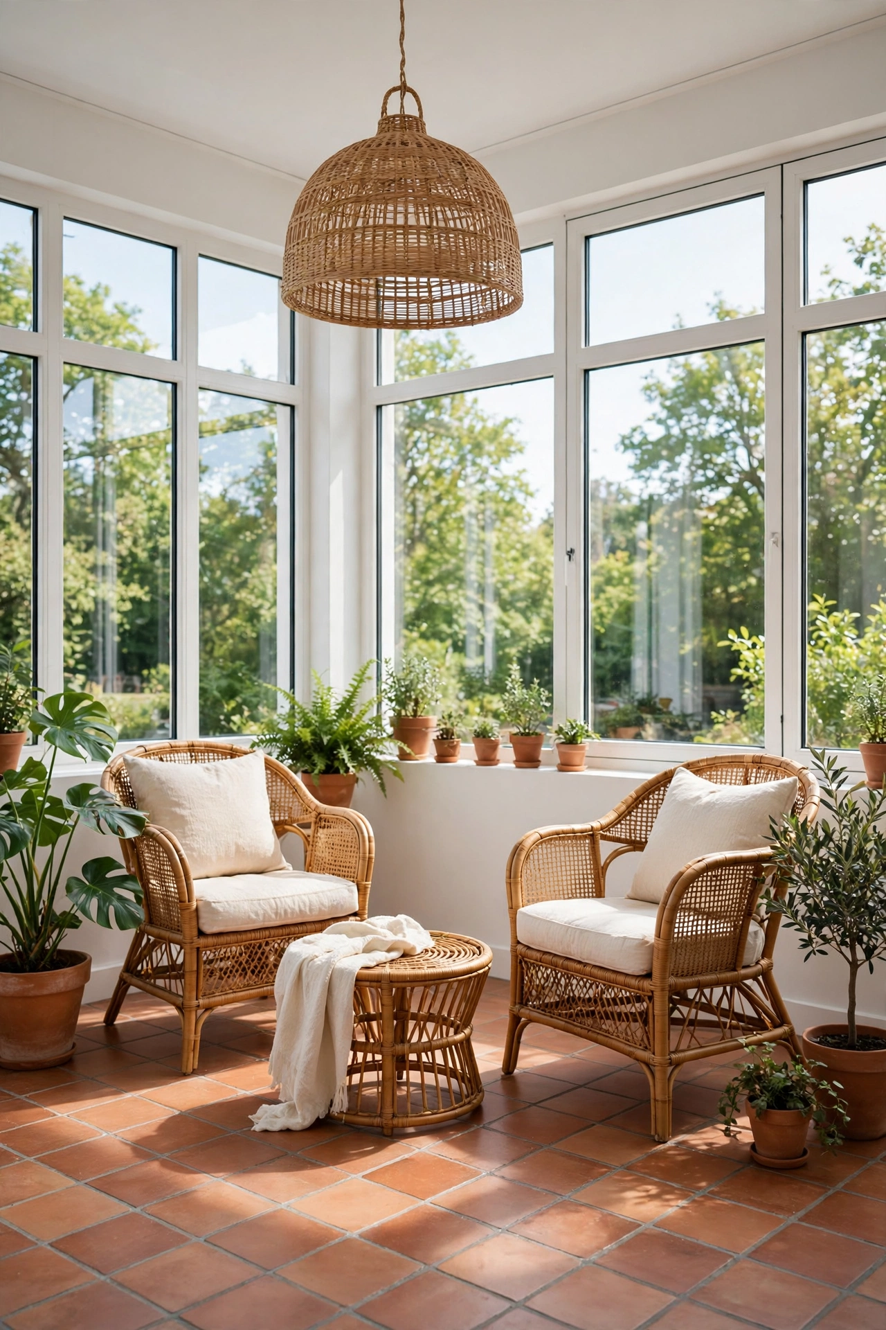
Natural rattan adds relaxed texture to terracotta, and the pale golden weave keeps the clay tone feeling light. Rattan chairs, pendant lights, and baskets bring a breezy, handmade quality that suits sunrooms, porches, and casual living rooms. The pairing feels like a holiday home, easy and unforced.
Let the rattan appear in a few larger pieces, like a pair of chairs or a pendant light, rather than in many small accessories. Terracotta floor tile or a terracotta wall grounds the pale weave and stops the room from looking washed out. Add cream linen and a few green plants to finish the relaxed look.
20. Terracotta and Dusty Rose for a Soft Vintage Feel
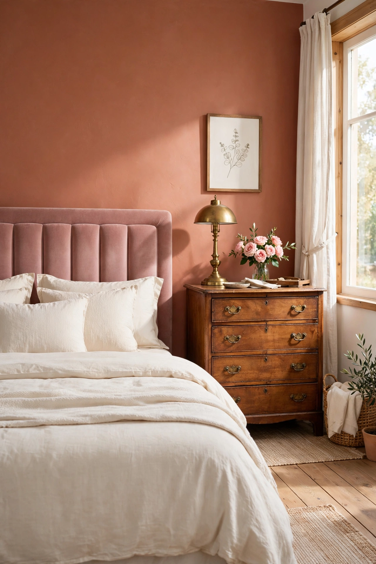
Dusty rose is a muted, grown up pink that pairs with terracotta for a soft vintage feeling. The rose brings a gentle blush that warms the clay without competing with it, and the two tones blend into a palette that feels like a faded garden. This pairing suits bedrooms, dressing rooms, and bathrooms.
Use dusty rose on upholstery or bedding and terracotta on the floor or the walls, so each color has its own territory. Antique wood furniture and aged brass suit this palette well, because they add to the vintage mood. Keep the lighting warm and low to let the soft tones glow.
21. Terracotta and Forest Green for a Rich Woodland Palette
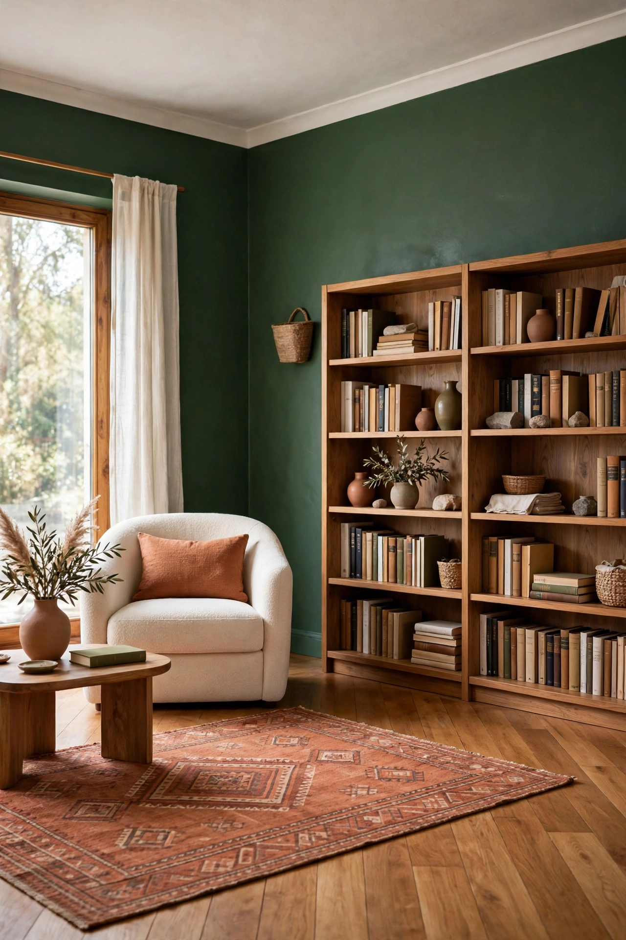
Forest green is a deep, serious green that gives terracotta a rich woodland palette. The dark green reads like a forest floor in shadow, and the clay tone reads like sunlit earth, so the room feels like a landscape. This pairing suits libraries, dining rooms, and living rooms with generous natural light.
Use forest green on walls or large furniture, and let terracotta appear in the rug, the art, or a tiled fireplace surround. A little cream or warm white will keep the dark green from closing the room in. Natural wood and leather complete the woodland feeling and add to the depth.
22. Terracotta and Warm Greige for a Modern Neutral Base
Warm greige, the blend of gray and beige, gives terracotta a modern neutral base that feels current and calm. The greige stays quiet on walls and large furniture, while terracotta adds the warmth that plain gray often lacks. The result is a room that feels designed and settled without trying too hard.
This pairing suits open plan living spaces, where one neutral needs to flow across a large area. Use greige on the walls throughout, and bring terracotta in through the sofa, the dining chairs, or a large rug. Black or dark bronze accents will sharpen the scheme and give it a finished edge.
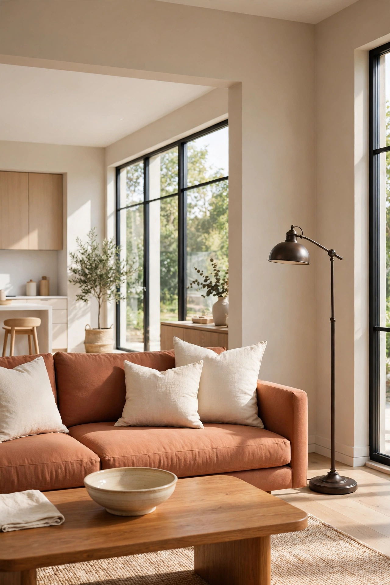
23. Terracotta and Burnt Orange for a Sunset Palette
Burnt orange sits close to terracotta on the color wheel, so the two blend into a sunset palette that feels warm and joyful. The orange is brighter and more energetic, while the terracotta grounds it, so the room glows without shouting. This pairing suits creative spaces, dining rooms, and eclectic living rooms.
Use burnt orange sparingly, in art, cushions, or a single chair, and let terracotta hold the larger surfaces. A cream or warm white wall behind the two warm tones gives the eye a cool resting place. Layered rugs and mixed patterns suit this palette, because it already has a collected, artistic feeling.
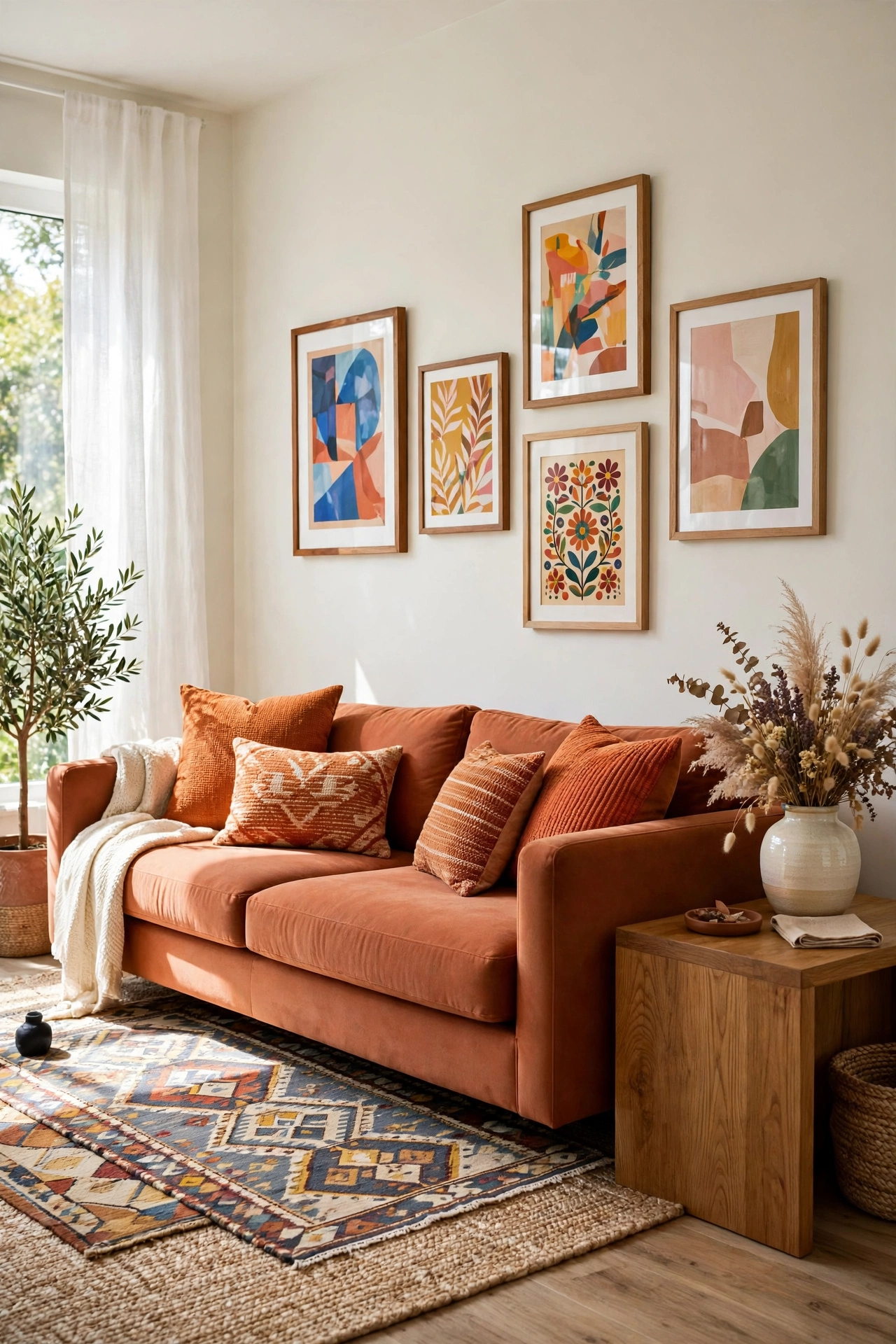
24. Terracotta and Antique Gold for Quiet Luxury
Antique gold brings quiet luxury to terracotta, with a soft metallic shimmer that feels collected rather than flashy. Gold frames, gold tray tables, and gold hardware catch the light and echo the warm undertones in the clay. The pairing feels elegant in a living room, a bedroom, or a dining room.
Choose antique or aged gold rather than bright polished gold, so the metal stays in harmony with the earthy clay. Repeat the gold in three or four small touches around the room, so the eye travels and the scheme feels balanced. Cream and warm wood keep the luxury grounded and livable.
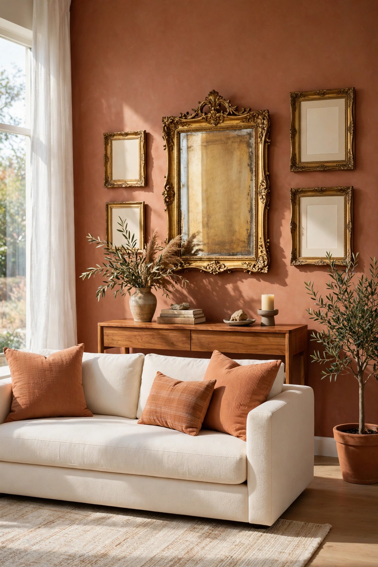
25. Terracotta and Denim Blue for a Casual Balance
Denim blue is a relaxed, familiar blue that balances terracotta with casual ease. The soft mid blue cools the clay tone just enough, and the pairing feels like a favorite pair of jeans with a warm clay pot, comfortable and unfussy. It suits family rooms, kitchens, and casual dining spaces.
Use denim blue on upholstery, on painted cabinets, or on a rug, and let terracotta appear in tile, cushions, or a painted wall. The combination takes pattern well, so striped or checked textiles in the two colors add charm without clutter. Warm wood and cream complete the easygoing look.
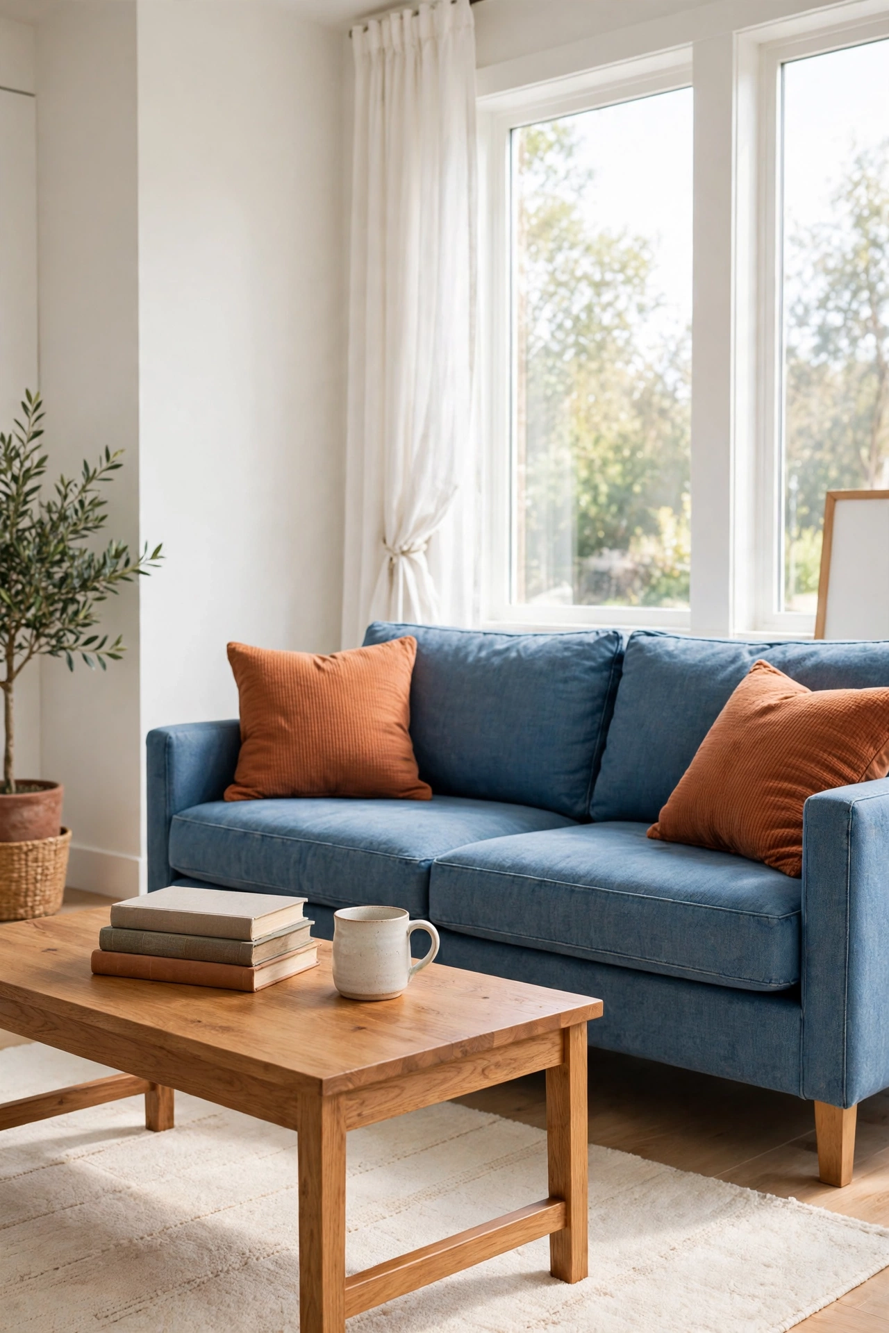
26. Terracotta and Ivory Linen for a Breezy Neutral Look
Ivory linen softens terracotta into a breezy neutral look that feels light and natural. The ivory is warmer than white, so it blends with the clay tone instead of contrasting sharply with it. Linen curtains, linen slipcovers, and a linen rug give the room a relaxed texture that suits coastal and farmhouse styles.
Let the ivory dominate the large surfaces and use terracotta as the warm accent, in a rug, in pots, or on a single wall. The linen texture is the star here, so keep patterns simple and let the weave show. A few pieces of pale wood and woven baskets finish the airy, natural feeling.
27. Terracotta and Dark Walnut for a Grounded Library Feel
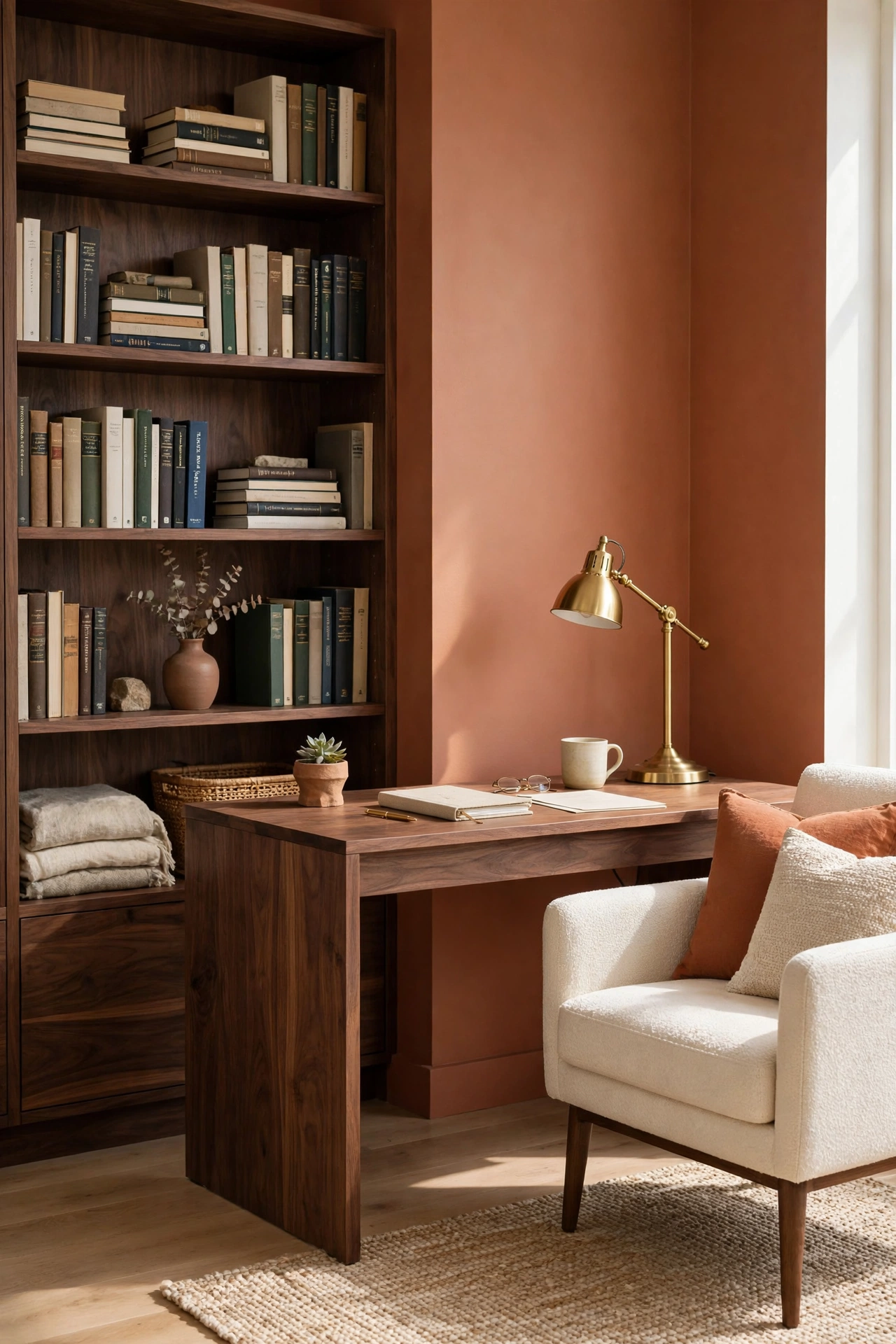
Dark walnut wood grounds terracotta with a richness that suits libraries, studies, and dining rooms. The deep brown grain of walnut adds weight and formality, while the clay tone keeps the room warm and inviting. A walnut bookcase against a terracotta wall is a pairing that looks collected and timeless.
Use walnut in larger furniture pieces, like a dining table, a bookcase, or a sideboard, and let terracotta appear on the walls or in the rug. Brass or copper hardware on the walnut picks up the warmth in both materials. Keep the lighting warm so the dark wood glows rather than recedes.
28. Terracotta and Muted Plum for an Unexpected Pairing
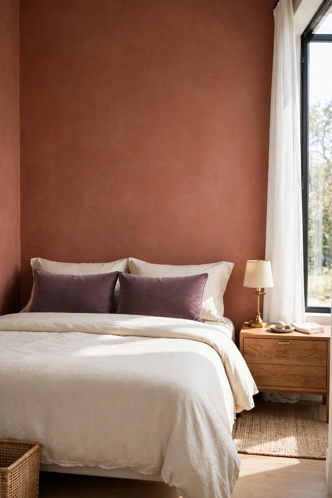
Muted plum is an unexpected partner for terracotta, and the surprise is what makes it work. The dusty purple has warm red undertones that connect with the clay, while its depth adds a moody richness. This pairing suits a bedroom, a powder room, or a dining room where a little drama feels right.
Use plum in smaller doses, like velvet cushions, a painted cabinet, or a piece of art, and let terracotta hold the walls or the floor. The two colors share warmth, so they blend more easily than they first appear to. Cream and warm wood will keep the scheme from feeling too dark.
29. Terracotta and Desert Sand for a Warm Minimal Room
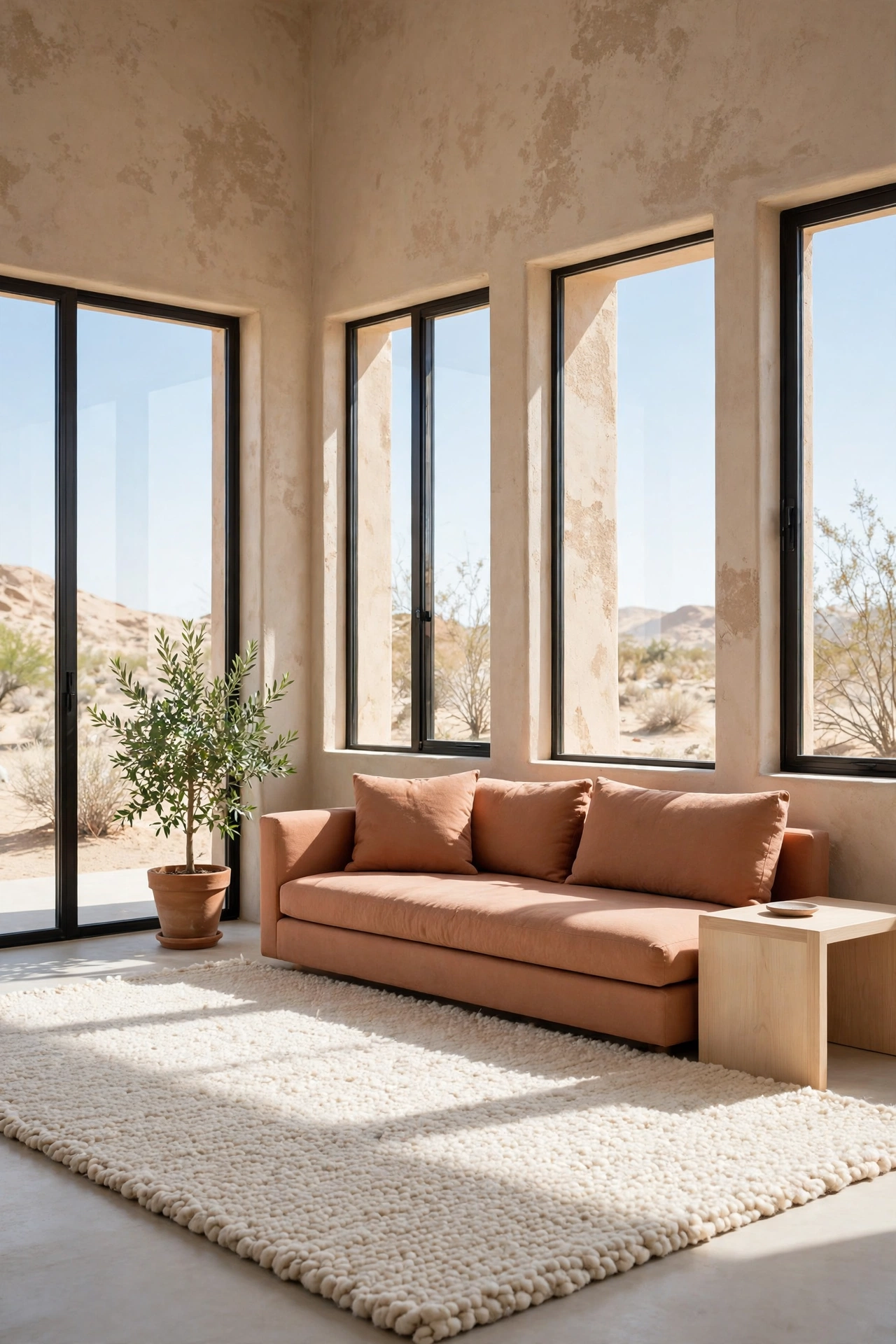
Desert sand is a pale, warm neutral that lets terracotta shine in a minimal room. The sand tone covers walls and floors in a quiet wash of warmth, while terracotta appears in a few strong shapes, like a sofa, a large vase, or a tiled niche. The room feels calm, warm, and uncluttered.
This pairing suits modern minimal interiors, where every object earns its place. Keep the furniture low and simple, and let texture carry the interest, with nubby wool, smooth plaster, and rough clay. A single green plant adds life without breaking the calm desert palette.
Conclusion
Terracotta is one of the most generous colors you can bring into a home, because it pairs with nearly every color family. Cream and sage keep it calm, navy and teal give it drama, and brass and rattan add texture and glow. The best pairing is the one that matches your light, your furniture, and the mood you want to live in.
Start with one combination from this list and test it in a single room before you commit to the whole house. Paint a sample board, lay out the cushions, and live with the pairing for a few days. When the colors feel right in morning light and evening light, you have found the combination that will make your home feel warm for years.
Frequently Asked Questions About Terracotta Color Combinations for Warm Interiors
What colors go best with terracotta walls?
Cream, sage green, warm white, and soft beige are the safest partners for terracotta walls, because they let the clay color lead without competing. For more contrast, navy blue, deep teal, and charcoal gray all work well. Warm wood tones and brass accents suit every terracotta pairing.
Does terracotta work in small rooms?
Yes, terracotta works in small rooms when you balance it with light colors. Paint one wall terracotta and keep the rest cream or white, or use terracotta in the rug and cushions instead of on the walls. Good lighting matters more than room size, so keep windows clear and use warm lamps.
Is terracotta a warm or cool color?
Terracotta is a warm color, because it comes from the orange and red side of the color wheel. Its baked clay tone carries red, orange, and brown undertones. That warmth is why it pairs so well with cool colors like sage green, teal, and navy, which balance the heat.
Can I mix terracotta with gray?
Yes, but choose a warm gray or greige rather than a cool blue gray, so the two colors stay in harmony. Charcoal gray works as an accent with terracotta when the room has enough warm light and warm wood to balance it. A warm gray sofa with terracotta cushions is an easy way to test the pairing.
What metal finishes go with terracotta?
Brass, antique gold, and copper are the best metal finishes for terracotta, because their warm tones echo the clay. Matte black also works well as a crisp contrast in fixtures and hardware. Avoid cool chrome in large amounts, as it can clash with the warmth of the terracotta.

Hi, I’m Emily! I turn messy corners into cozy, organized spots. DreamNestDecor is where I share simple, practical home ideas — decor, organization, and small-space solutions that work in real life, not just in photos. Every idea here is carefully researched before it’s shared.