
Walk into a kitchen that stops you in your tracks and you will usually find one secret at work: the cabinets are not wearing a single color. Designers layer three or more colors across uppers, lowers, islands, and accents, and the result feels collected, warm, and far more expensive than a flat wall of one shade. A thoughtful palette turns plain cabinetry into the main character of the room.
You do not need a full renovation to get that designer look. Paint, stain, and a brave color plan can transform the cabinets you already own. These 22 kitchen cabinet color combinations show you how to mix three or more colors with confidence, from soft earthy trios to bold jewel-toned schemes, so you can find the palette that fits your home and your style.
1. Sage Green, Cream, and Warm Walnut
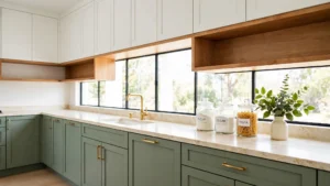
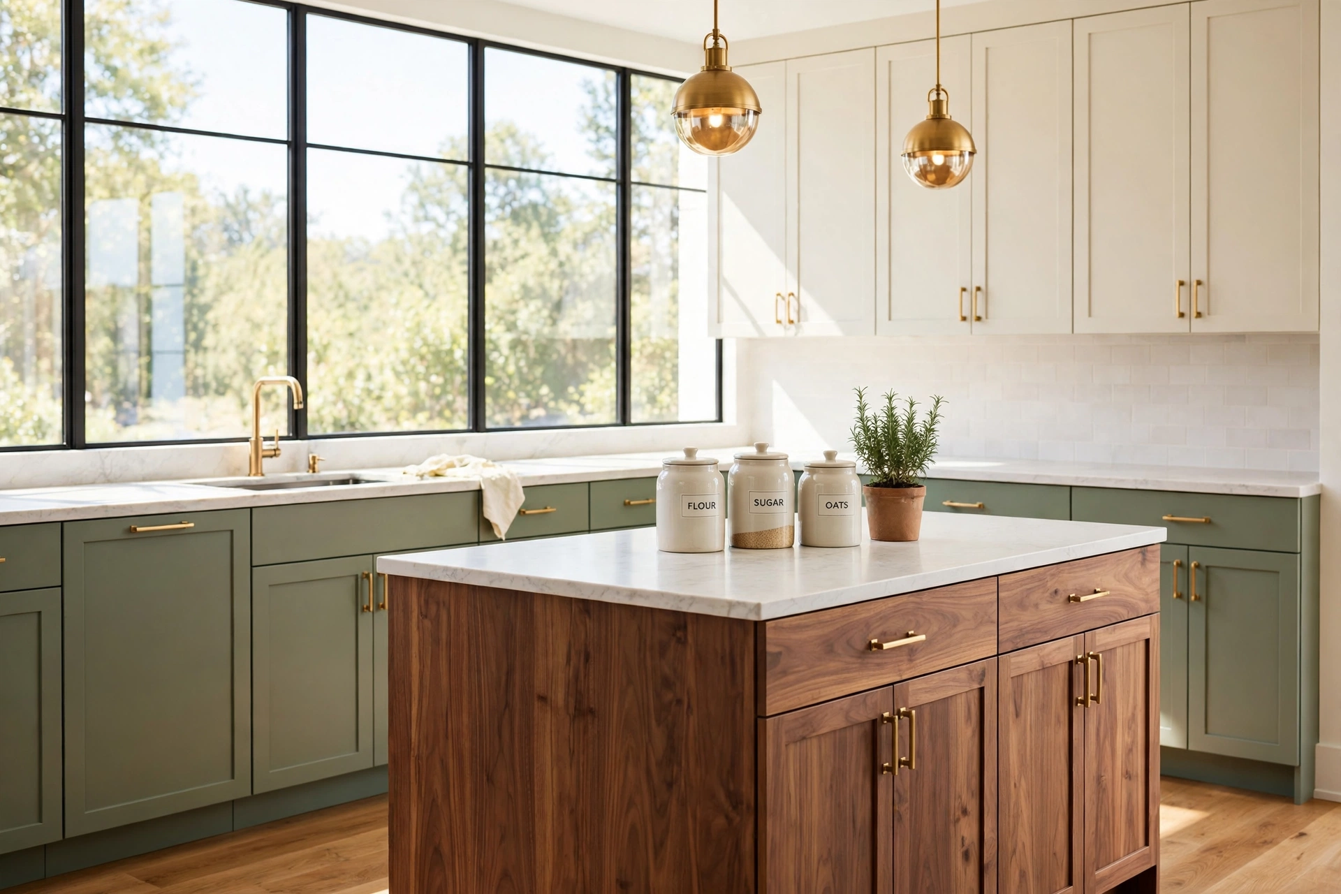
Sage green lower cabinets paired with cream uppers and a warm walnut island create a kitchen that feels calm and grounded. The sage brings a soft natural tone to the room, the cream keeps the upper walls light and open, and the walnut adds rich warmth that stops the palette from feeling cold. Brass hardware ties the three colors together beautifully.
This combination works in almost any style of home, from farmhouse to modern cottage. Keep the countertops light and the backsplash simple so the three cabinet colors stay the focus. Add a few potted herbs on the windowsill and the whole room will feel fresh and welcoming.
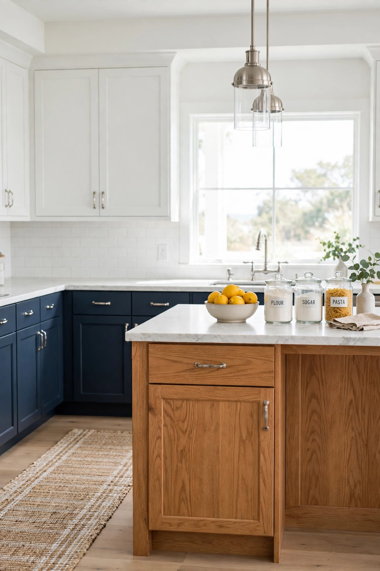
2. Navy Blue, Soft White, and Honey Oak
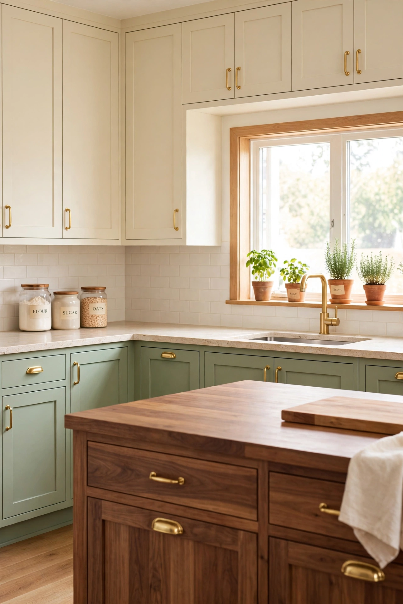
Navy blue lower cabinets ground the kitchen with depth and drama, while soft white uppers keep the room bright and airy. A honey oak island sits between the two shades and warms the whole scheme with golden wood tones. The contrast feels classic, like a coastal home with a tailored edge.
Use marble-look counters and simple silver or nickel hardware to keep the look crisp. This palette suits both large open kitchens and compact galley layouts, since the white uppers reflect light and the navy anchors the lower half. A woven runner and a bowl of lemons complete the fresh, finished feel.
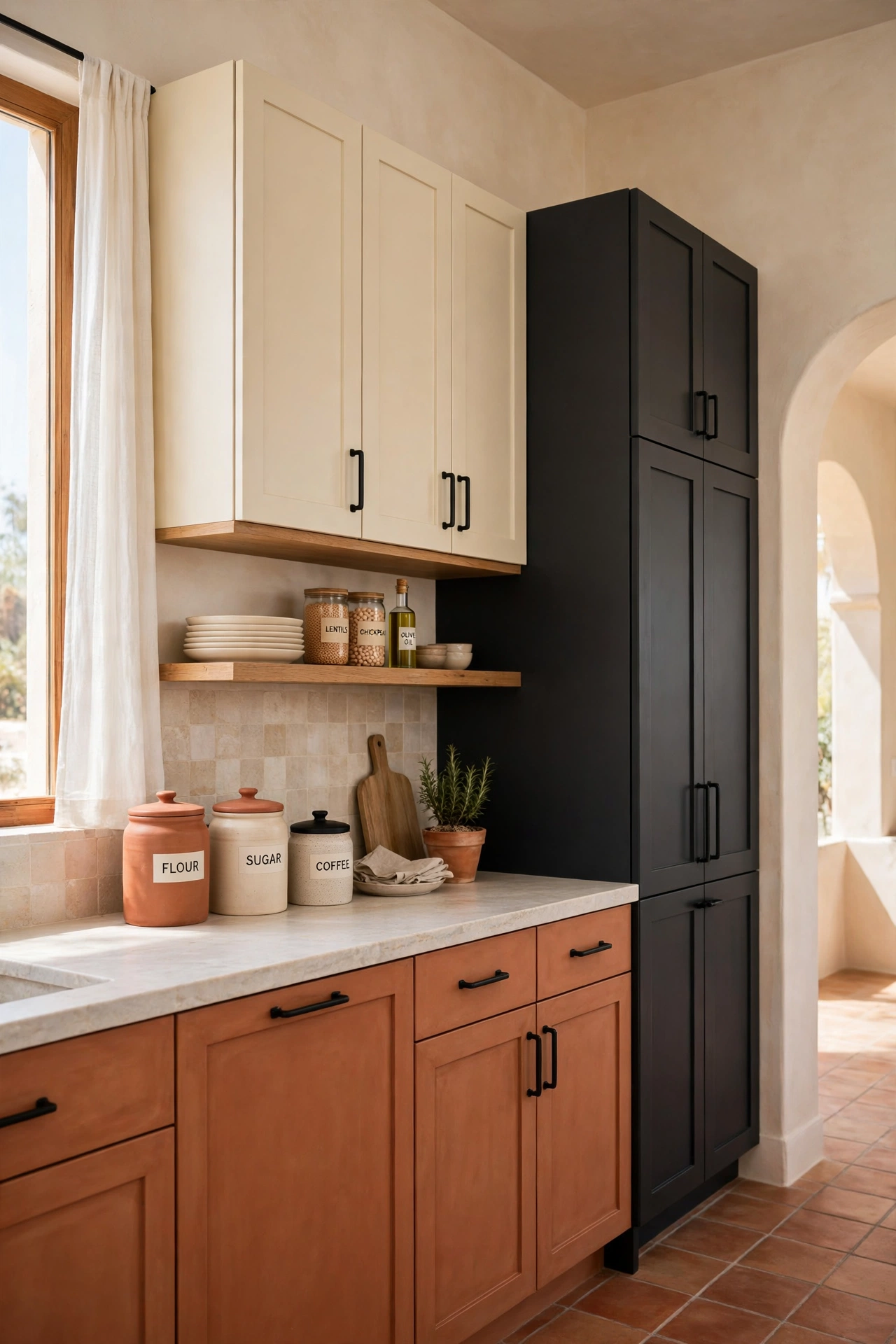
3. Terracotta, Charcoal, and Warm Cream
Terracotta lower cabinets bring sun-baked warmth to the kitchen, charcoal tall cabinets add a bold modern edge, and warm cream uppers soften the contrast between the two. The mix feels earthy and artistic, like a Mediterranean villa with a contemporary twist. Black hardware and a stone-look countertop pull the palette together.
This trio shines in kitchens with plenty of natural light, where the terracotta glows and the charcoal reads rich instead of heavy. For more ways to use this sun-warmed hue around the home, explore these terracotta color combinations. Keep open shelving light and uncluttered so the cabinet colors carry the room.
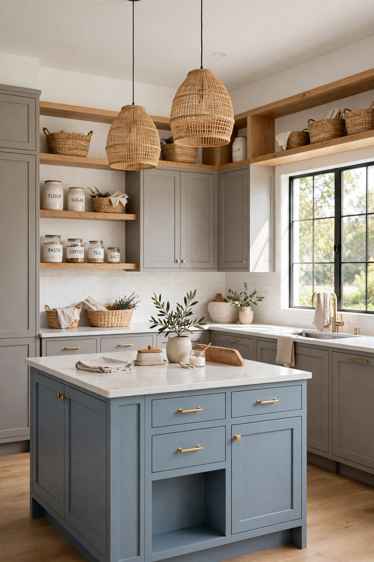
4. Dusty Blue, Warm Gray, and Natural Oak
Dusty blue cabinets on the island, warm gray perimeter cabinets, and natural oak open shelves create a soft layered look that never feels flat. The blue adds gentle color, the gray adds a quiet neutral base, and the oak brings in organic texture. Together they form a palette that feels serene and lived in.
This combination is a strong choice for family kitchens because it hides everyday wear gracefully and pairs well with white, wood, or patterned tile. Choose matte finishes for a soft chalky effect and add woven baskets on the shelves for texture. The result is a kitchen that feels calm from morning to night.
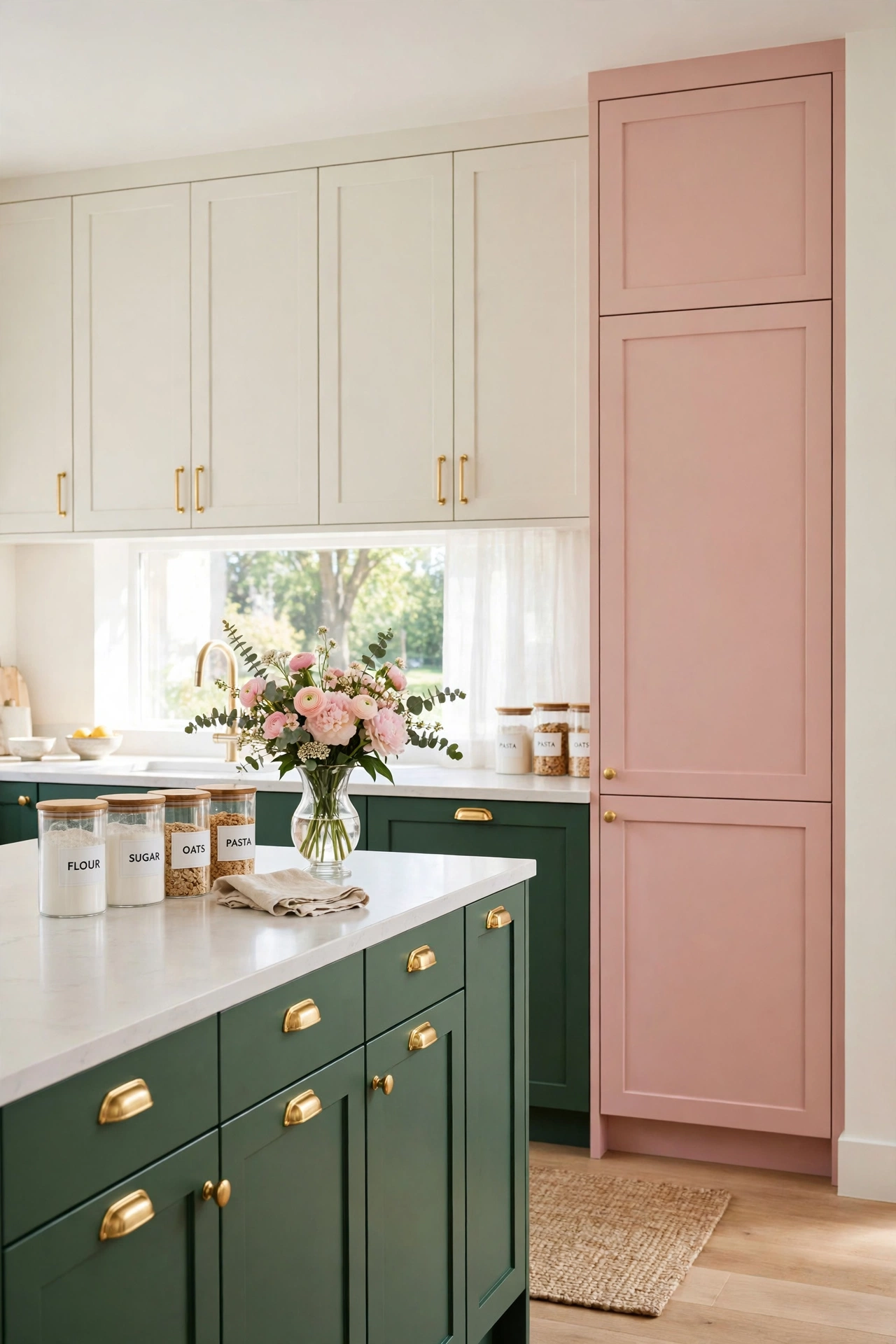
5. Forest Green, Blush Pink, and Ivory
Forest green lower cabinets, blush pink accents on a pantry wall or island, and ivory uppers make a kitchen that feels both bold and gentle. The deep green grounds the room, the blush adds a soft romantic touch, and the ivory keeps everything light and balanced. Gold hardware bridges the green and pink beautifully.
This palette works best when the blush stays in small doses, such as a single run of cabinets or a painted pantry door. Keep the counters pale and the backsplash simple so the three colors stay harmonious. A vase of fresh flowers on the island echoes the pink and softens the green.
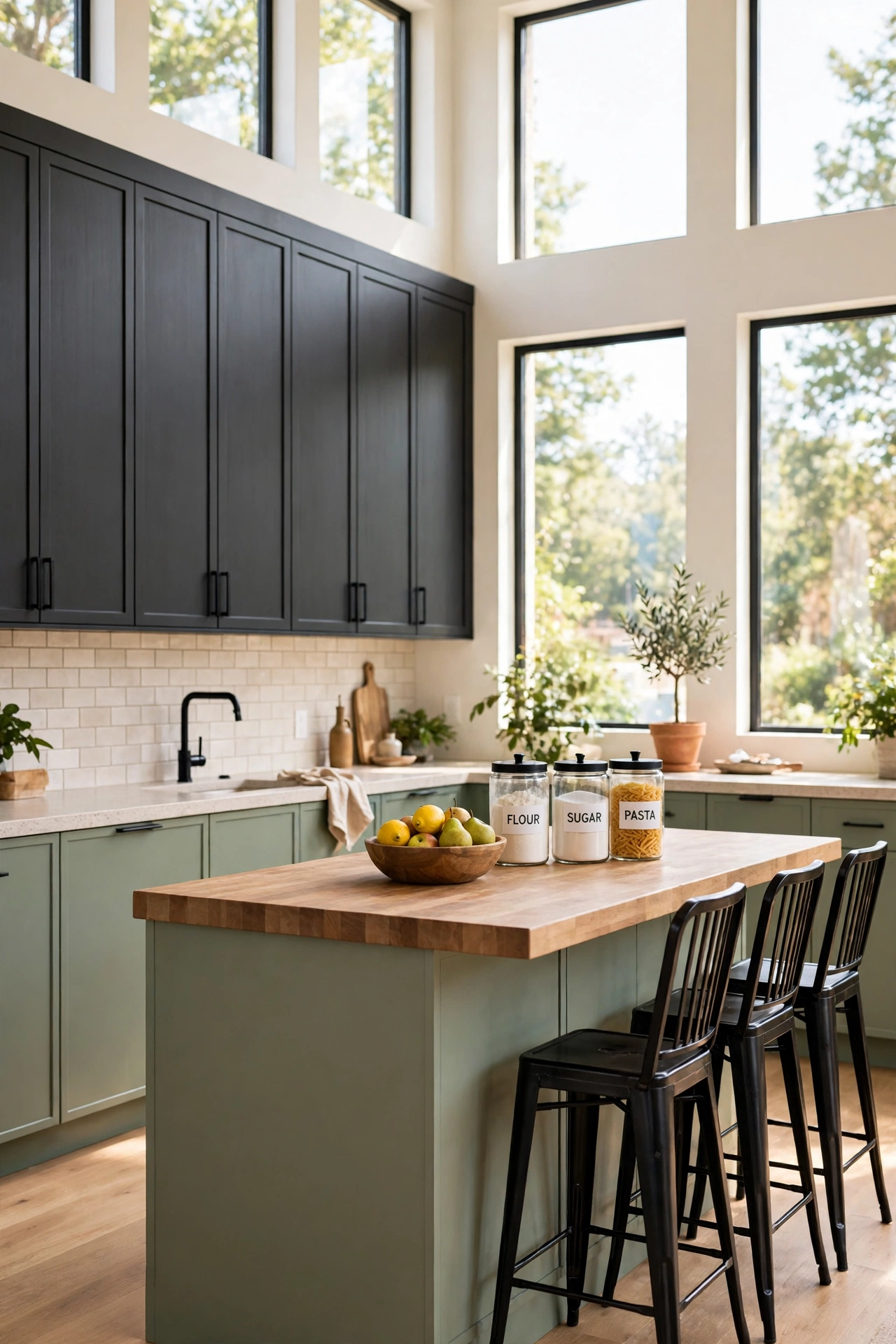
6. Charcoal, Sage, and Butcher Block Wood
Charcoal tall cabinets, sage green base cabinets, and butcher block wood on the island create a moody yet warm kitchen with real depth. The charcoal adds drama and structure, the sage softens the dark tones with a natural green, and the butcher block brings a handcrafted warmth that ties both colors together.
Use light stone counters and a pale backsplash to keep the dark cabinets from closing in the room. This combination suits kitchens with large windows and plenty of daylight. Add black metal bar stools and a wooden fruit bowl to complete the warm, grounded look.
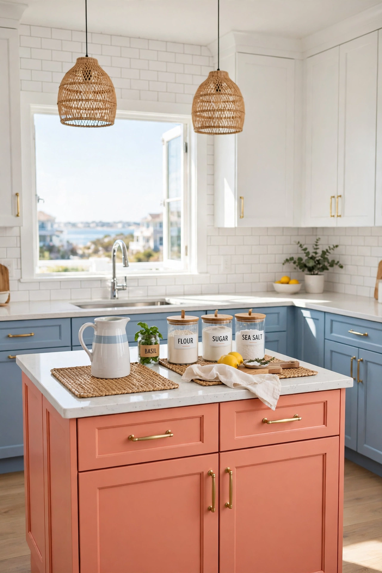
7. Powder Blue, Coral, and Crisp White
Powder blue lower cabinets, coral accents on the island, and crisp white uppers create a cheerful kitchen with a fresh coastal spirit. The blue feels cool and clean, the coral adds a happy pop of warm color, and the white keeps the whole scheme bright and open. It is a palette that makes weekday mornings feel sunnier.
Keep the coral contained to one feature, such as the island or a row of bar cabinets, so it reads as a deliberate accent rather than a competing color. White quartz counters and a simple subway tile backsplash let the trio shine. A few woven placemats and a pitcher of orange juice on the counter add to the fresh, lively mood.
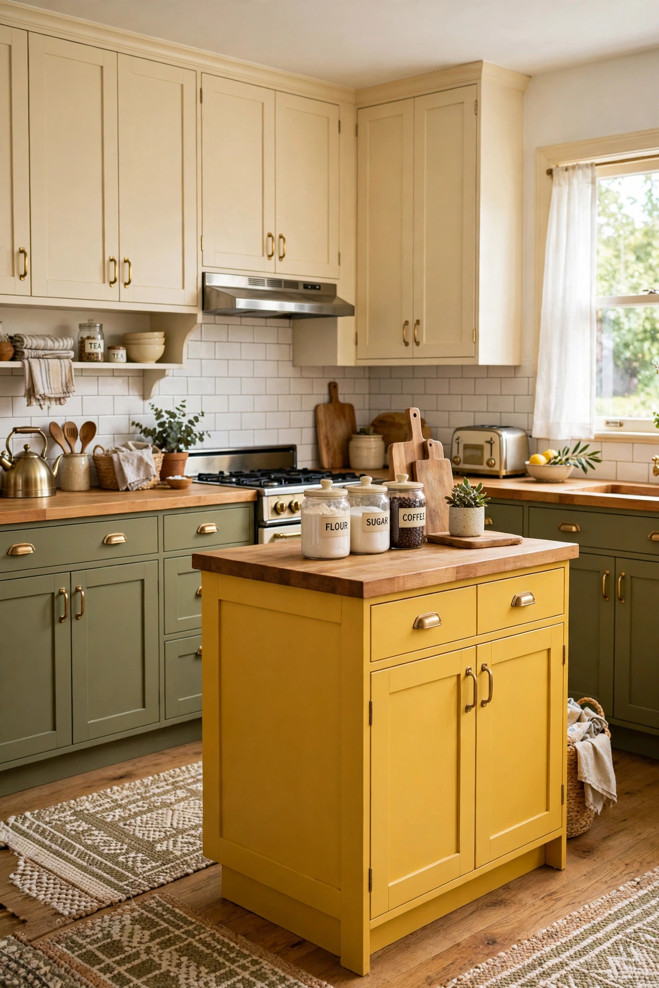
8. Olive Green, Mustard Yellow, and Cream
Olive green perimeter cabinets, mustard yellow accents on the island, and cream uppers bring a warm retro spirit to the kitchen. The olive feels earthy and sophisticated, the mustard adds a golden glow, and the cream softens both colors into a cozy, inviting whole. Wooden counters and brass pulls complete the vintage-inspired look.
This combination loves natural textures, so pair it with woven rugs, wooden cutting boards, and ceramic jars filled with pantry staples. Keep the backsplash simple and pale so the mustard stays the star. The result is a kitchen that feels like a sunny autumn afternoon all year long.
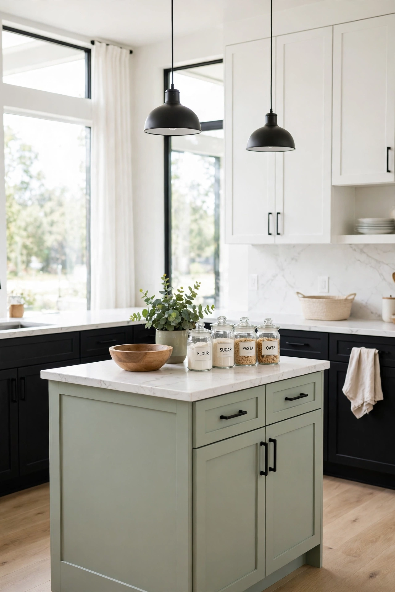
9. Black, White, and Soft Sage
Black lower cabinets, white upper cabinets, and a soft sage island create a crisp graphic kitchen with a gentle natural twist. The black and white contrast gives the room a clean tailored structure, while the sage island softens the bold lines and adds a calm organic note. It is a modern classic with personality.
Use white marble-look counters and black hardware to sharpen the contrast, then let the sage island be the quiet surprise in the middle of the room. This palette suits open-plan kitchens where the island is visible from the living area. A wooden bowl and a small potted plant on the island echo the sage and warm the scheme.
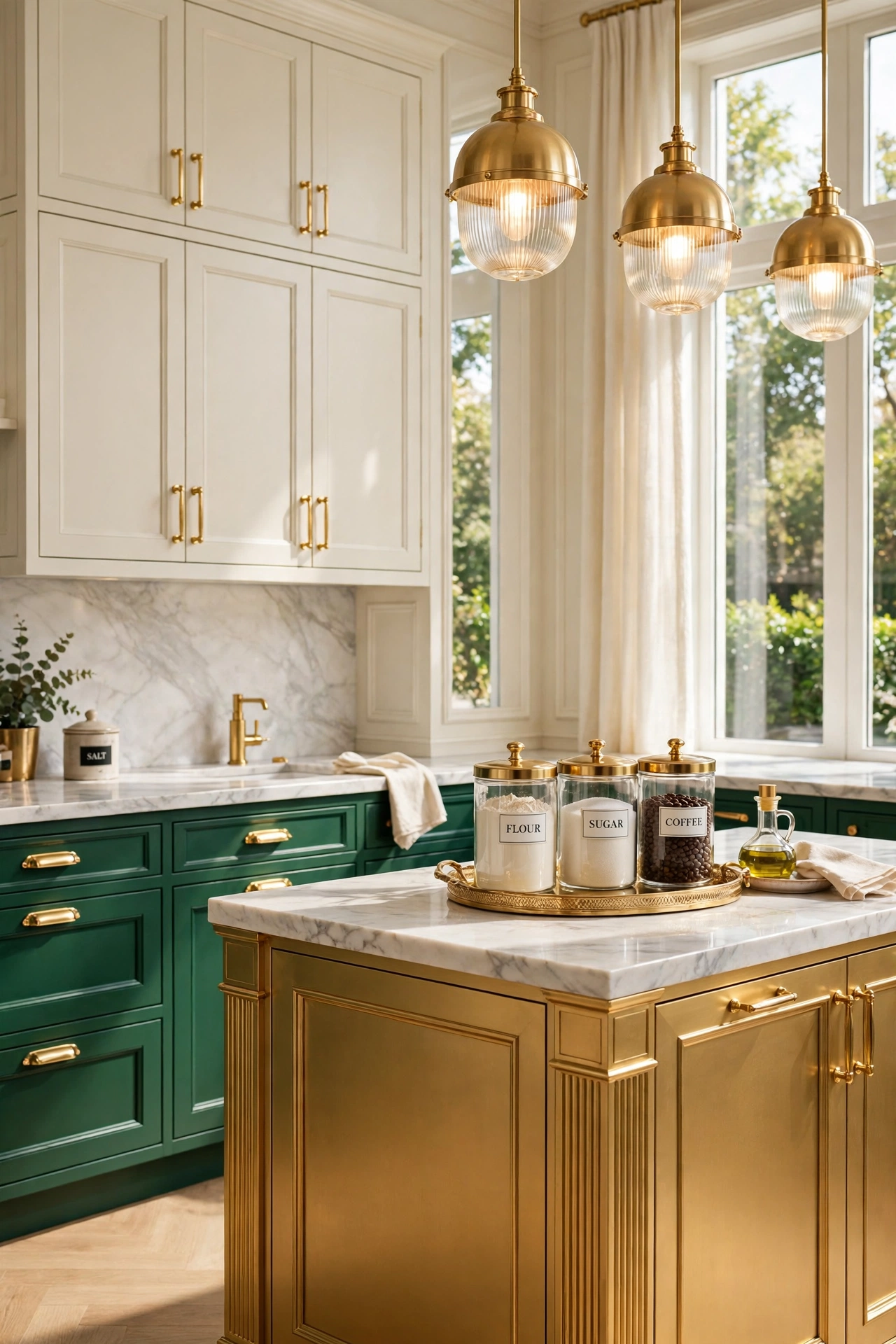
10. Emerald Green, Warm Gold, and Cream
Emerald green cabinets, warm gold accents on the island and hardware, and cream uppers create a kitchen with true jewel-box luxury. The emerald brings depth and richness, the gold adds warmth and shine, and the cream keeps the room light enough to feel welcoming. Together they read glamorous without feeling overdone.
Choose satin or semi-gloss finishes so the green catches the light and the gold details glow. A marble-look backsplash with soft gray veining ties the palette together elegantly. Keep accessories minimal and let the cabinet colors do the talking, with just a brass tray or a pair of gold-framed prints as finishing touches.
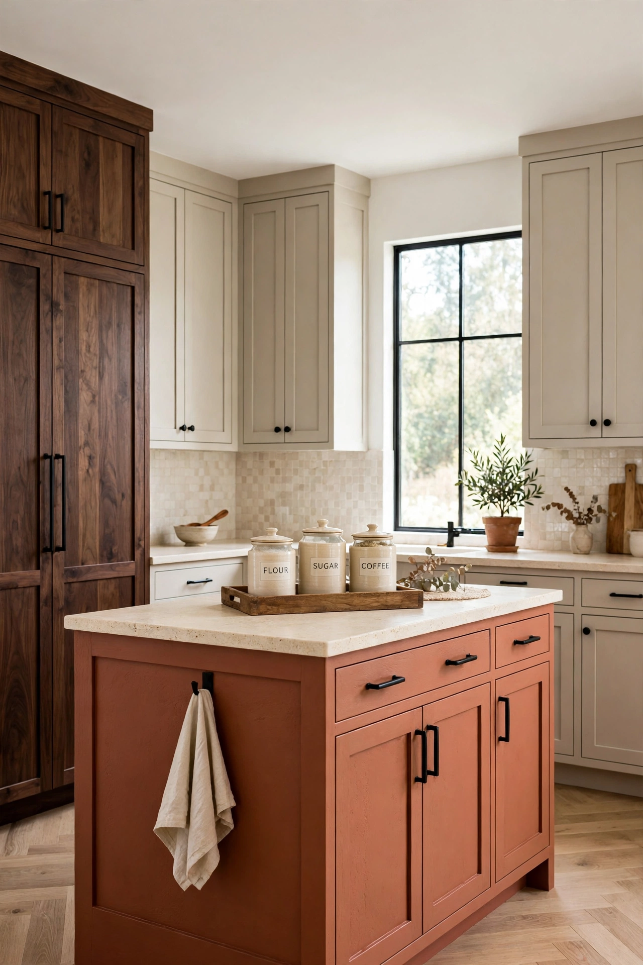
11. Greige, Terracotta, and Dark Walnut
Greige perimeter cabinets, terracotta accents on the island, and dark walnut tall cabinets form a warm earthy palette with real designer polish. The greige acts as a soft neutral bridge, the terracotta adds a sun-warmed focal point, and the walnut grounds the scheme with deep wood richness. The mix feels modern, warm, and timeless.
This combination works beautifully with cream stone counters and a handmade-look tile backsplash. Use matte black hardware to sharpen the edges and keep the overall feel contemporary. A wooden tray with ceramic canisters on the counter reinforces the warm, natural palette.
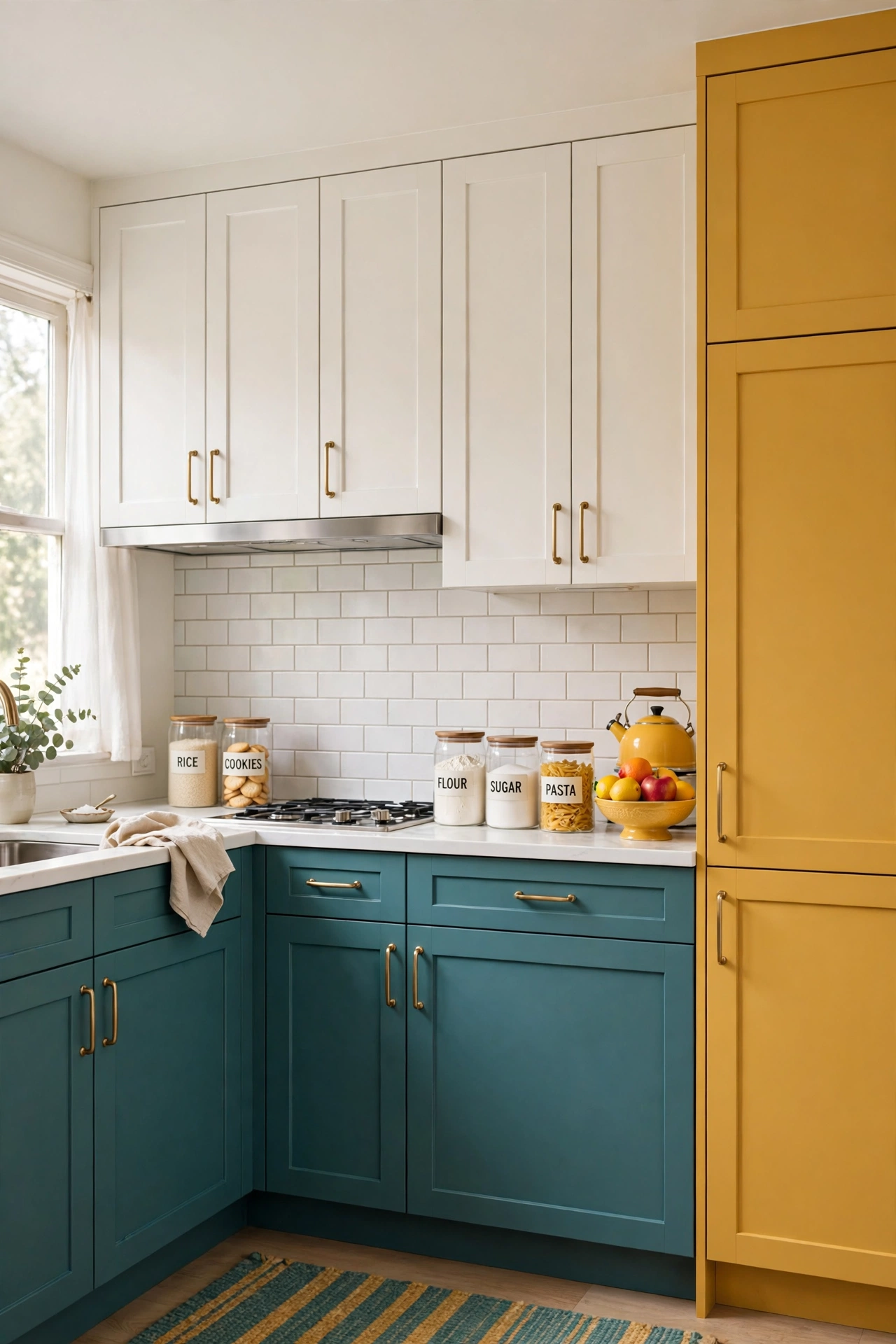
12. Teal, Mustard, and Warm White
Teal lower cabinets, mustard yellow accents on bar stools and a feature pantry, and warm white uppers create a kitchen full of personality and cheer. The teal brings a rich coastal depth, the mustard adds golden energy, and the warm white keeps the bold colors feeling balanced and fresh. It is a palette with confidence.
To keep the look cohesive, repeat the mustard in small touches such as a kettle, a fruit bowl, or patterned seat cushions. White counters and a pale backsplash give the eye room to rest between the strong colors. This combination turns an ordinary kitchen into a room guests remember.
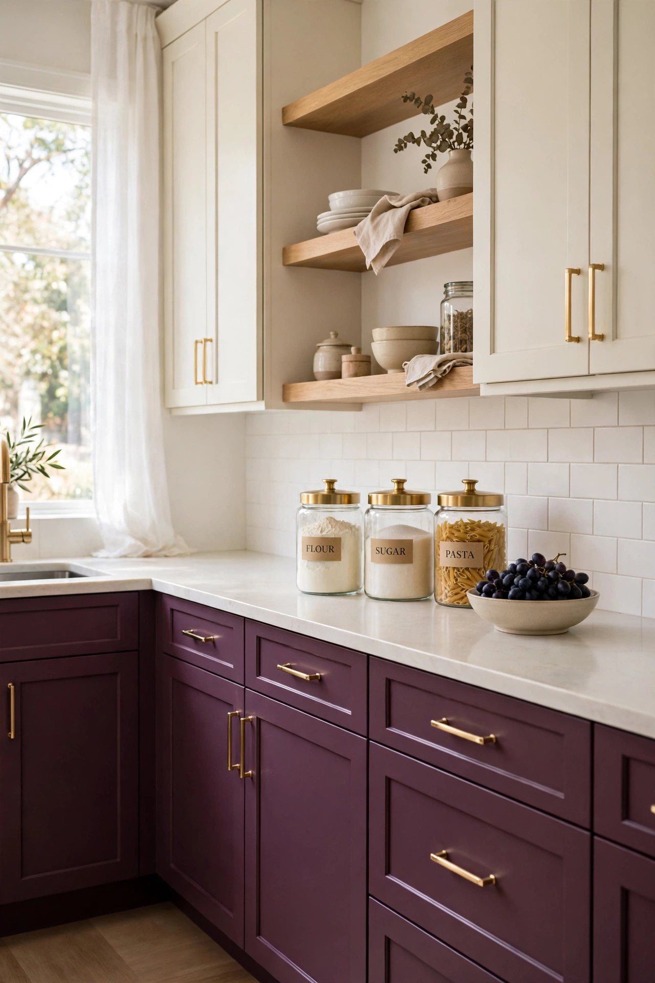
13. Plum, Cream, and Light Oak
Plum lower cabinets, cream uppers, and light oak open shelving create a kitchen that feels rich, soft, and quietly daring. The plum adds a deep berry tone that reads elegant rather than loud, the cream lifts the upper walls, and the light oak brings a natural warmth that keeps the palette grounded. Brushed gold hardware adds a final touch of refinement.
This combination suits kitchens with warm lighting, where the plum glows and the oak turns golden. Keep the counters pale and the backsplash simple so the plum stays the clear focal point. A bowl of dark grapes or a vase of mauve flowers on the counter echoes the cabinet color beautifully.
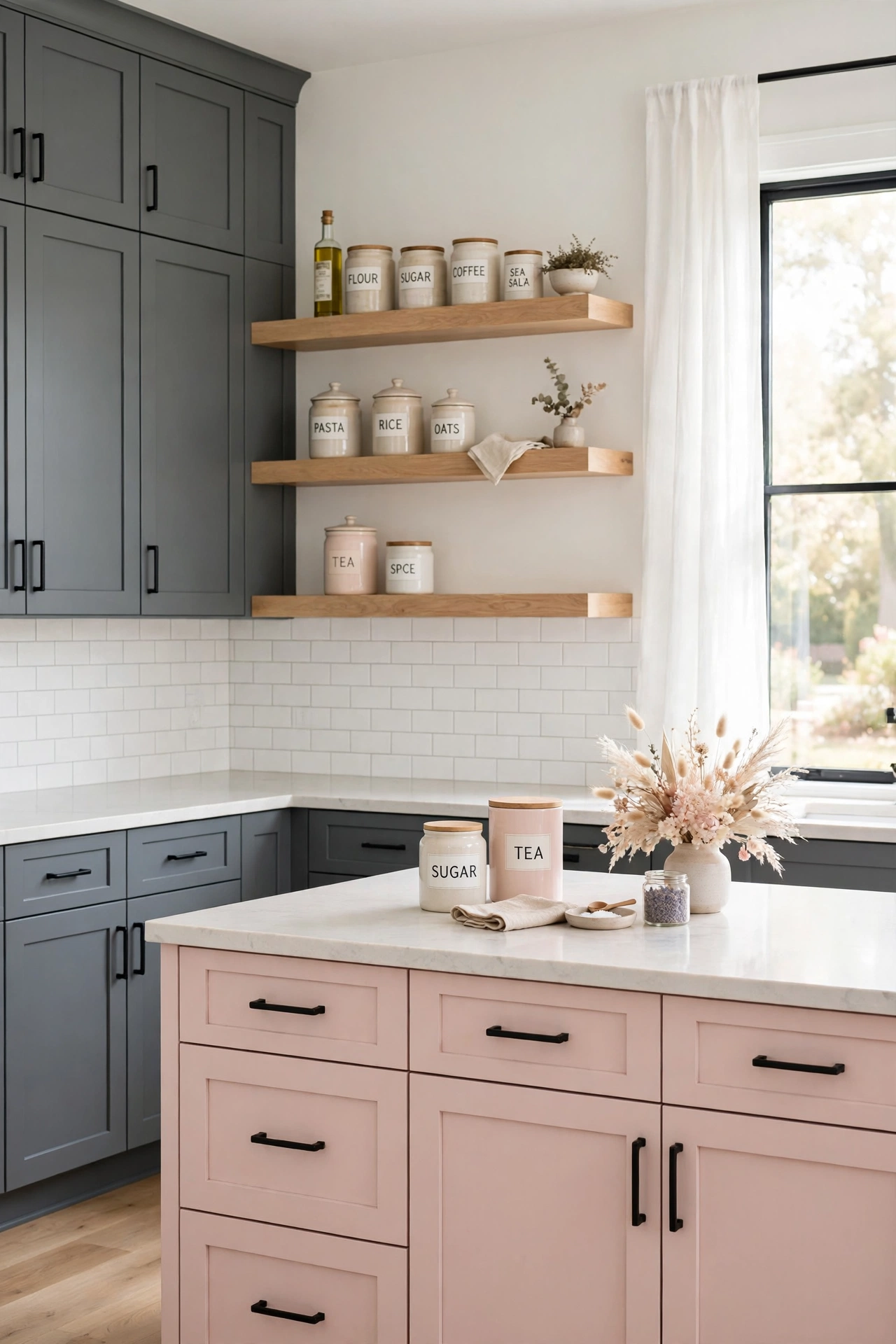
14. Slate Gray, Blush, and White Oak
Slate gray perimeter cabinets, blush pink accents on the island, and white oak floating shelves form a soft modern palette with a gentle romantic edge. The slate gray adds calm structure, the blush softens the cool tones, and the white oak brings in light natural texture. The result feels serene and thoughtfully styled.
Use pale quartz counters and a white or blush-toned backsplash to keep the scheme light and cohesive. Matte black or brushed nickel hardware keeps the look contemporary. This trio is a lovely choice for open kitchens that flow into a living area, since the soft colors blend gracefully with nearby furniture.
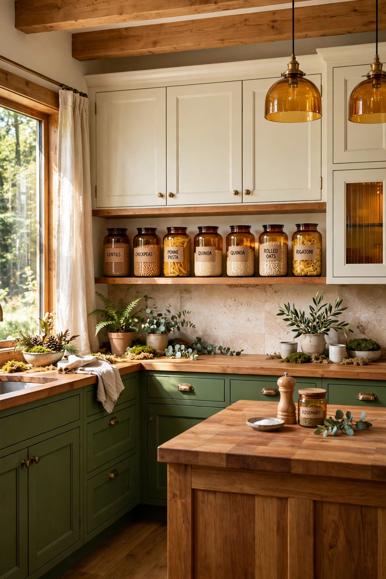
15. Moss Green, Amber, and Soft Ivory
Moss green lower cabinets, amber glass accents and warm wood tones on the island, and soft ivory uppers create a kitchen inspired by autumn woodlands. The moss green feels earthy and restful, the amber adds a honeyed glow, and the ivory keeps the room bright and welcoming. It is a palette that feels close to nature.
Pair this combination with warm wood counters or a butcher block island top to deepen the natural feel. Amber glass jars filled with grains and pasta on open shelves repeat the accent color in a practical way. The whole room will feel like a cozy cabin kitchen with designer polish.
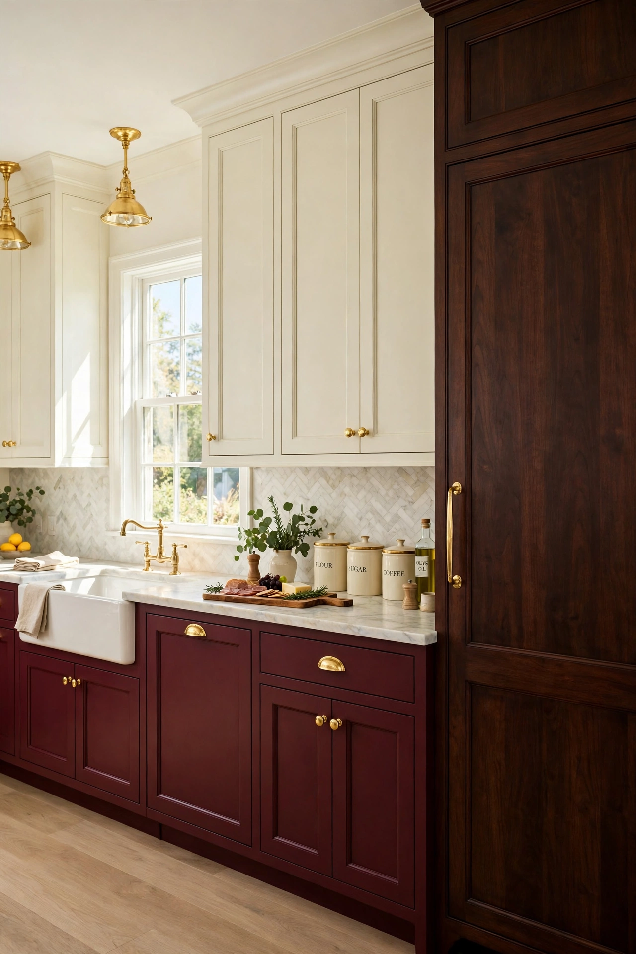
16. Burgundy, Cream, and Espresso Wood
Burgundy lower cabinets, cream uppers, and espresso wood tall cabinets create a kitchen with old-world richness and warmth. The burgundy brings a deep wine tone that feels luxurious, the cream softens the contrast, and the espresso wood adds a dark polished depth. Gold or brass hardware completes the classic look.
This palette shines in kitchens with traditional details such as panelled cabinet doors and a farmhouse sink. Keep the backsplash light and the counters pale marble-look so the dark colors stay elegant rather than heavy. A wooden charcuterie board and a pair of cream ceramic canisters add the final welcoming touches.
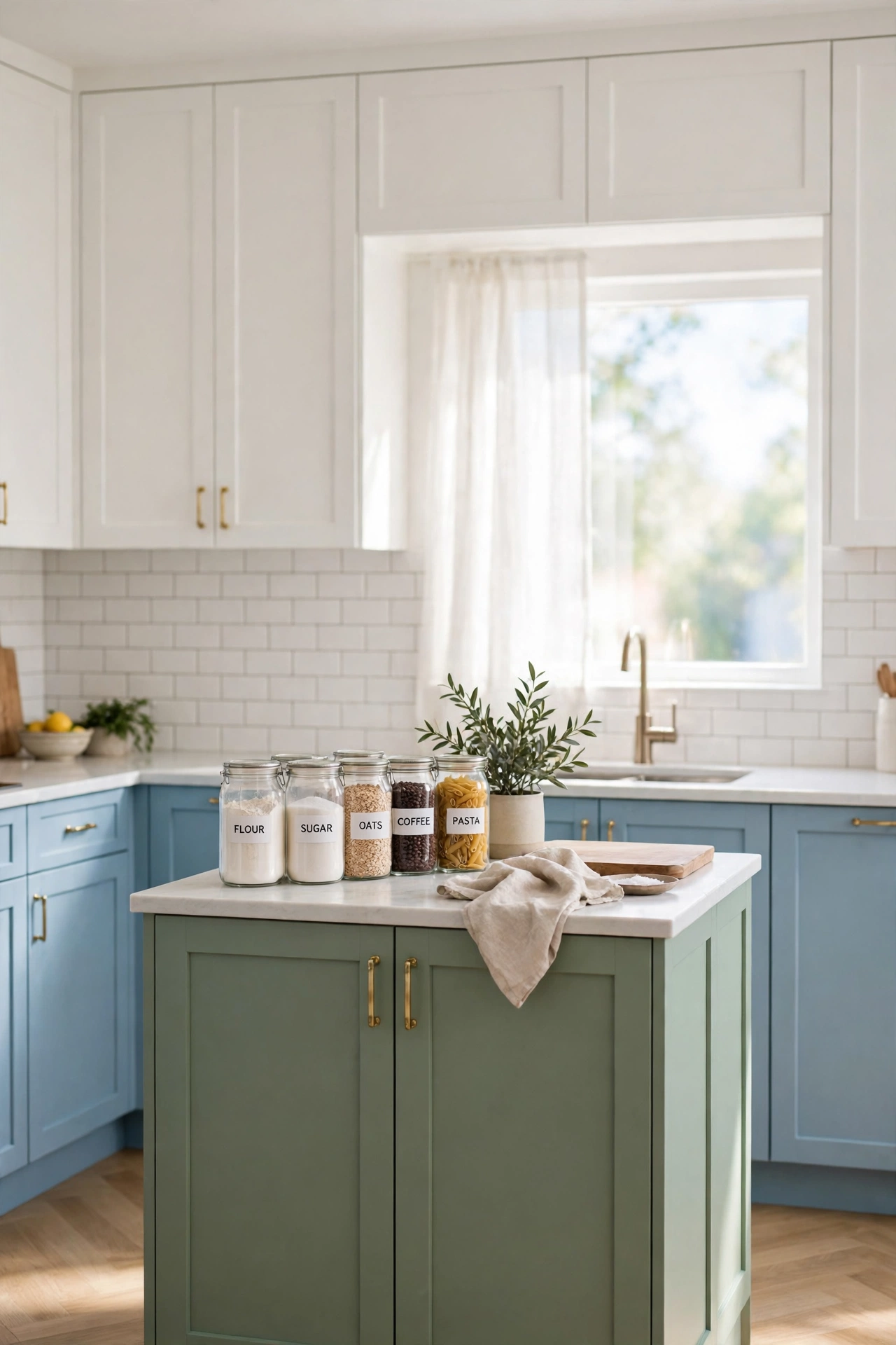
17. Sky Blue, Sage, and Bright White
Sky blue lower cabinets, sage green accents on the island, and bright white uppers create a kitchen that feels like a clear morning. The sky blue brings a fresh airy tone, the sage adds a soft natural green, and the white keeps everything crisp and open. It is a gentle palette that makes small kitchens feel larger.
This combination works especially well in compact layouts, where light colors and clean lines matter most. If your kitchen is narrow, pair this palette with smart planning from these galley kitchen layout ideas to make every inch count. Keep the backsplash white and the counters pale so the blue and sage stay soft and serene.
18. Chocolate Brown, Cream, and Soft Blue
Chocolate brown lower cabinets, cream uppers, and soft blue accents on the island create a kitchen that feels warm, rich, and balanced. The chocolate brings a deep cocoa warmth, the cream lightens the upper walls, and the soft blue adds a cool refreshing note that stops the palette from feeling too heavy. It is comfort with a designer twist.
Use warm wood counters or a light stone top to bridge the brown and cream, and choose brushed nickel hardware for a clean finish. A soft blue backsplash or a row of blue ceramic jars can repeat the accent color without overwhelming the room. The result is a kitchen that feels like a warm hug with a cool breeze.
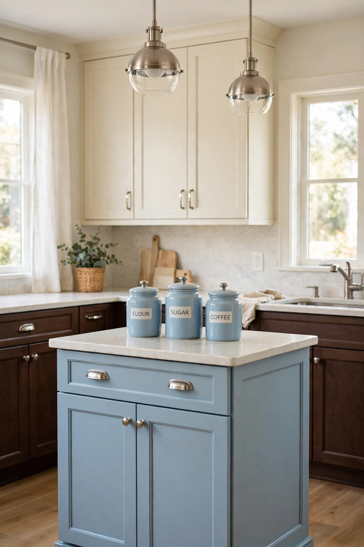
19. Hunter Green, Black, and Warm Cream
Hunter green perimeter cabinets, black accents on the island and range hood, and warm cream uppers create a bold kitchen with a tailored, moody elegance. The hunter green brings a deep forest tone, the black adds graphic definition, and the warm cream softens the dark palette so the room stays inviting. It is drama with warmth.
This combination needs good lighting to shine, so pair it with bright under-cabinet lights and a pale backsplash. Warm wood bar stools and a cream stone countertop keep the dark colors from feeling cold. The result is a kitchen that feels like a stylish private club with a welcoming heart.
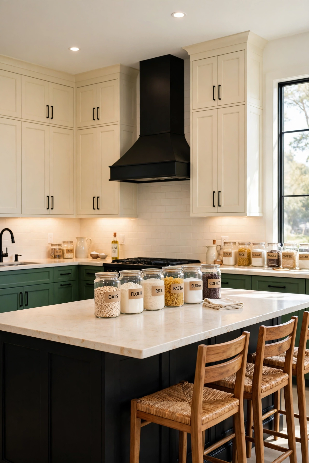
20. Coral, Teal, and Natural Timber
Coral lower cabinets, teal accents on the island and pantry wall, and natural timber open shelves create a kitchen bursting with joyful color. The coral brings warmth and energy, the teal adds a cool jewel-toned balance, and the timber softens both colors with organic texture. It is a palette for people who love color and are not afraid to use it.
Keep the counters and backsplash pale and simple so the coral and teal stay the stars of the room. White walls and plenty of natural light help the bold colors feel fresh rather than overwhelming. A wooden fruit bowl and a few green plants tie the timber and teal together naturally.
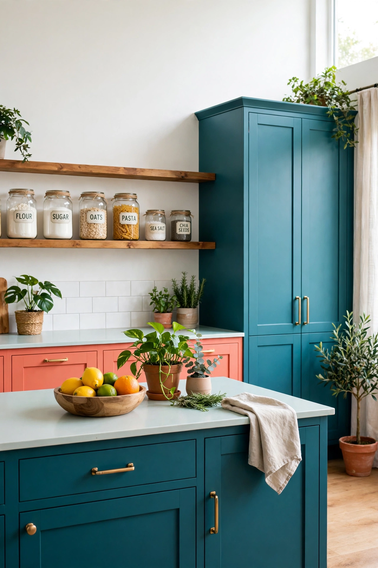
21. Lavender Gray, White, and Warm Wood
Lavender gray lower cabinets, white uppers, and warm wood accents on the island and shelves create a kitchen that feels soft, dreamy, and modern. The lavender gray adds a gentle hint of purple that reads calm rather than sweet, the white keeps the room crisp, and the warm wood grounds the pale palette with natural texture.
This combination pairs beautifully with marble-look counters and brushed nickel or matte black hardware. A pale gray or white backsplash keeps the scheme serene, while a wooden tray or a pair of oak bar stools add warmth. The result is a kitchen that feels like a quiet morning in a French country home.
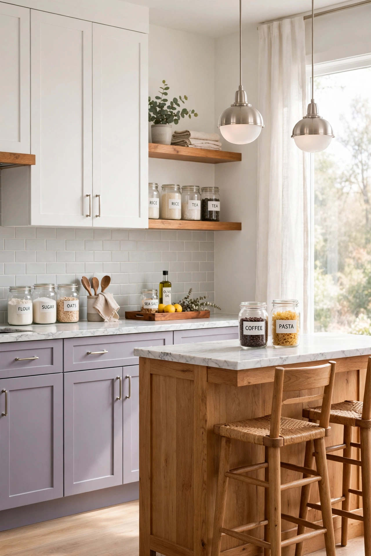
22. Deep Red, Cream, and Weathered Oak
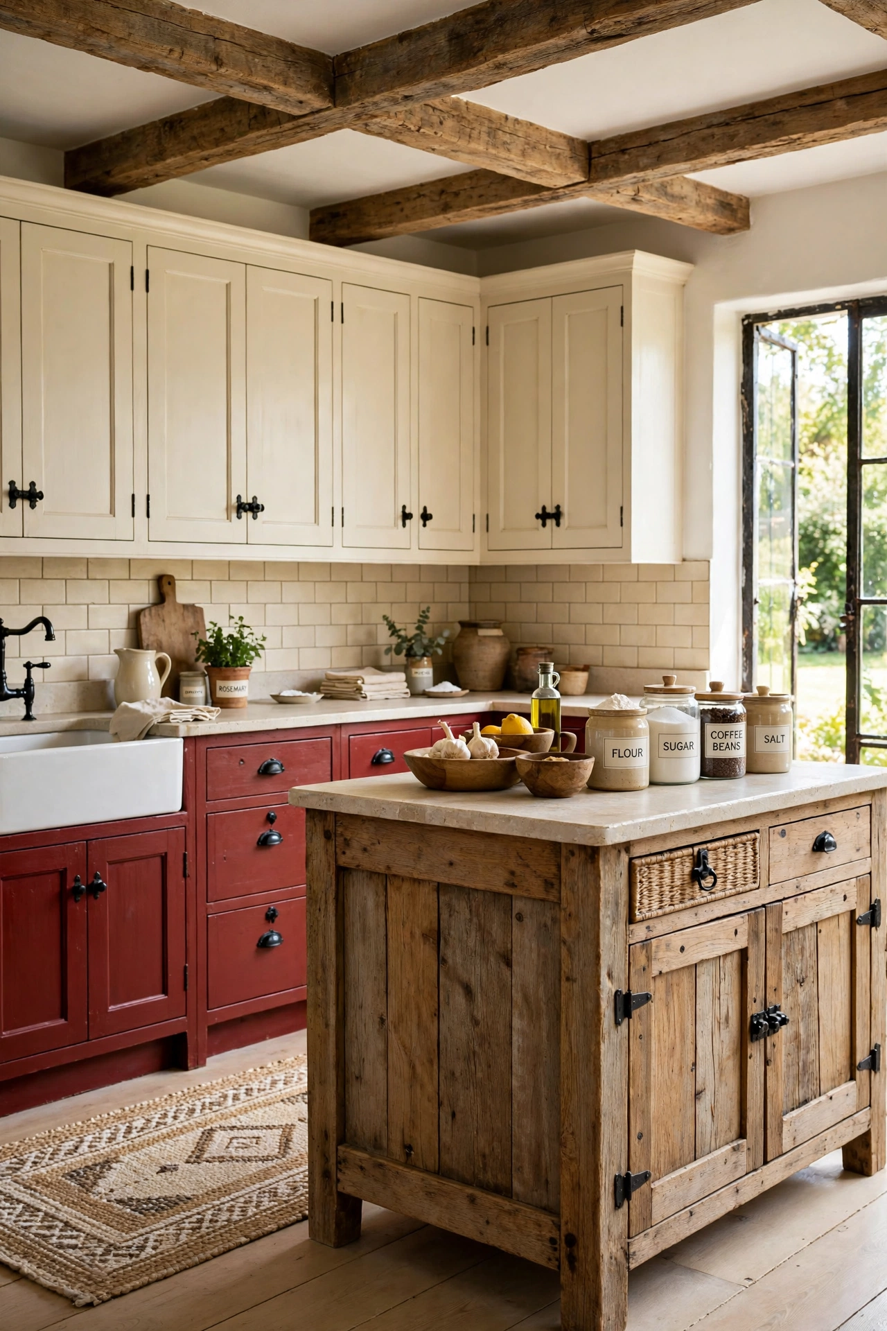
Deep red lower cabinets, cream uppers, and weathered oak accents on the island and beams create a kitchen with rustic warmth and bold character. The deep red brings a rich barn-inspired tone, the cream keeps the room light and open, and the weathered oak adds a timeworn texture that makes the whole palette feel storied and authentic.
Use a light stone countertop and a simple cream backsplash to balance the strong red, and choose black iron hardware for a farmhouse finish. Wooden bowls, a woven rug, and ceramic jars filled with pantry staples complete the warm, gathered look. This palette turns the kitchen into the heart of the home.
Conclusion
The best kitchen cabinet color combinations share one secret: they layer three or more colors with a clear plan, so each shade has a job to do. One color grounds the room, one keeps it light, and one adds warmth, texture, or personality. When you give every color a role, the whole kitchen feels intentional and beautifully designed.
Pick the palette that matches your light, your style, and your courage, then test large swatches on the cabinets before you commit. A backsplash that echoes one of your cabinet colors will pull the whole scheme together, and these cheap kitchen backsplash ideas prove that a polished finish does not need a large budget. Your dream kitchen is only a few colors away.
Frequently Asked Questions About Kitchen Cabinet Color Combinations for Designer Interiors
How many colors should I use on kitchen cabinets?
Three colors is the sweet spot for a designer look. Use one color for lower cabinets, one for uppers, and a third for the island, pantry, or tall cabinets. A fourth color can appear in hardware, wood tones, or open shelving, but keep the main palette to three shades so the kitchen feels planned rather than busy.
Should the island be a different color from the cabinets?
Yes, a different island color is one of the easiest ways to create a layered designer look. The island acts as a focal point, so a contrasting color there adds depth and personality. Choose an island color that shares an undertone with the perimeter cabinets so the palette feels connected.
What is the safest three-color combination for resale value?
White uppers, a soft neutral such as greige or warm gray on the lowers, and a natural wood island is the safest trio for resale. It feels fresh, timeless, and easy for buyers to picture with their own style. Bolder colors can still work beautifully if the rest of the kitchen stays light and neutral.
Can I mix painted cabinets with wood cabinets?
Yes, mixing painted and wood cabinets is a classic designer move. The wood adds warmth and texture that paint alone cannot provide. Keep the wood tone consistent across the kitchen and choose paint colors with warm or cool undertones that match the wood for a cohesive result.
How do I choose cabinet colors for a small kitchen?
Keep the upper cabinets light and put deeper colors on the lowers or the island so the room feels open. A pale palette with one rich accent color adds personality without closing in the space. For more small-space guidance, these small L-shaped kitchen layout ideas show how color and layout work together in compact kitchens.

Hi, I’m Emily! I turn messy corners into cozy, organized spots. DreamNestDecor is where I share simple, practical home ideas — decor, organization, and small-space solutions that work in real life, not just in photos. Every idea here is carefully researched before it’s shared.