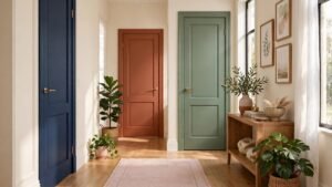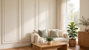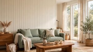

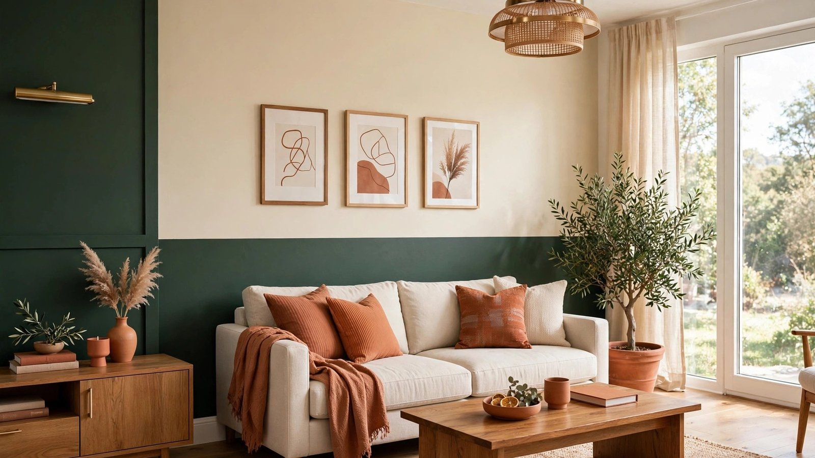
Last year I walked into my friend Rachel’s dining room and stopped right at the doorway. One wall was painted deep green on the bottom half and warm cream on the top half, and the whole room looked twice as interesting as it had before. She told me it took her one weekend and two cans of paint. I went home and stared at my own plain white walls for a very long time.
That was the start of my two tone wall paint obsession. Instead of choosing one color for the whole room, you divide the wall into two tones. It adds depth and personality for the price of a second paint can. Below are 23 two tone wall paint ideas that can give your home a stylish new look, from calm and classic pairings to bold and joyful ones.
1. Classic Black and White Two Tone Walls
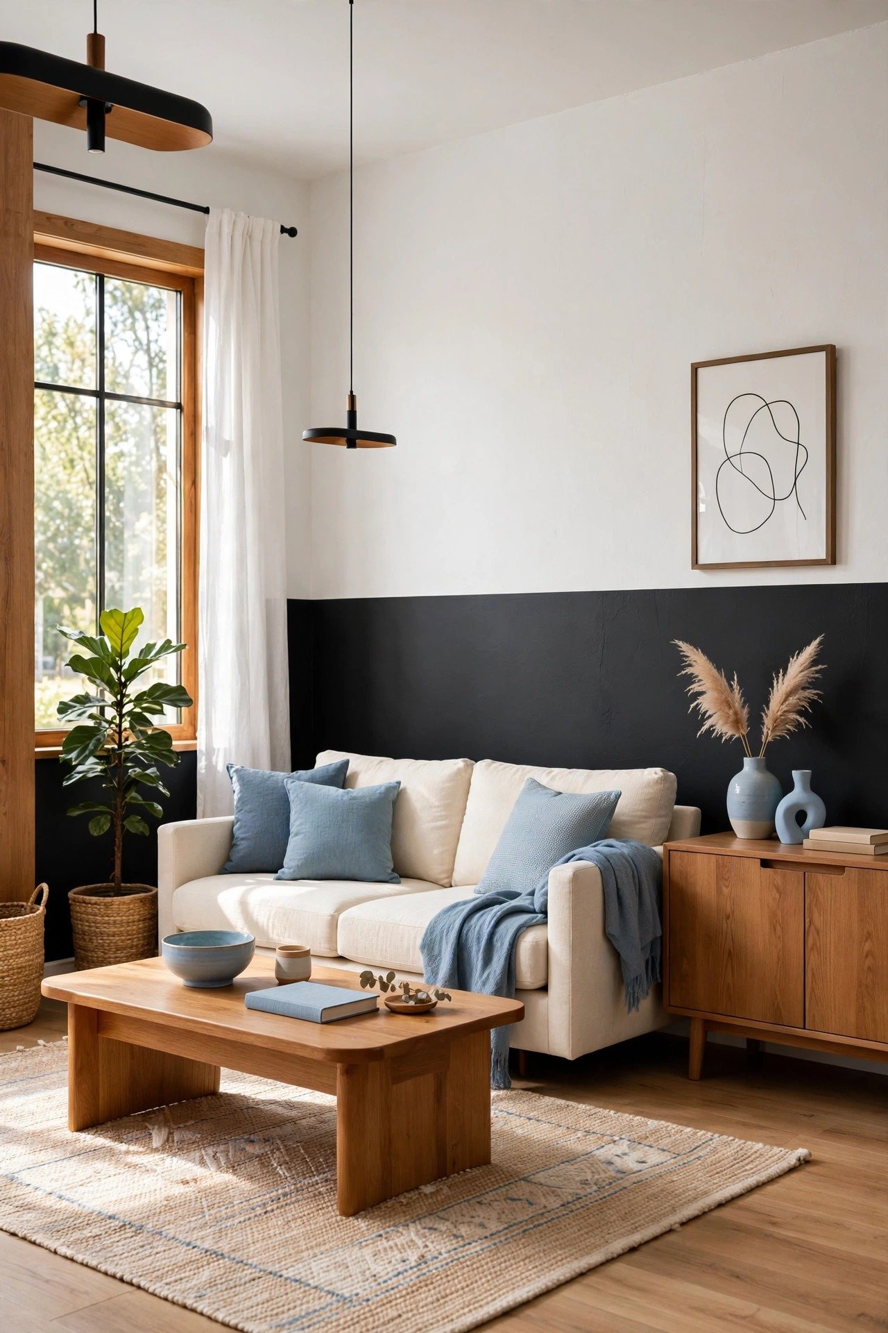
Black on the lower half and white on the upper half is the most timeless of all two tone wall paint ideas. The dark base grounds the room and hides scuffs near the floor, while the white top keeps the ceiling feeling high and the space feeling open. You will love how sharp and clean it looks with almost any furniture.
Use painter’s tape to get a crisp straight line where the two colors meet. If you want a softer transition, place a simple chair rail or slim molding right along the divide. It will look like it was built that way on purpose.
2. Soft Pastel Paint Pairings
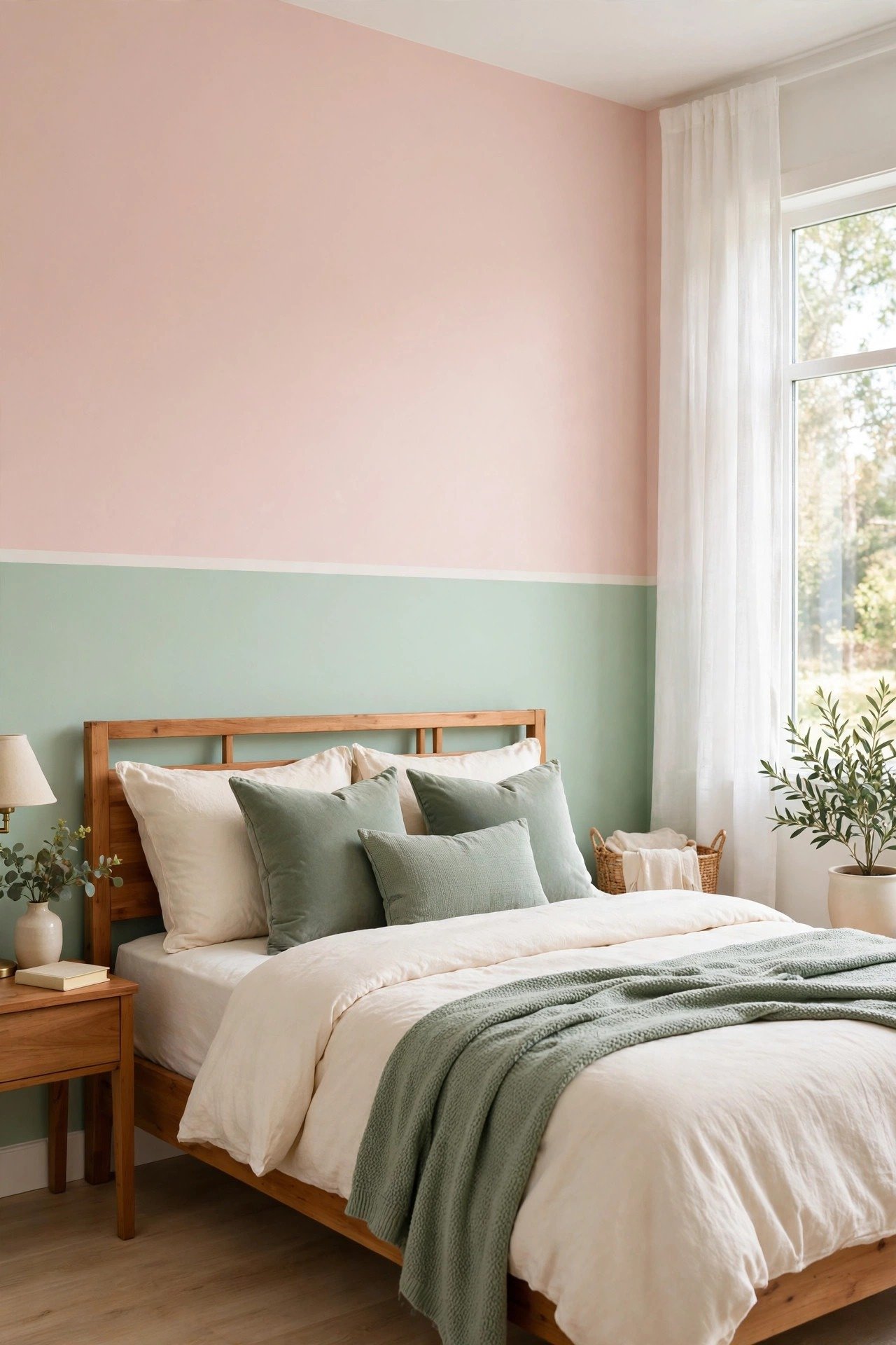
Pair two soft pastels, such as blush pink with mint green, for walls that feel calm and gentle. This combination works beautifully in bedrooms, nurseries, and any room where you want to relax. The light colors bounce daylight around the room and make small spaces feel larger.
Keep your furniture and bedding simple so the pastel walls can shine on their own. White wood furniture and sheer curtains are perfect partners. The result is sweet and serene without feeling childish.
3. Navy Blue and White Wall Combination
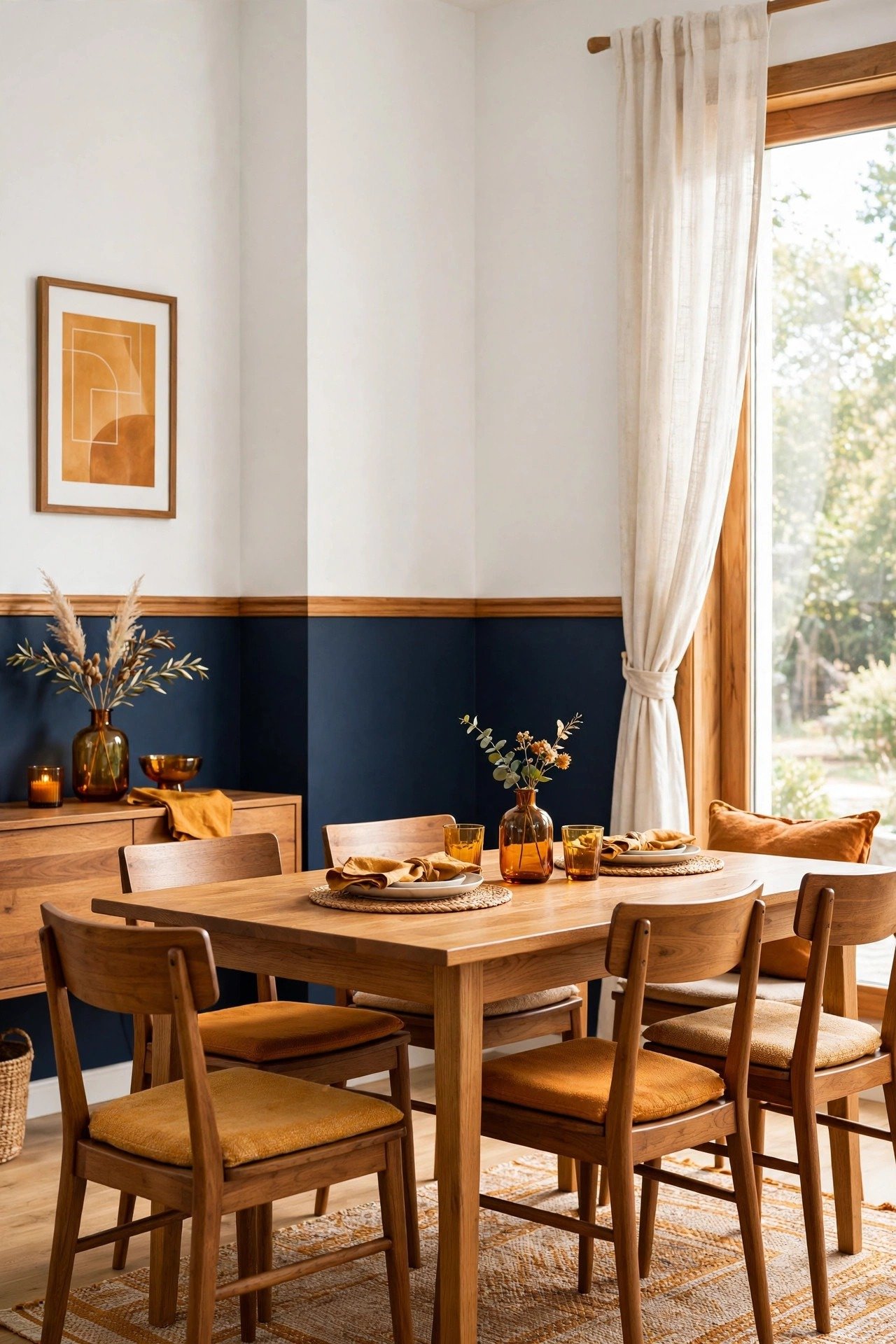
Navy blue below and white above brings a polished, slightly nautical feel to your home. This pairing looks stunning in living rooms and dining rooms, where it adds both drama and freshness at once. Navy has the richness of a dark color but still feels classic and easy to live with.
Add brass or gold light fixtures to make the navy glow in the evening. A white bookshelf or a gallery of framed prints on the white section will keep the look balanced. It is a combination that never goes out of style.
4. Beige and Terracotta Wall Duo
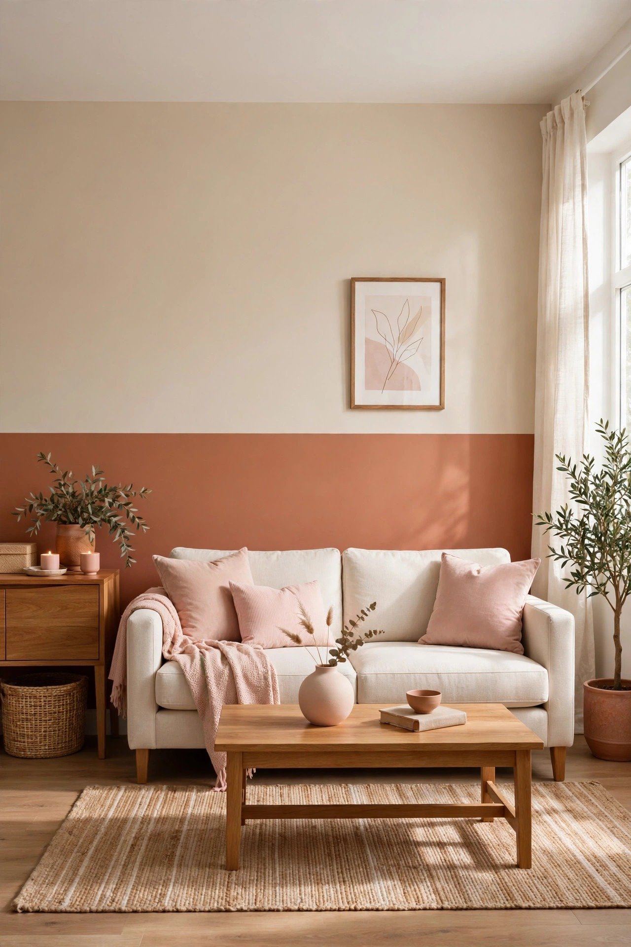
Beige and terracotta together feel like a warm hug on a wall. The terracotta brings the cozy richness of baked clay, while beige keeps it soft and balanced. You can use this duo in a living room or a reading corner to make the space feel instantly inviting.
Style this pairing with wood furniture and a few green plants for a natural, earthy look. Woven baskets and linen throws will fit right in. It is one of the most comforting two tone wall paint ideas on this list.
5. Yellow and Gray Paint Pairing
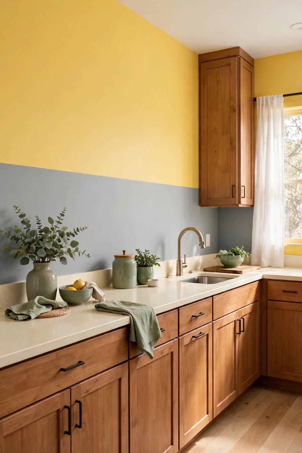
Yellow and gray is the perfect balance of happy and calm. The yellow fills the room with energy and sunshine, while gray keeps it sophisticated and grounded. This duo is wonderful for a small kitchen or a home office where you need both focus and cheer.
Let the gray take up more of the wall and use yellow as the brighter accent. White cabinets or a white desk will pop against both colors. You will find this pairing lifts your mood every single day.
6. Emerald Green and Cream Two Tone Walls
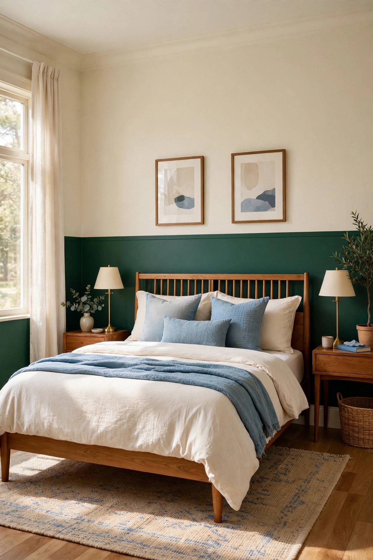
Emerald green with soft cream feels rich and peaceful at the same time. The deep green adds a sense of luxury, while cream keeps the room light and restful. It is a dream combination for bedrooms and formal sitting rooms where you want a little drama.
A timeless gallery wall of framed art on the cream section will look absolutely stunning. Add gold picture frames or a brass lamp for a touch of elegance. The green will make everything around it look more expensive.
7. Dusty Blue and Taupe Wall Combo
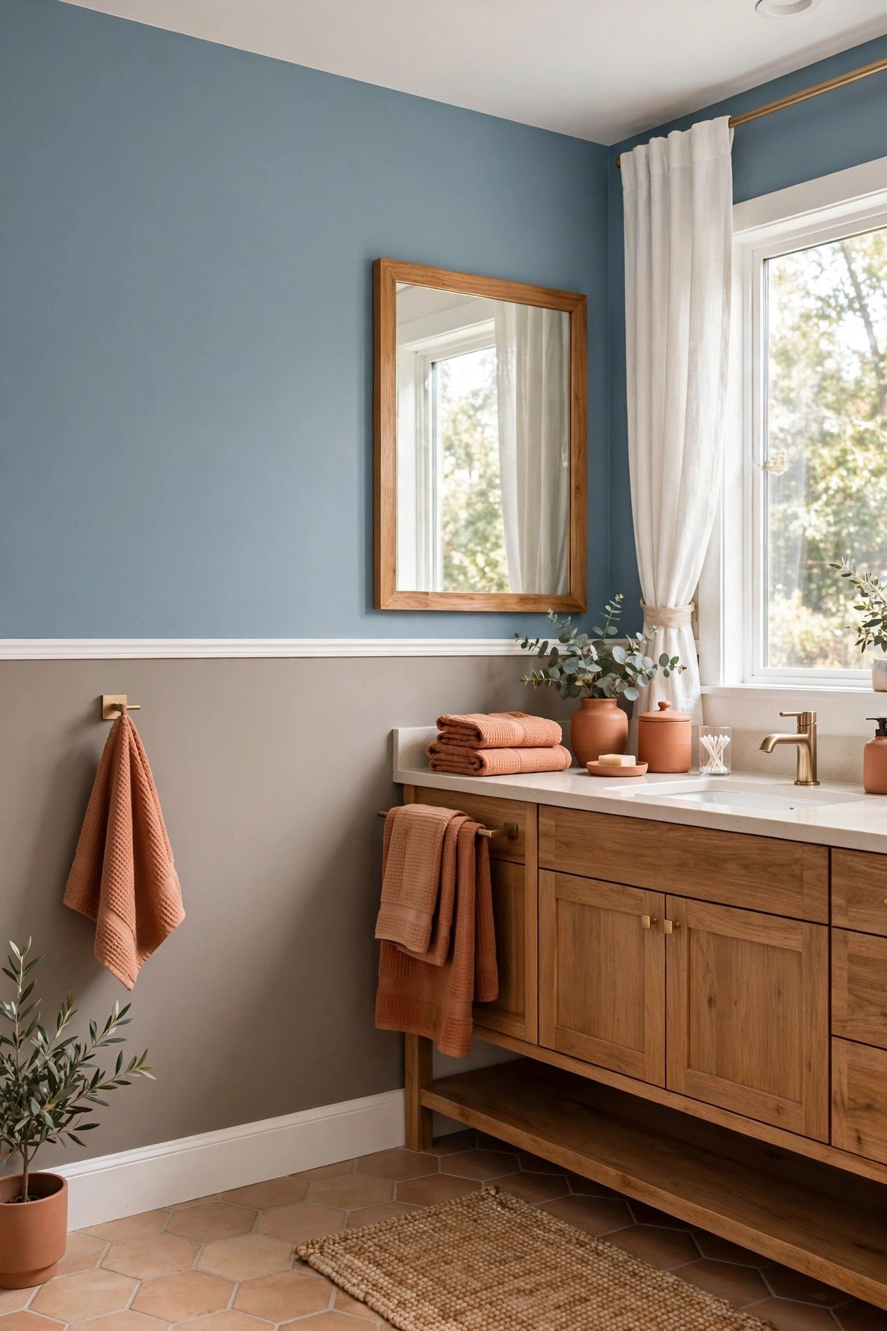
Dusty blue and warm taupe create one of the most relaxing wall combinations you can choose. The blue cools the space down, while taupe adds warmth from below. Try it in a bathroom or a quiet living room corner where rest matters most.
Paint the taupe on the lower half so the room feels anchored and cozy. Natural textures like wood, rattan, and woven cotton will blend in beautifully. It is a combination that feels like a deep breath.
8. Charcoal Gray and Lavender Walls
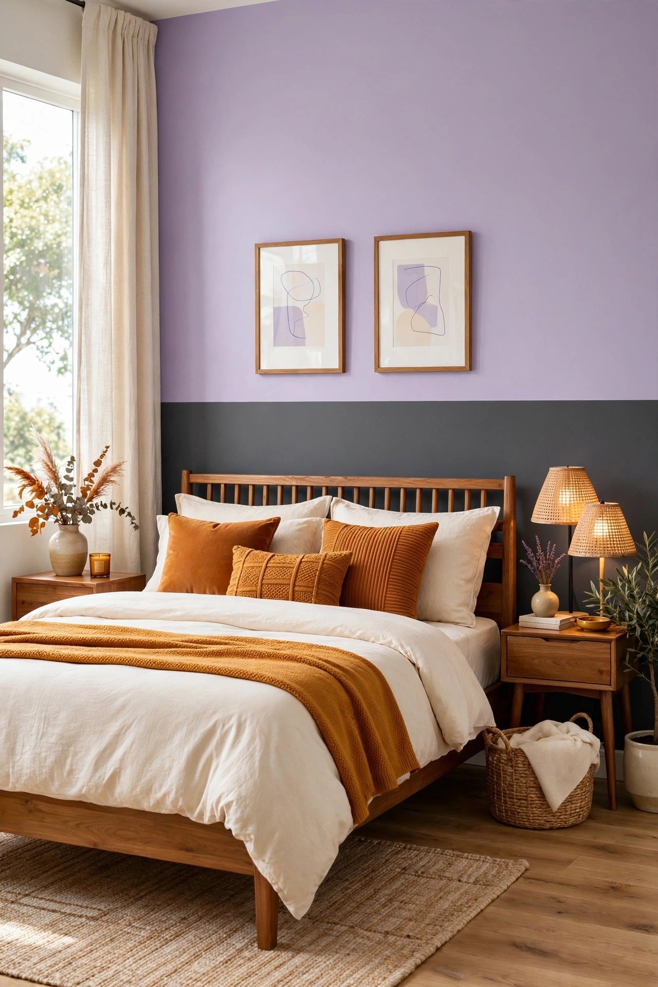
Charcoal gray and soft lavender is an unexpected pairing that turns out beautifully. The dark gray gives the room depth and a modern edge, while lavender softens it with a gentle, romantic touch. It works well in bedrooms and creative spaces that need a little personality.
Bring in metallic touches like silver or chrome to make both colors shimmer. Soft gray bedding and a textured throw will complete the look. You will have a room that feels both bold and dreamy.
9. Coral and Beige Paint Duo
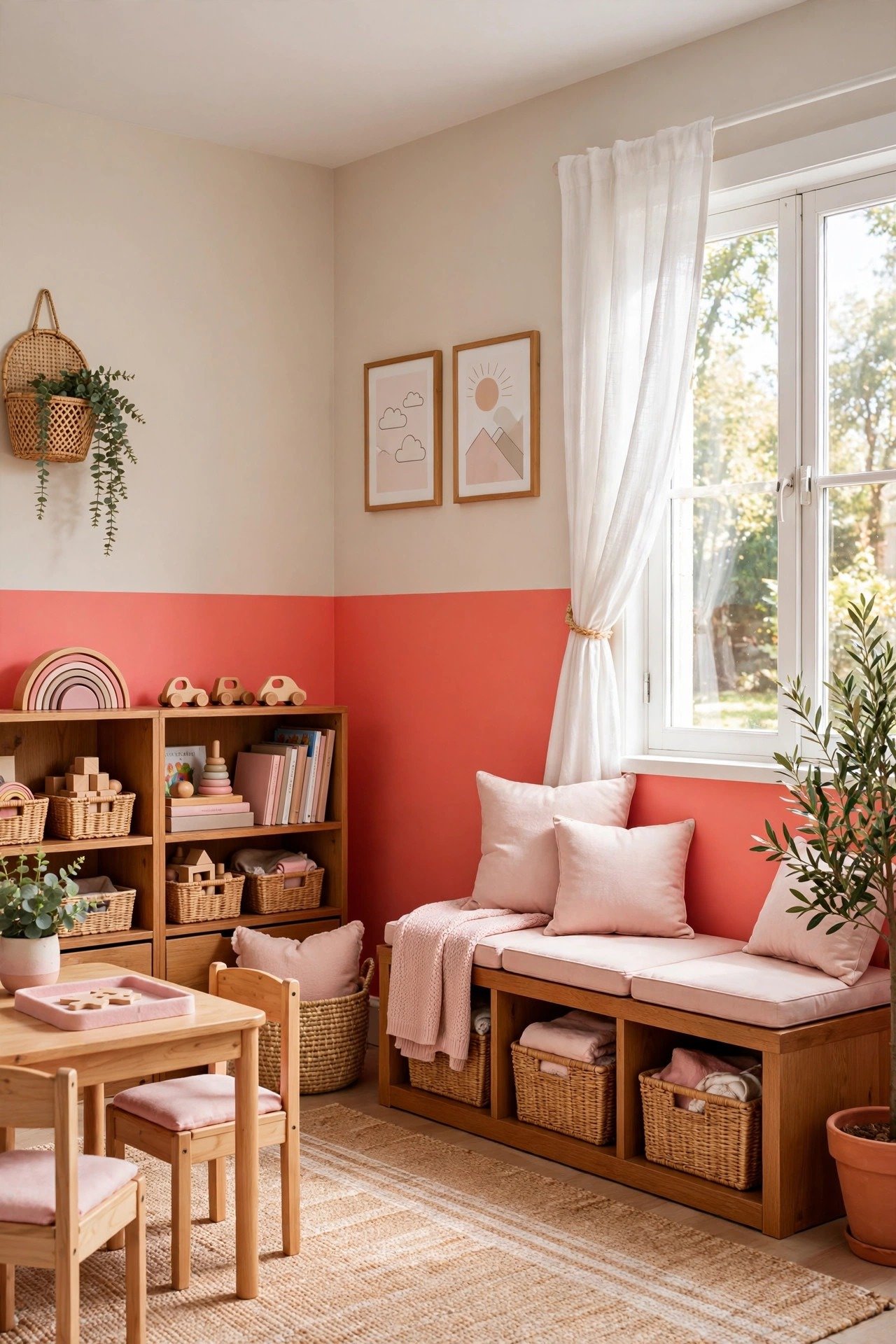
Coral and beige is playful and warm without going overboard. The coral adds a burst of happy energy, while beige keeps the room calm and livable. This is a lovely choice for a playroom, a kids bedroom, or a cheerful kitchen corner.
Use light wood furniture to keep the coral feeling fresh instead of heavy. If you want a softer edge, ask for a blended finish where the two colors gently melt into each other. It will feel like a sunset on your wall.
10. Forest Green and Peach Two Tone Walls
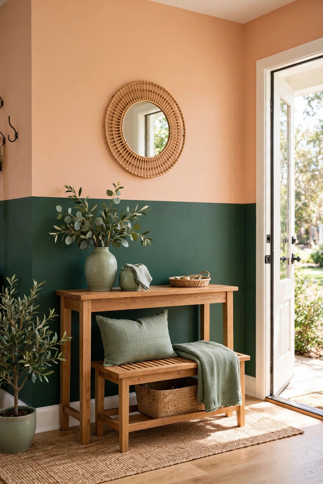
Forest green and soft peach balance strength and sweetness. The deep green brings the richness of the woods indoors, while peach adds a warm, welcoming glow. An entryway painted in this duo will make every guest feel at home the moment they step inside.
Copper or terracotta accessories will pick up the warmth of the peach perfectly. A round mirror on the peach section will reflect light around the space. It is a combination that feels both fresh and classic.
11. Teal and Sand Coastal Wall Pairing
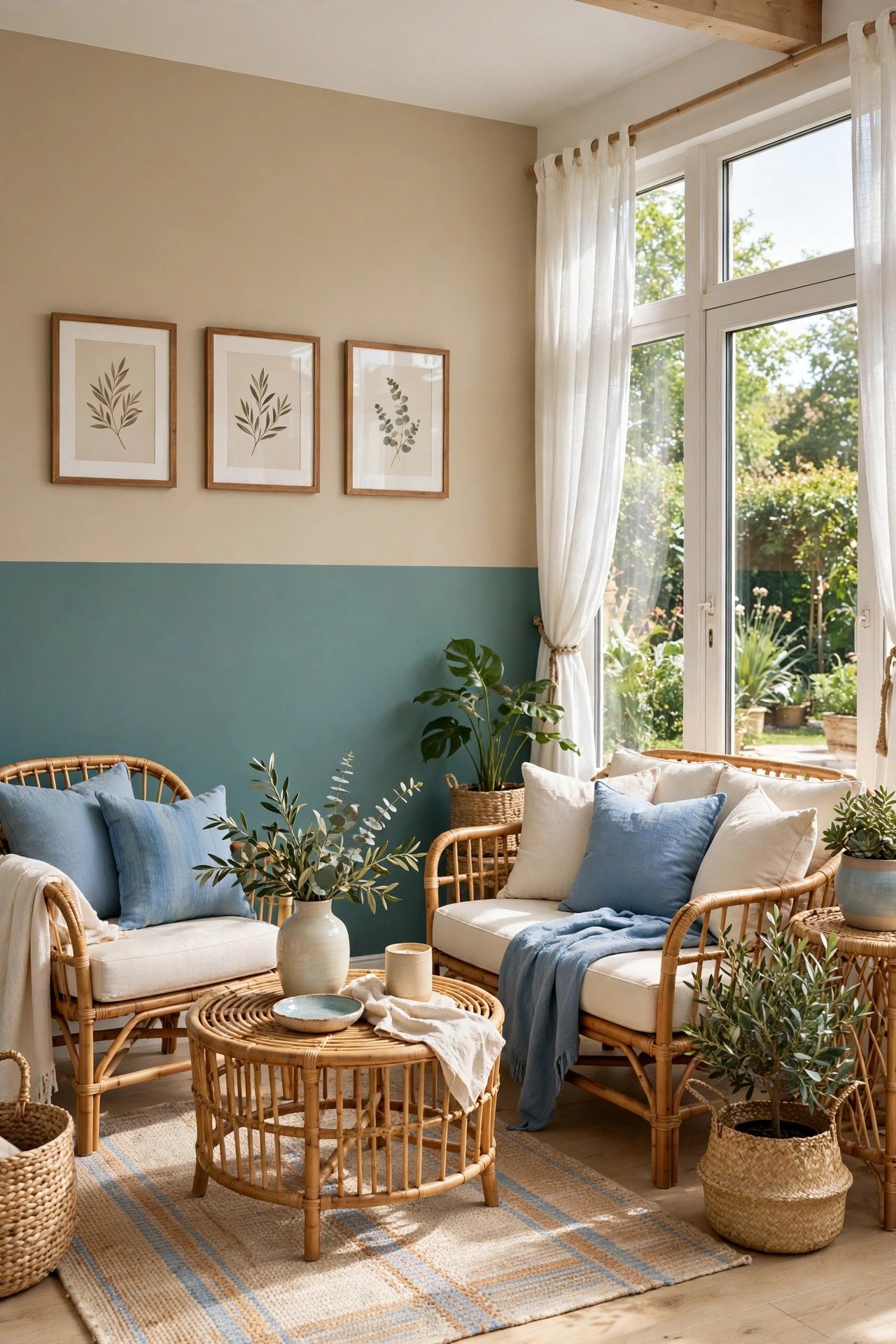
Muted teal and light sand will make you feel like you are on holiday at home. The teal carries the calm of the sea, while the sandy tone adds warmth like a beach at golden hour. Bathrooms and sunrooms are perfect places for this breezy pairing.
Pair it with white furniture and natural wood for a true coastal feel. A jute rug and a few shells or driftwood pieces will complete the story. You may never want to leave this room.
12. Burgundy and Gray Wall Combination
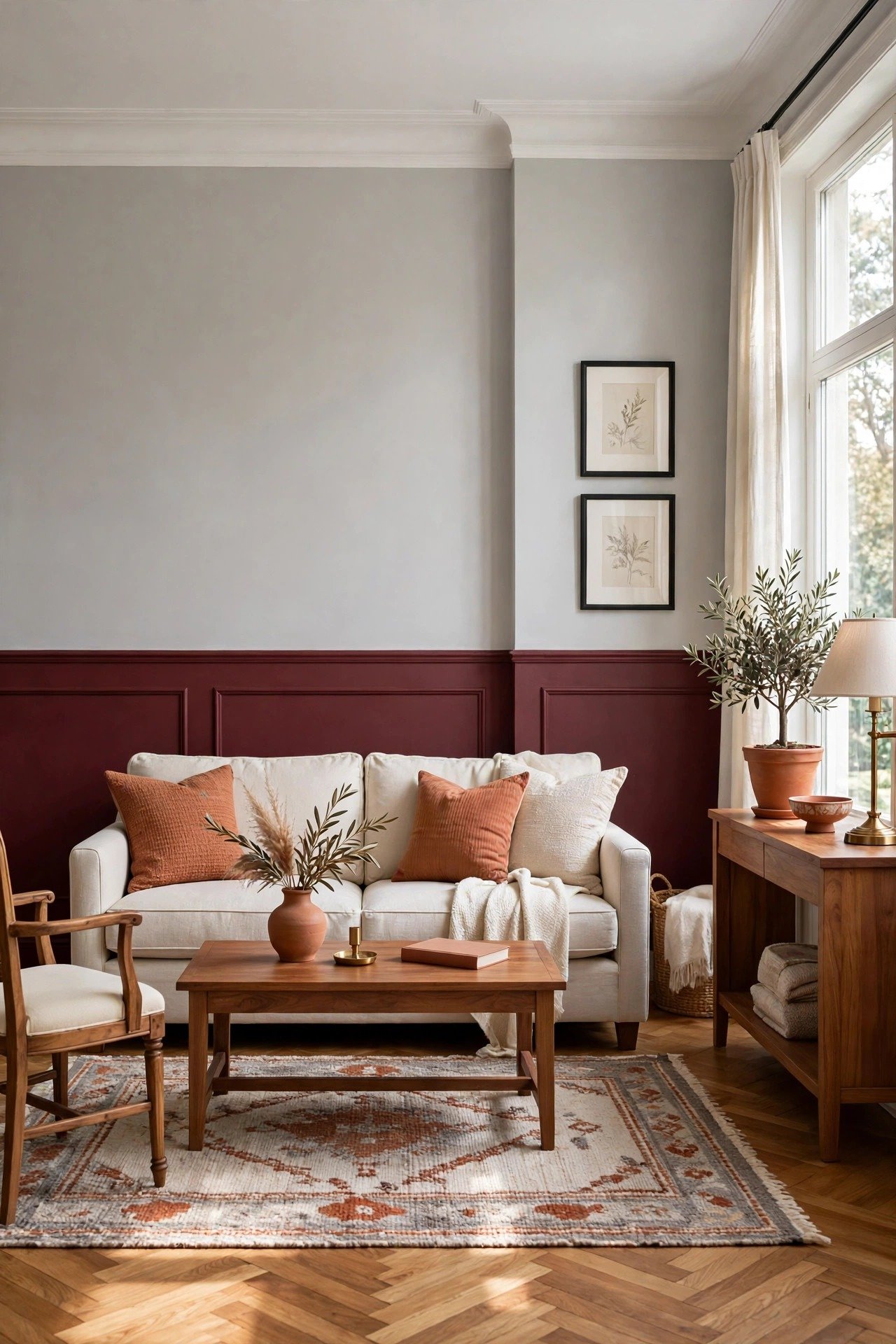
Deep burgundy with light gray is pure elegance. The burgundy adds richness and warmth like a glass of fine wine, while gray keeps it modern and fresh. Formal living rooms and dining rooms will shine with this sophisticated duo.
Take inspiration from a moody fall color palette and add gold or brass accents to make the burgundy glow. Velvet cushions in the same wine tone will tie the whole room together. Your guests will ask about these walls.
13. Slate Blue and Pale Pink Walls
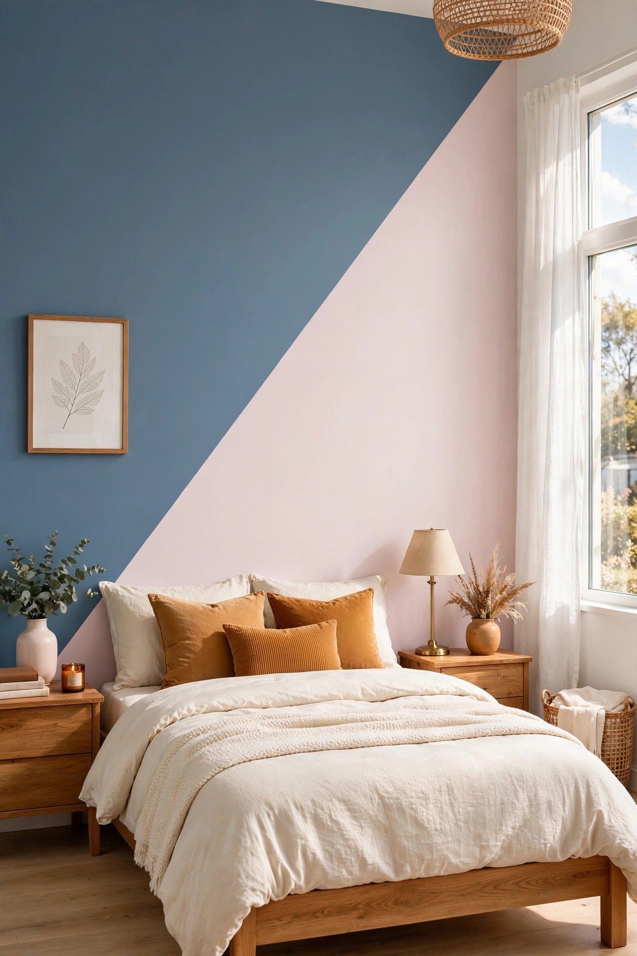
Slate blue and pale pink feel modern and charming at the same time. The blue brings cool calmness, while pink adds softness and warmth. In a room with plenty of natural light, both colors will look fresh and alive.
Try a diagonal or geometric divide instead of a straight horizontal line for a more artistic look. White bedding and light wood furniture will keep it airy. It is a fun way to show a little creativity.
14. Burnt Orange and Light Gray Duo
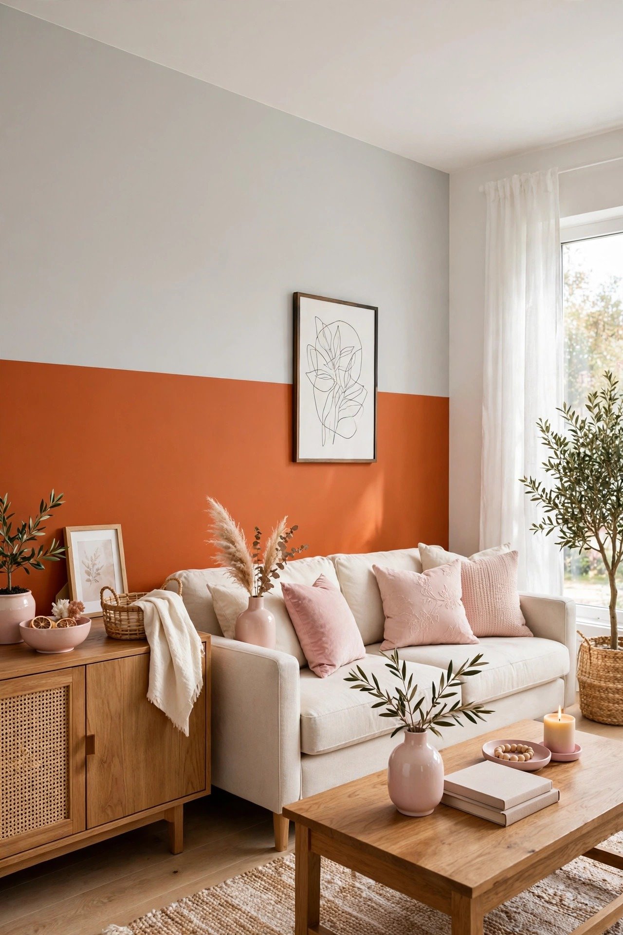
Burnt orange and light gray is warm, bold, and full of life. The orange adds energy like autumn leaves, while gray tones it down so the room still feels relaxed. This duo is ideal for an accent wall in a living room that needs a spark.
Black picture frames or dark wood furniture will look striking against these colors. If you are feeling playful, try a zigzag or angled divide between the tones. It will give the whole wall a burst of character.
15. Calm Beige and White Two Tone Walls
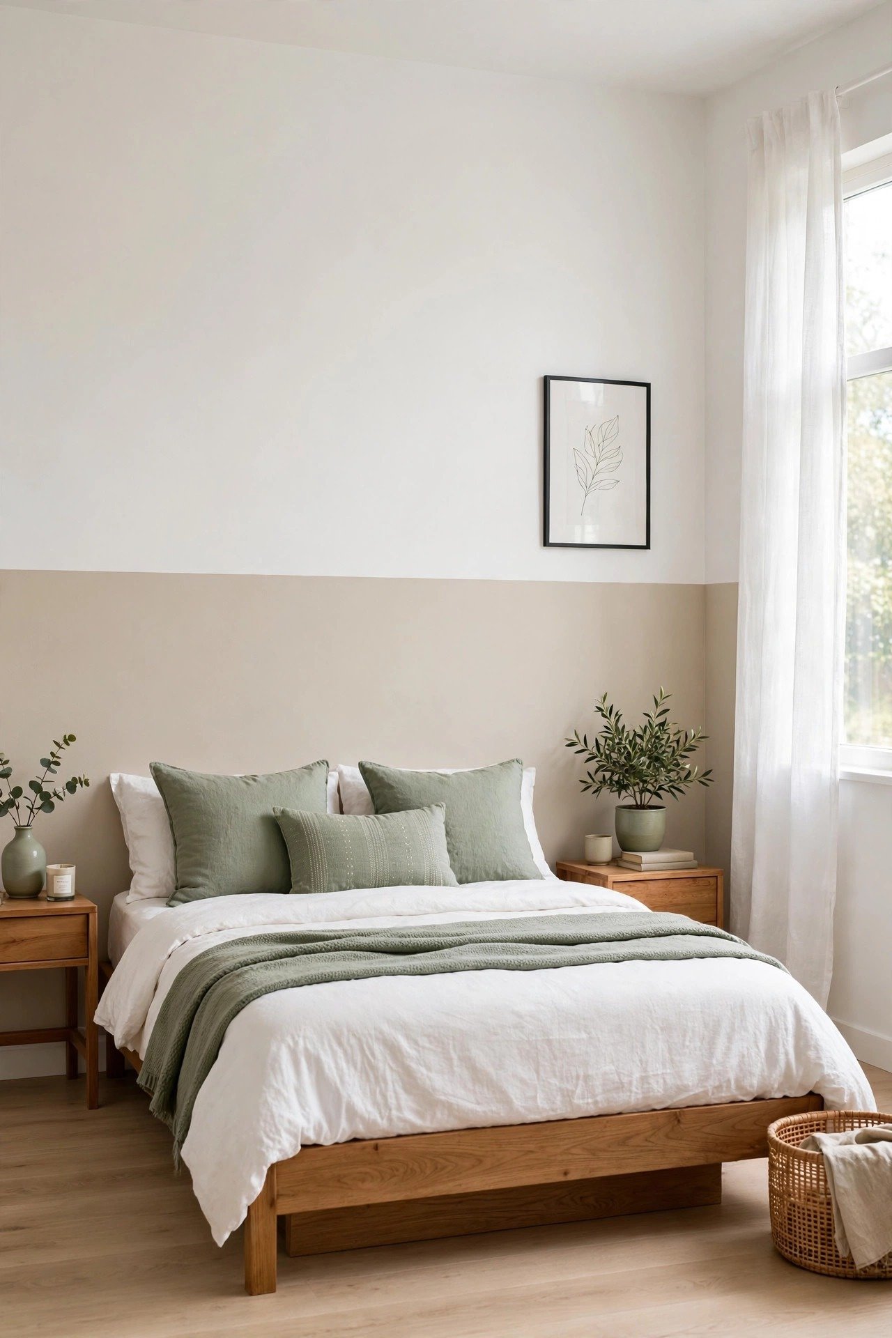
Beige and white is the quietest and most versatile pairing on this list. The beige adds gentle warmth, while white keeps everything bright and open. Bedrooms and bathrooms will feel calm and spa-like with these two tones.
This neutral base lets you change your decor with the seasons without repainting. Swap in colorful cushions in spring or cozy knits in winter. It is a canvas that works with every style you will ever try.
16. Playful Pink and Orange Walls
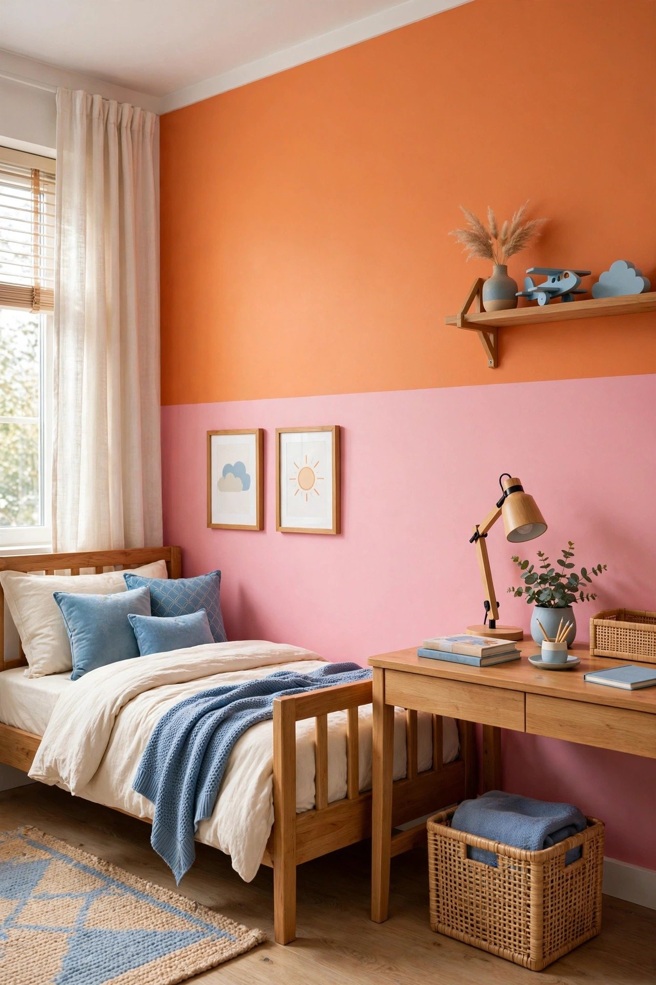
Pink and orange together are pure joy on a wall. These happy colors bring energy and creativity to playrooms, kids bedrooms, and creative workspaces. Use softer shades for a gentle effect or go bold for maximum fun.
Balance the brightness with white furniture and simple curtains. A few framed prints in matching tones will pull the look together. You will smile every time you walk into this room.
17. Minimalist Gray and White Walls
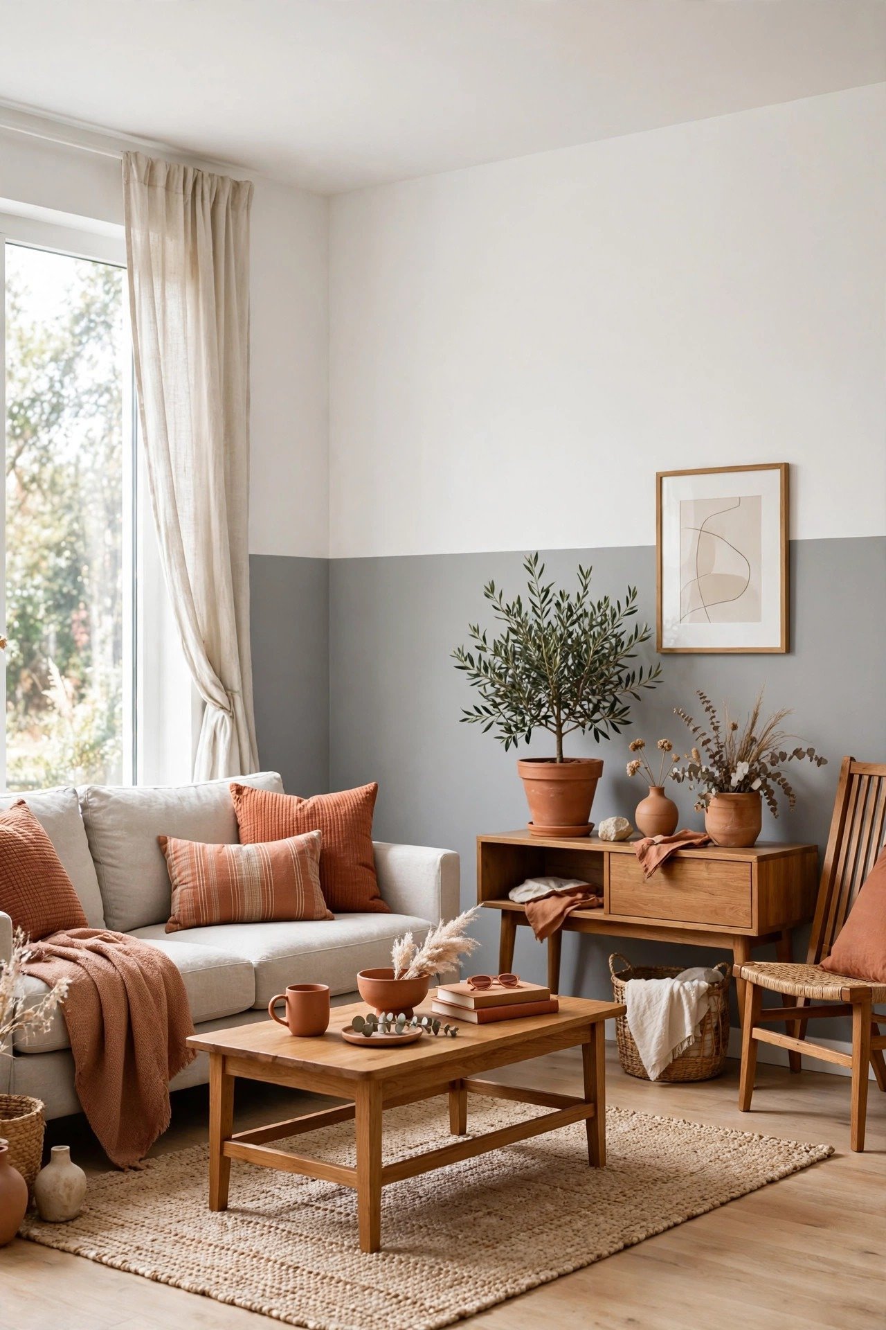
Soft gray with white is the definition of clean and modern. The gray adds just enough depth to keep the room interesting, while white keeps it fresh and bright. It is a perfect backdrop for art, plants, and beautiful furniture.
Keep your decor simple and let the two tones do the talking. A single green plant or a textured rug will add life without clutter. This is two tone painting at its most effortless.
18. Blue and Yellow Bold Contrast
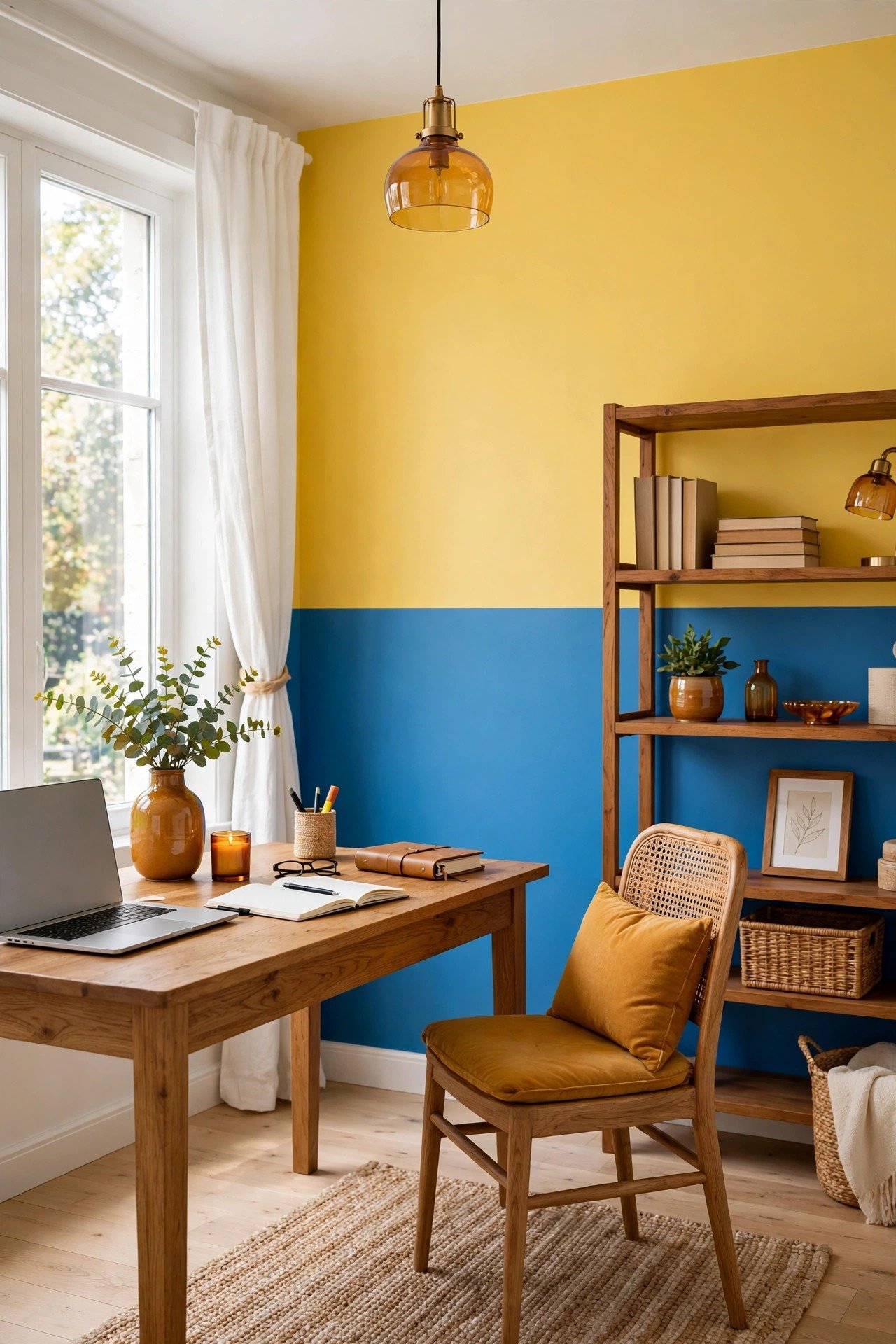
Blue and yellow together feel like a bright summer day. The blue adds depth and calm, while yellow brings sunshine and optimism. A home office or a playroom painted in this duo will feel alive and inspiring.
Let one color take the lead and use the other as a bold accent. Natural wood desks and white shelving will keep the look balanced. You will find it hard not to feel cheerful in here.
19. Warm Brown and Cream Wall Blend
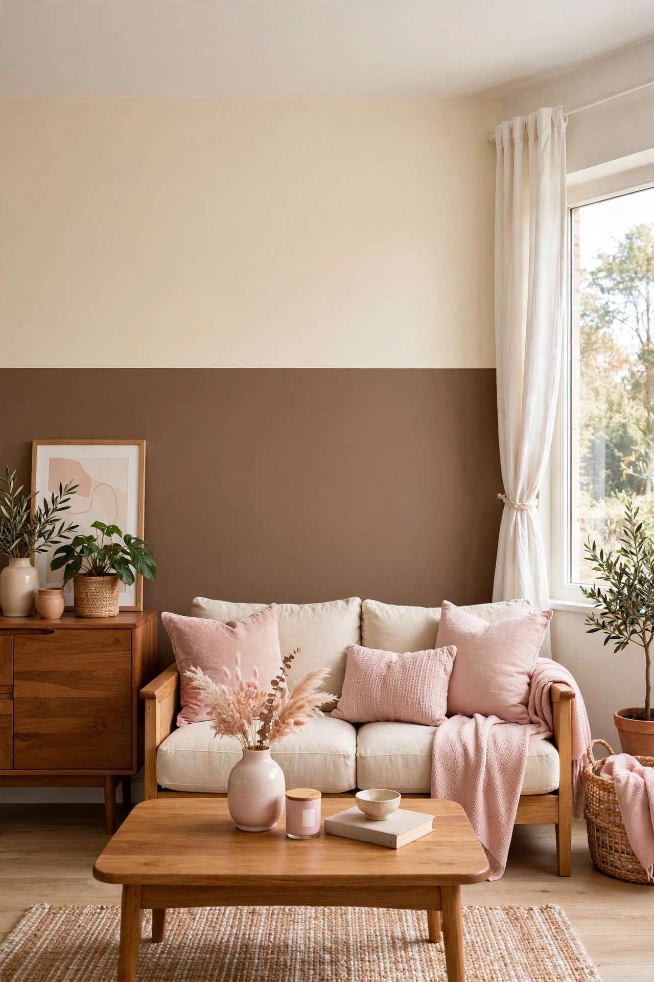
Warm brown and cream wrap a room in comfort. The brown brings the richness of warm mid century wood tones, while cream keeps it light and welcoming. Living rooms and dens will feel extra cozy with this pairing.
Leather furniture and woven textiles will feel right at home with these colors. Add a soft area rug in a matching tone to ground the space. It is the wall equivalent of a warm cup of cocoa.
20. Red and White Energetic Duo
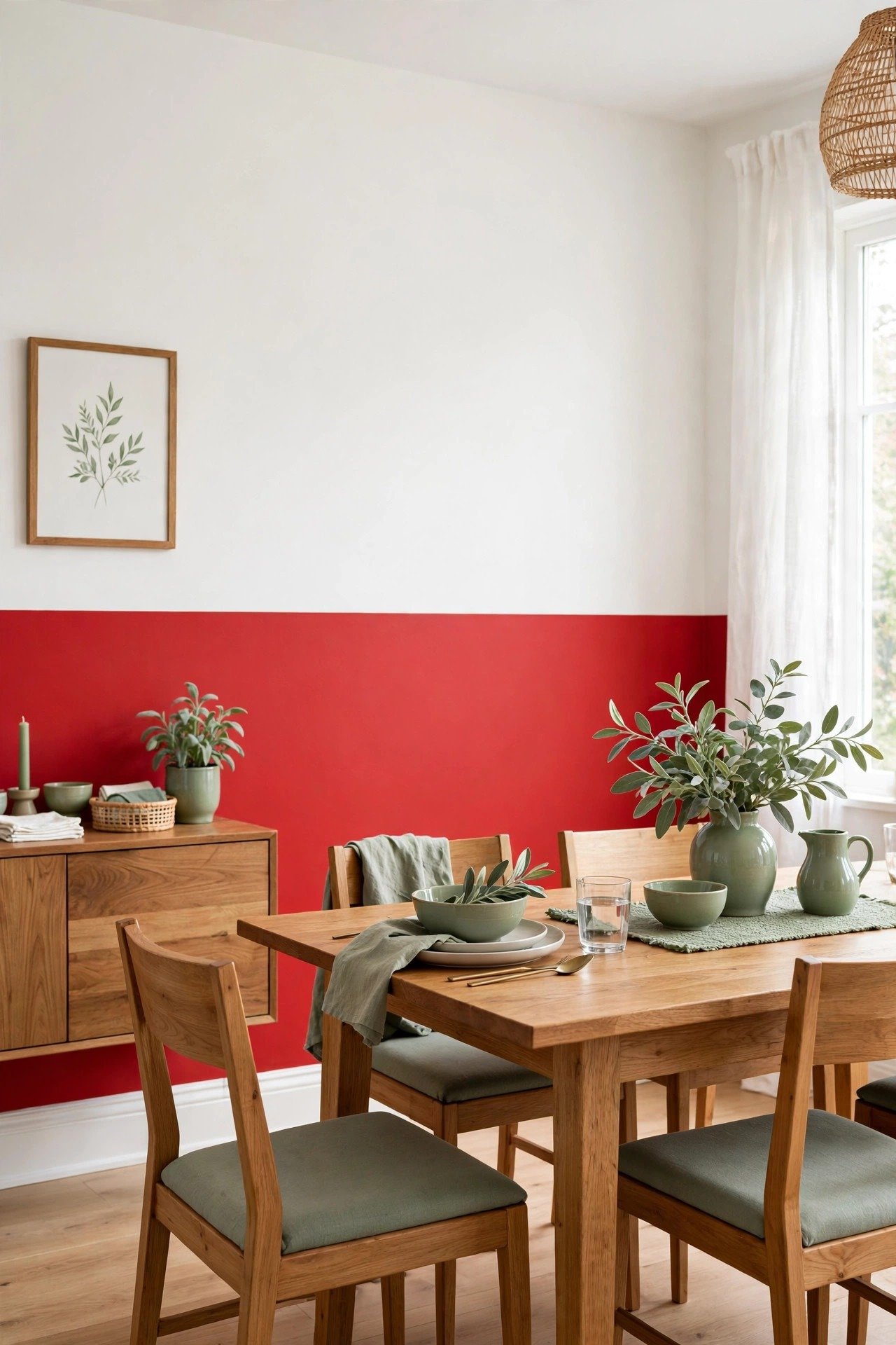
Red and white is bold, confident, and full of energy. The red makes a strong statement, while white keeps it crisp and clean. Use it on one dining room wall to create a space that feels festive and full of life.
Keep the rest of the room simple so the red can be the star. Dark wood furniture and white dishes will look classic against these walls. You will have a dining room made for long, happy dinners.
21. Mint Green and White Fresh Pairing
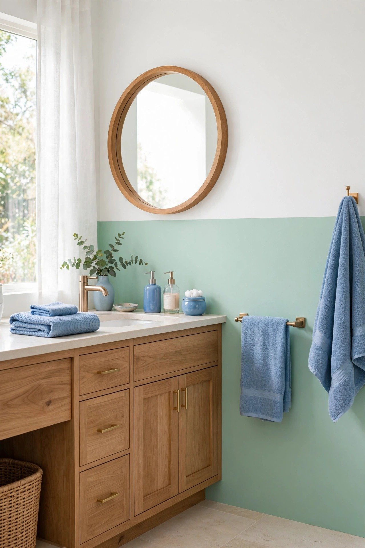
Mint green and white feel like a breath of fresh air. The mint adds a gentle splash of color, while white keeps everything bright and clean. Bathrooms and kitchens will feel fresh and cheerful with this pairing.
Chrome fixtures and white towels will look crisp and modern against the mint. A small green plant on the windowsill will complete the fresh feeling. It is a combination that always feels clean and uplifting.
22. Dramatic Black and Gold Accent Walls
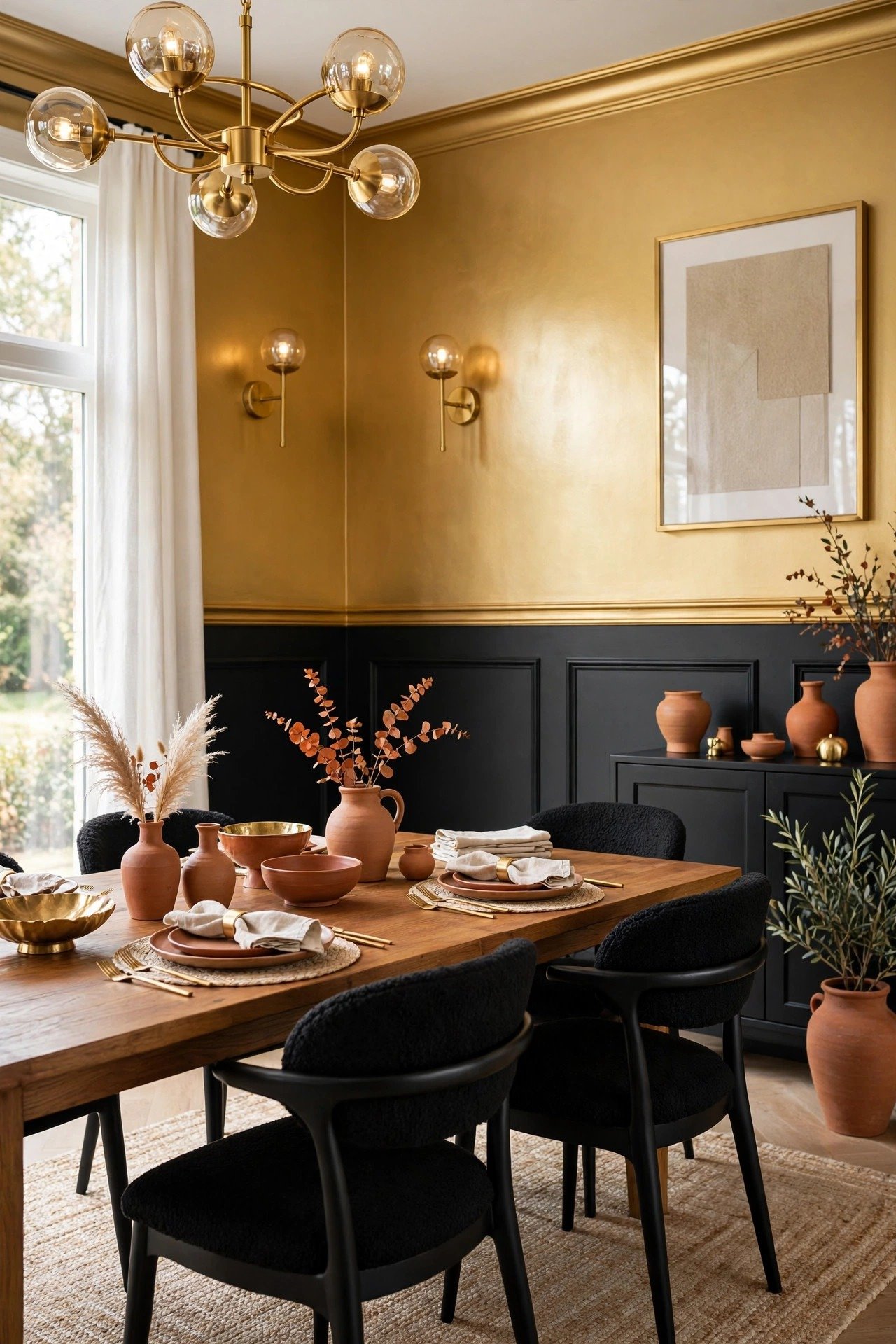
Black walls with gold accents are pure luxury. The black creates a deep, dramatic backdrop, while gold adds warmth and glamour. A dining room or a home office painted this way will feel like an exclusive boutique hotel.
Take cues from Art Deco glam touches with geometric mirrors and brass light fixtures. Keep the lighting warm so the black feels cozy instead of cold. This is the most dramatic look on the list, and it is worth it.
23. Sage Green and Warm White Organic Walls
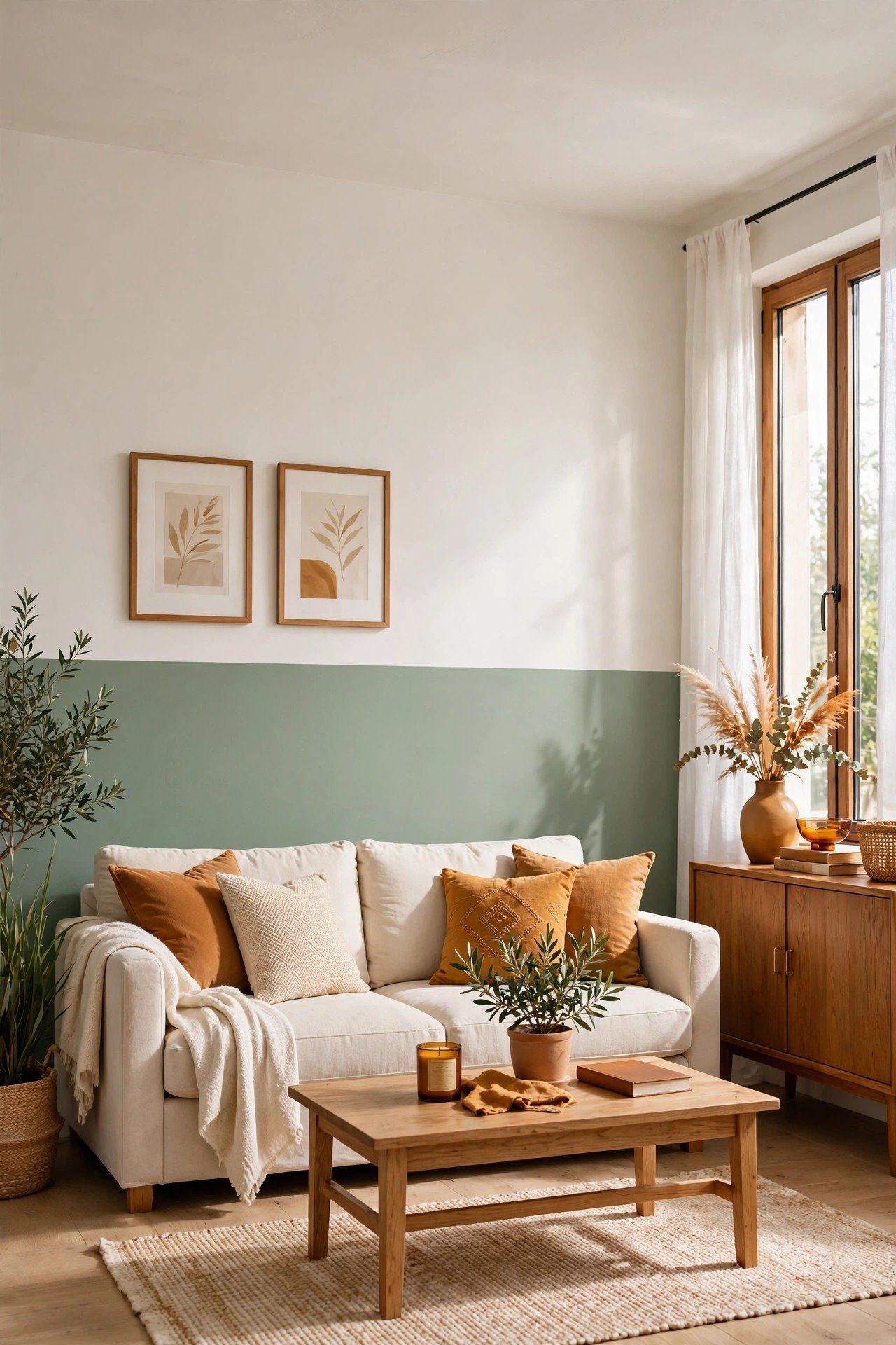
Sage green and warm white feel calm, natural, and effortlessly stylish. The sage brings a gentle touch of nature indoors, while warm white keeps the room soft and welcoming. It is perfect for living rooms and bedrooms where you want a peaceful, organic feel.
Style it with linen curtains, light wood furniture, and a few dried flowers or eucalyptus stems. Keep the divide between the colors soft with a simple straight line. You will have a room that feels like a quiet garden retreat.
Conclusion
Two tone walls prove that a little paint can make a very big difference. Whether you choose a calm neutral pairing or a bold and joyful duo, the second color adds depth and personality that a single shade simply cannot give.
Pick the combination that speaks to you, grab your painter’s tape, and enjoy the process. You will be amazed at how new your room feels when the last brushstroke dries. Happy painting, friend.
Frequently Asked Questions About Two Tone Wall Paint
What is two tone wall paint?
Two tone wall paint means using two different colors on the same wall instead of one. The colors are usually split by a straight line, a chair rail, or a creative divide like a diagonal. It adds depth and interest for the cost of one extra paint can.
Where should you split the two colors on the wall?
The most common choice is to split the wall horizontally at chair rail height, which is about one third of the way up. You can also split it halfway up the wall, try a diagonal line for a modern feel, or paint just one accent wall in two tones. Hold the darker color on the bottom half to ground the room.
Which two tone color combos work best in small rooms?
Light pairings work best in small rooms because they keep the space feeling open. Try beige and white, mint green and white, or soft pastels. Keep the darker tone on the lower part of the wall so the ceiling still feels high and bright.
What do you need for crisp lines between the two colors?
You need good painter’s tape, a steady hand, and a little patience. Press the tape down firmly so paint cannot seep underneath. Paint over the tape edge with the base color first, let it dry, then paint the second color. This seals the edge and gives you a sharp line.
Can you use two tone paint in a rental home?
Yes, as long as your landlord allows painting. Choose colors you can easily paint over when you move out. Light neutrals are the safest choice for rentals because they take fewer coats to cover later.

Hi, I’m Emily! I turn messy corners into cozy, organized spots. DreamNestDecor is where I share simple, practical home ideas — decor, organization, and small-space solutions that work in real life, not just in photos. Every idea here is carefully researched before it’s shared.